BCG RAIL REVENUE MANAGER
UX, UI & Information design, Product lead, Information architecture, Project management
Creating an interface to facilitate the management of train portfolios, from booking rate to ticket prices.
CONCEPT
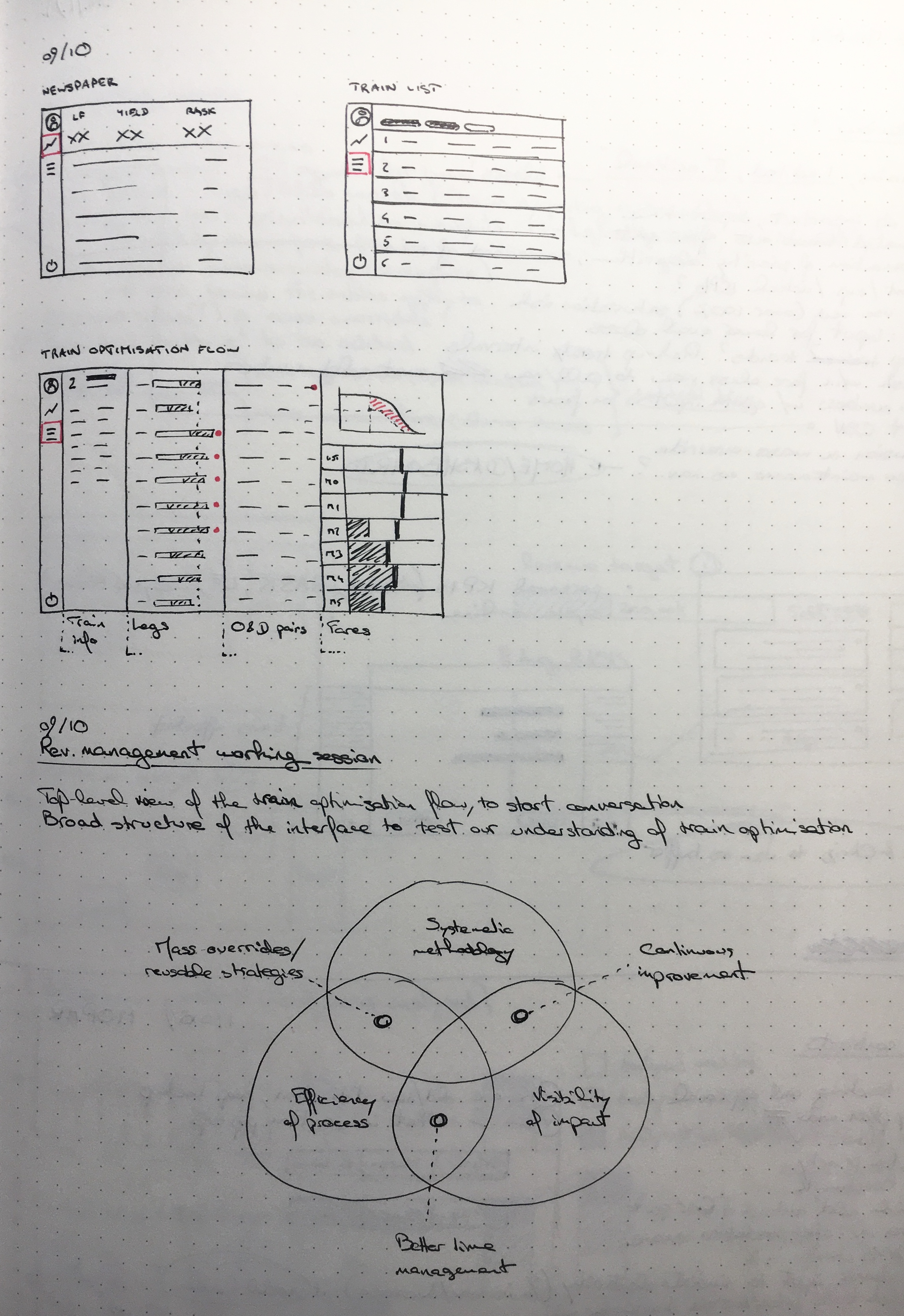
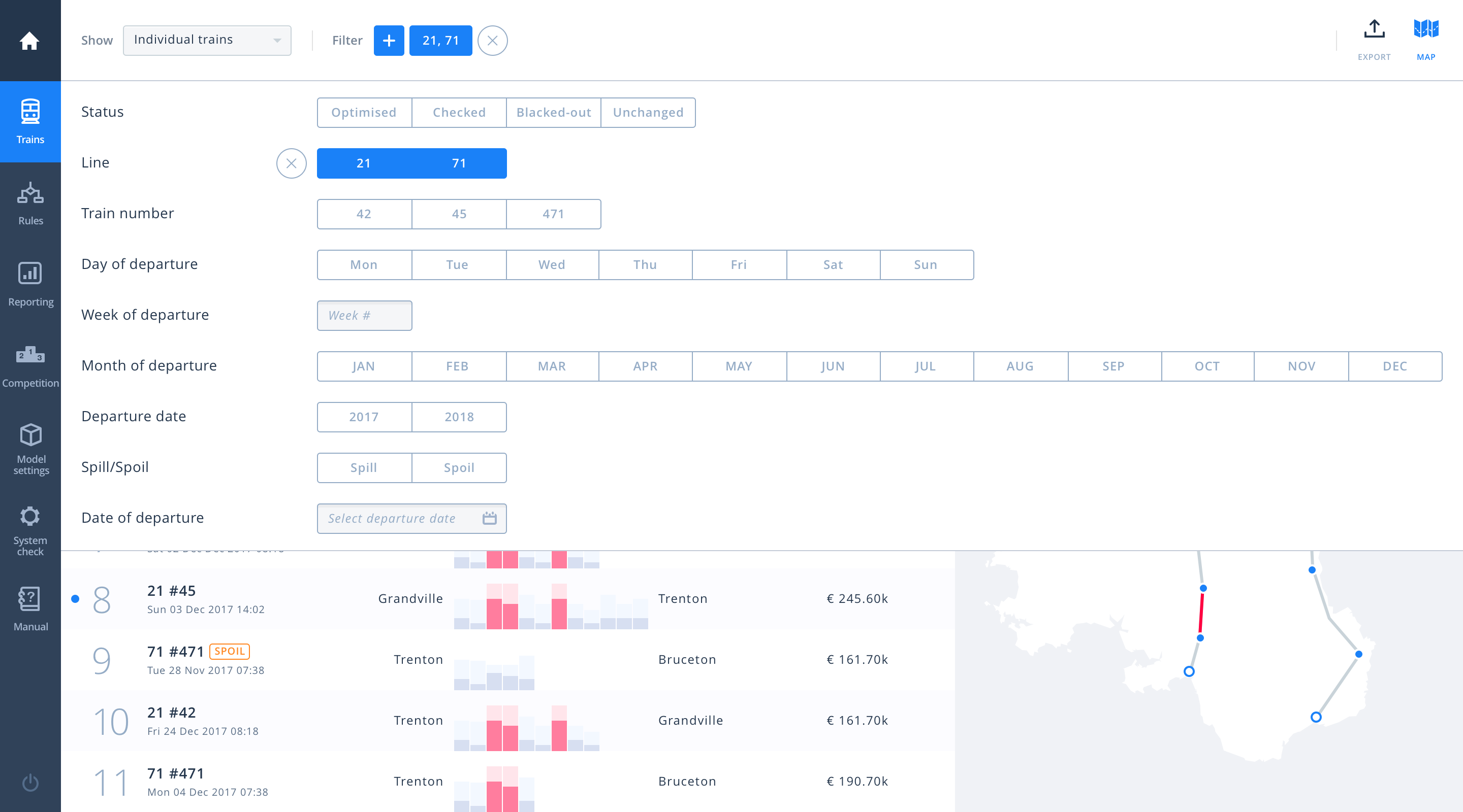
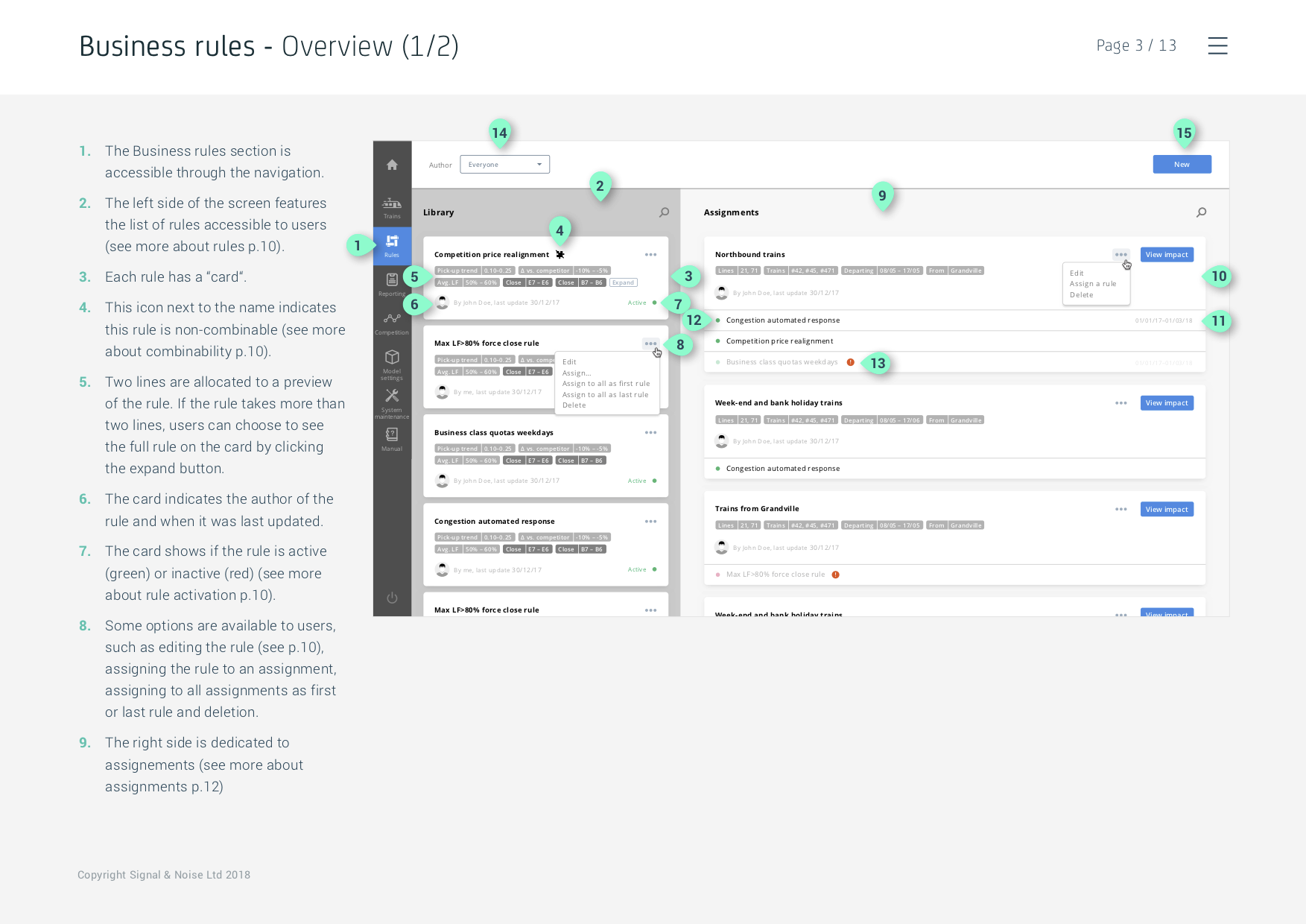
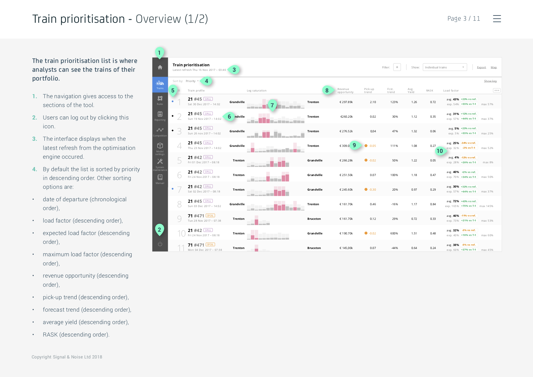
We were approached by BCG to help them build upon a proof-of-concept they developed in Excel, taking the form of extensive, jam-packed, lists of trains, ‘origins & destination’ (O&Ds)—ie. a train line in one direction— and ‘legs’ (ie. sections of these O&Ds).
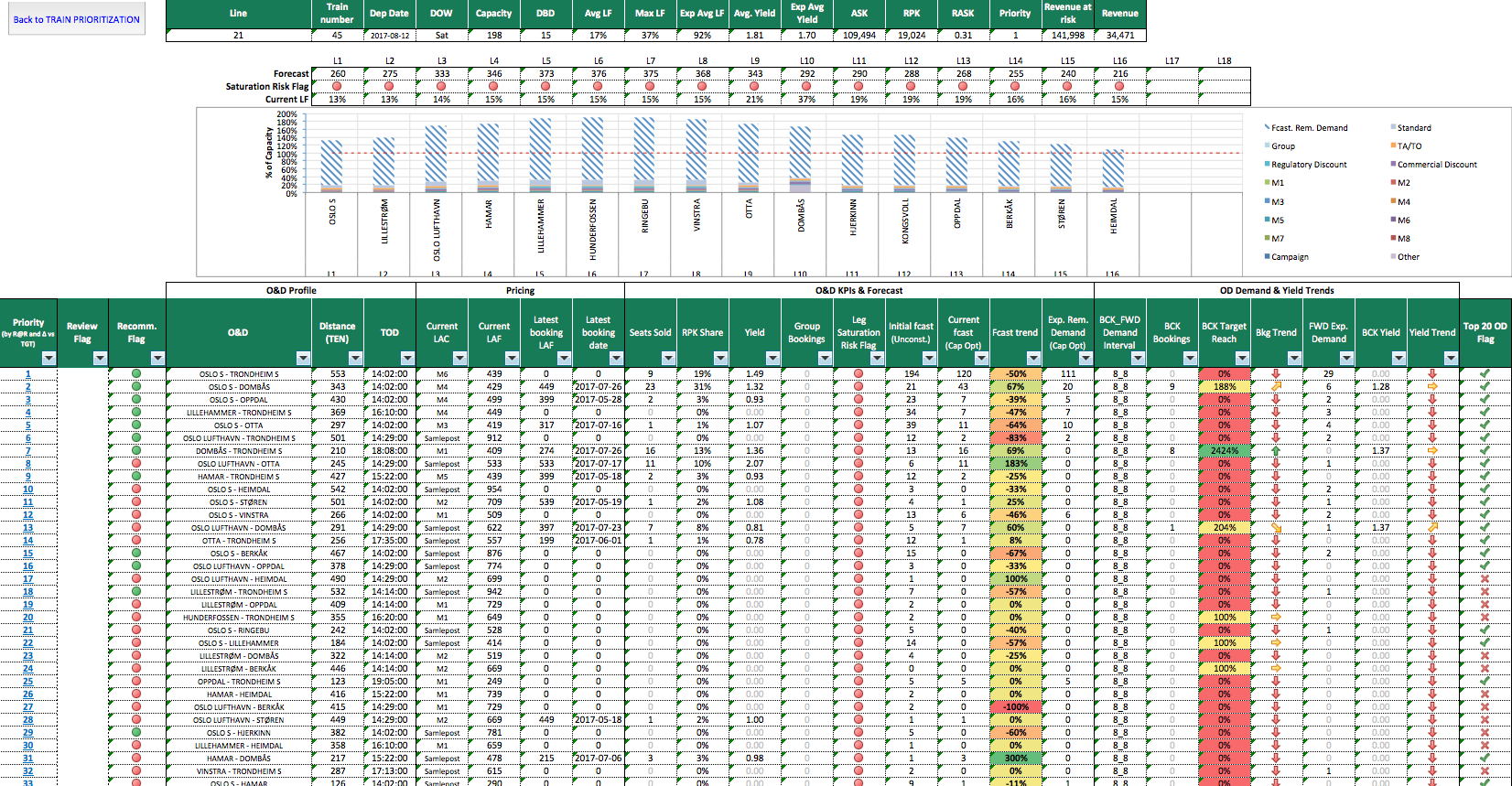
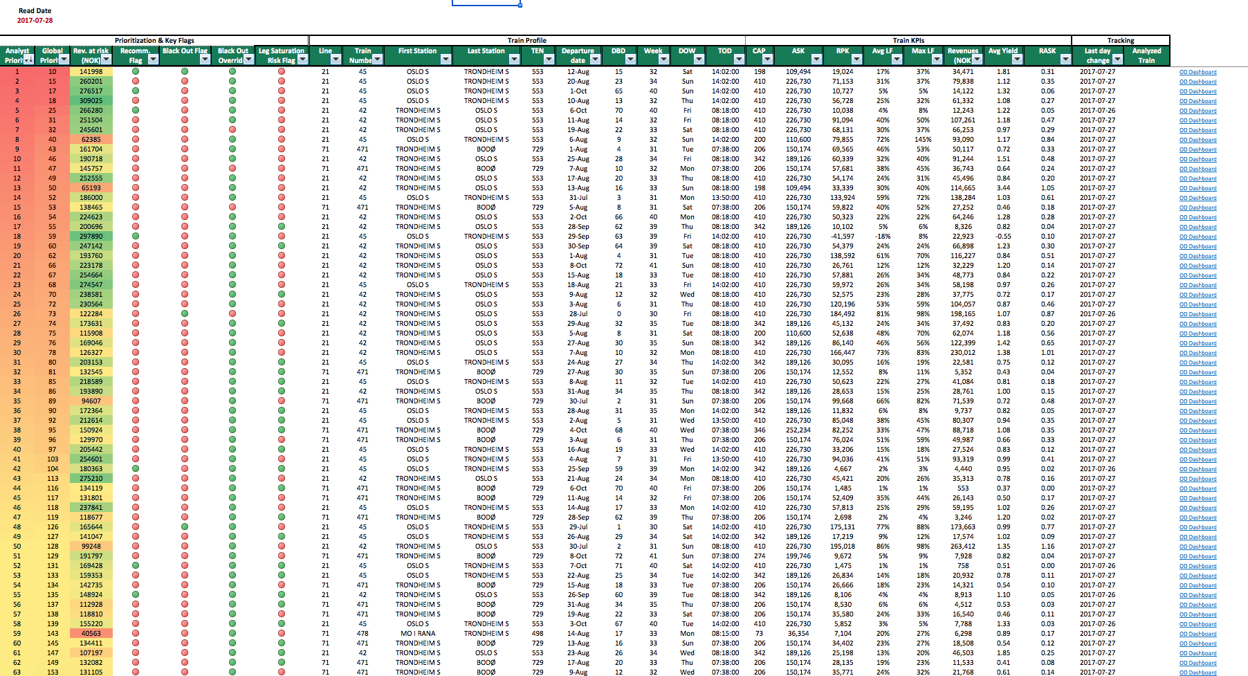
Requiring users to navigate a busy table and editing one cell after the other, we all recognised that much could be done regarding the usability and experience of the tool. We started, together with the client, by cleaning up the interface, defining for each screen what the goals of the user were.
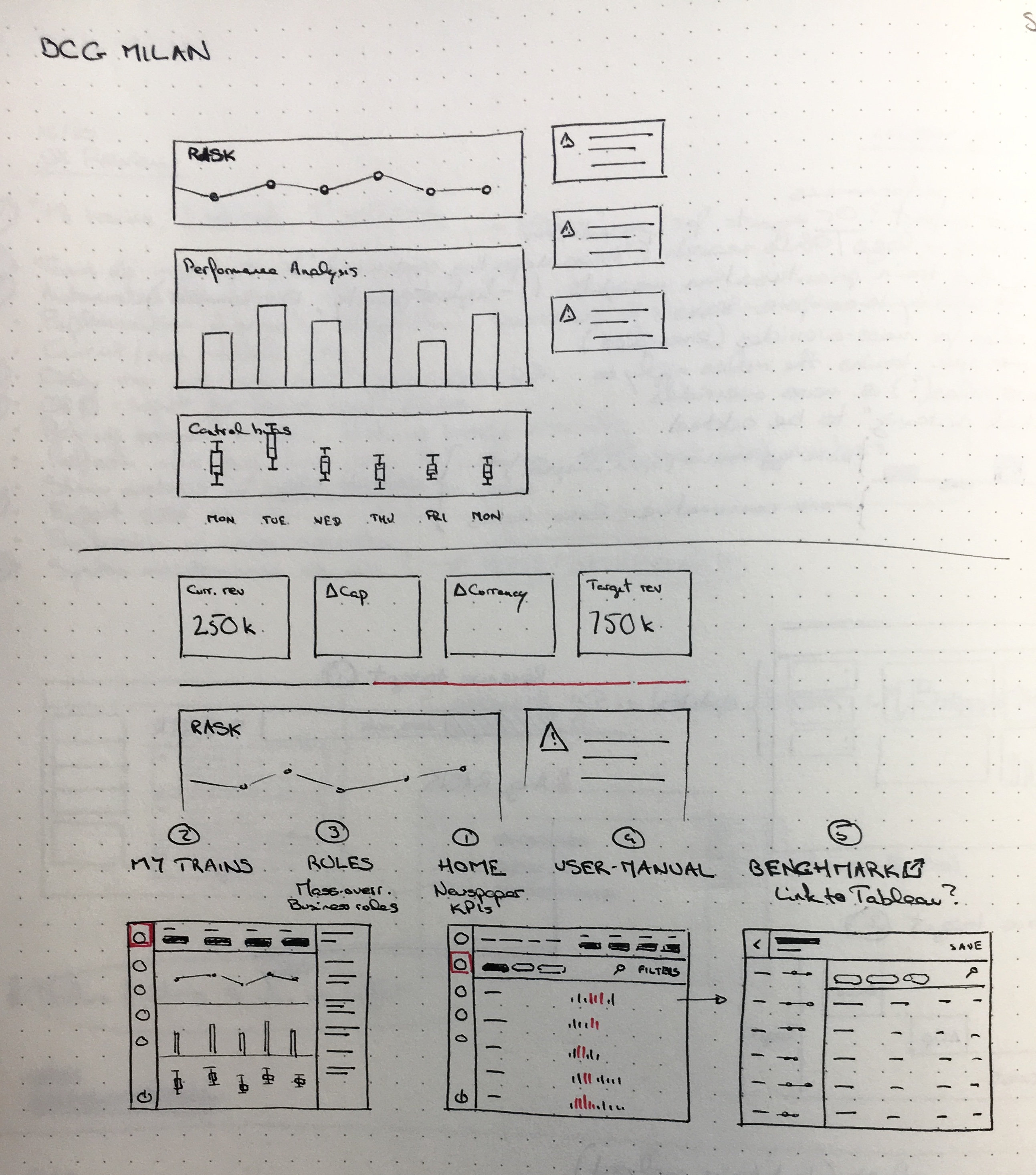
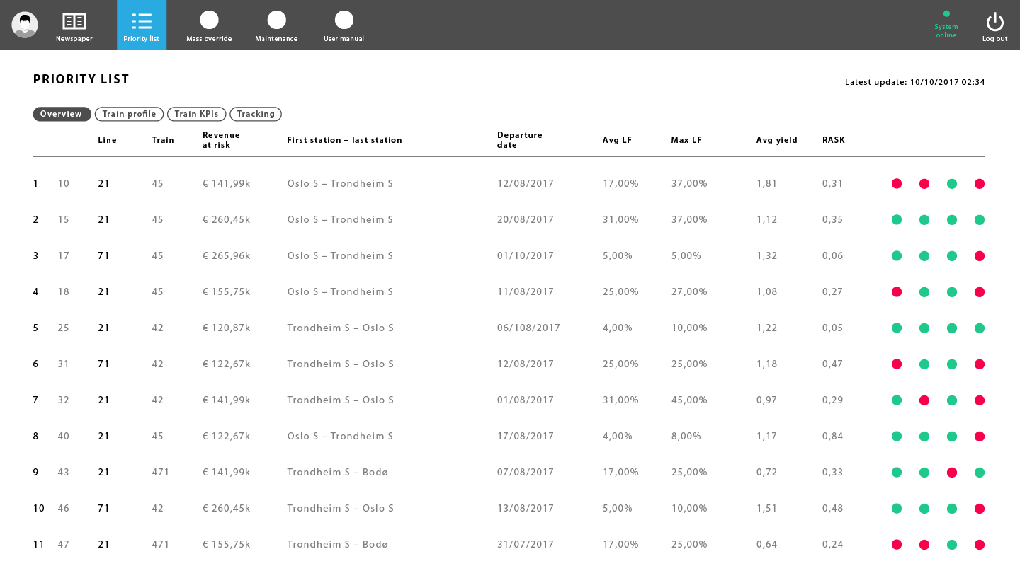
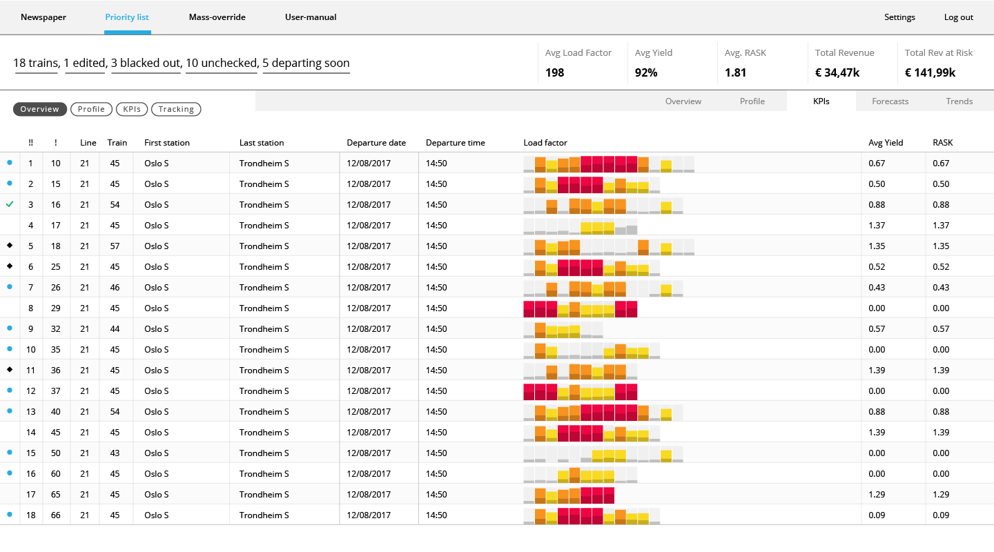
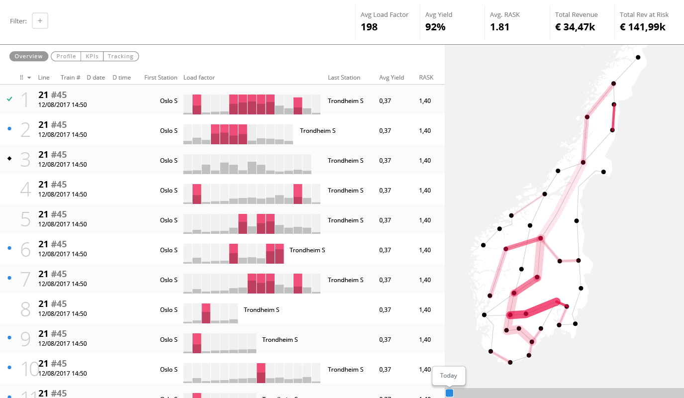
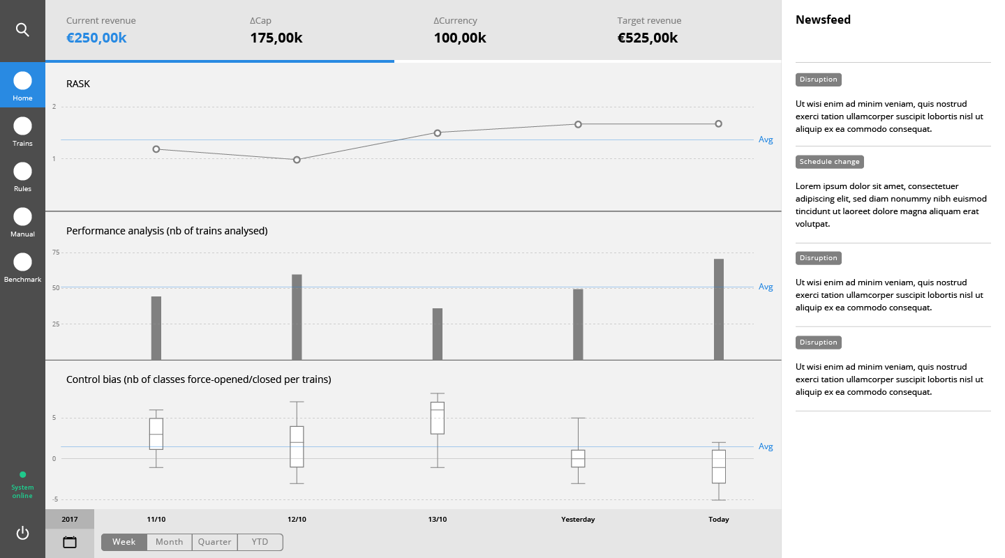
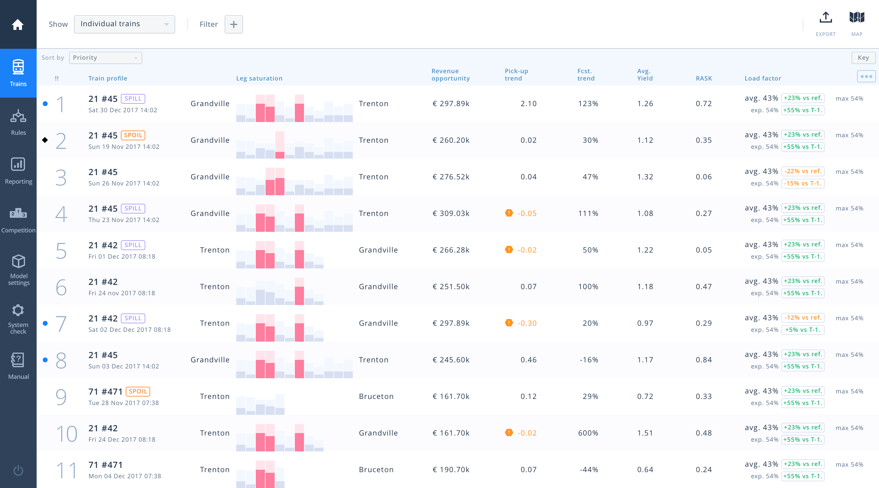
In parallel we started thinking about how we could display some of the data in a more meaningful way that a number in a crowded table. For instance each train has a small bar chart, where each bar is a leg, showing clearly how close to saturation they’re becoming.
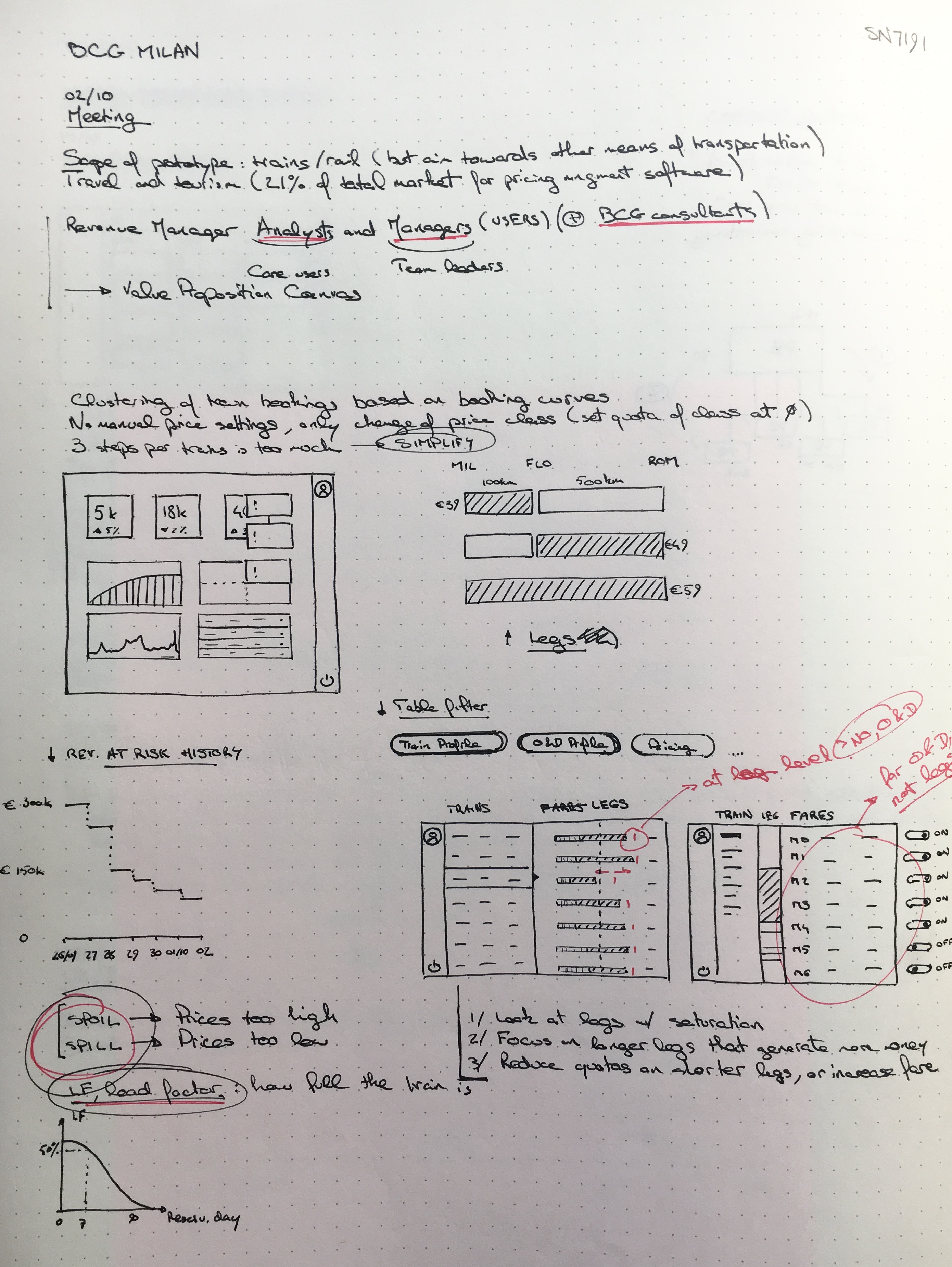
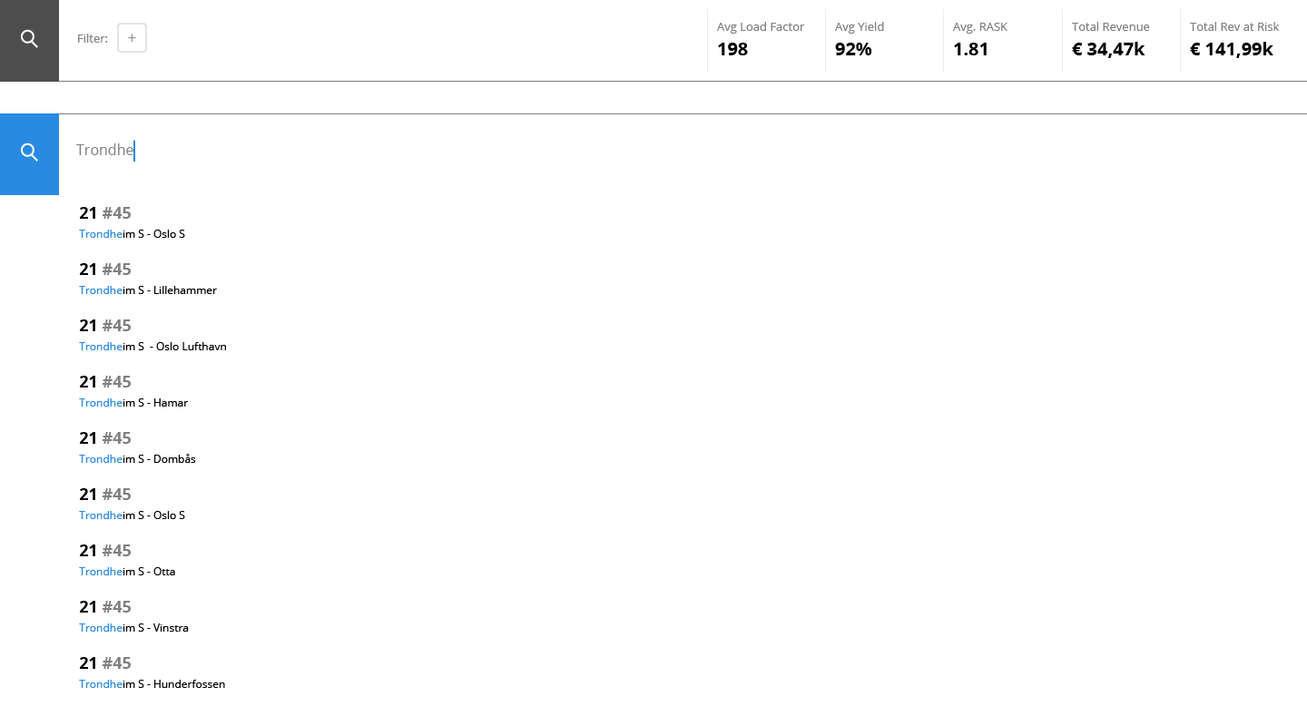
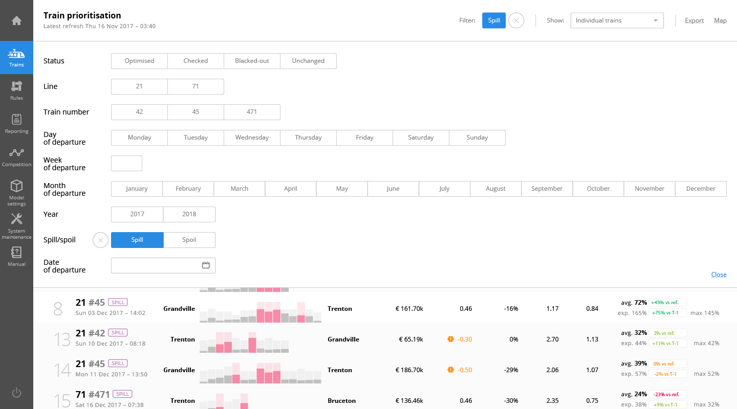
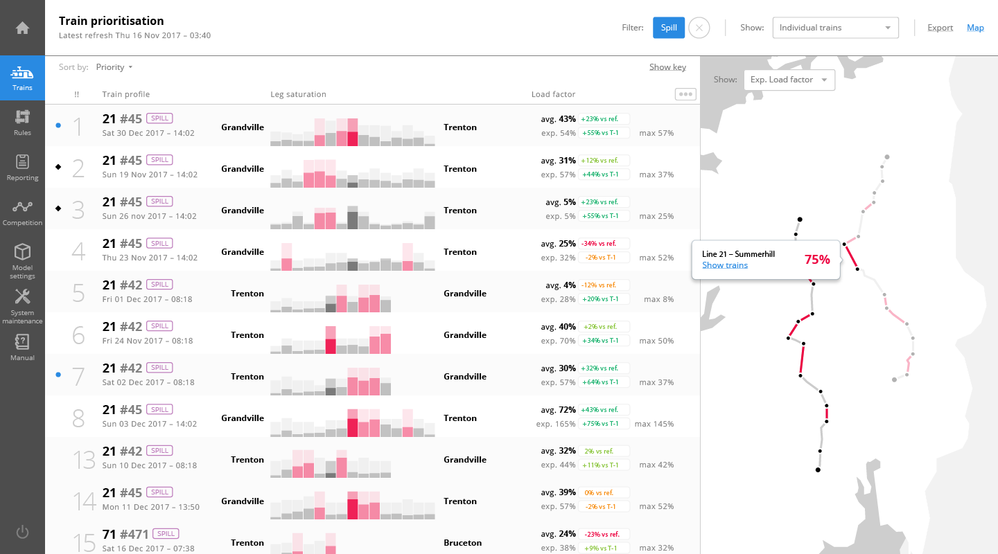
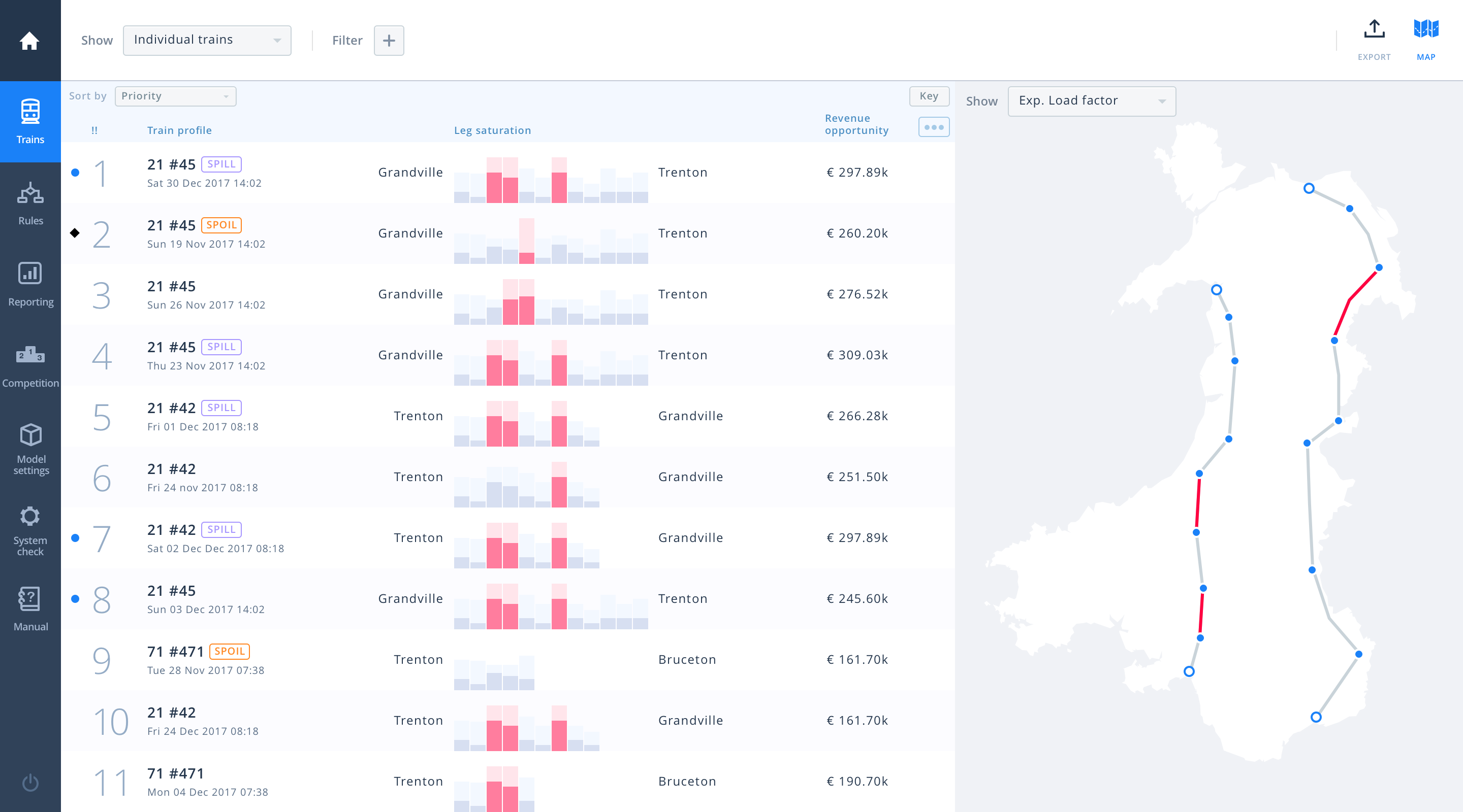
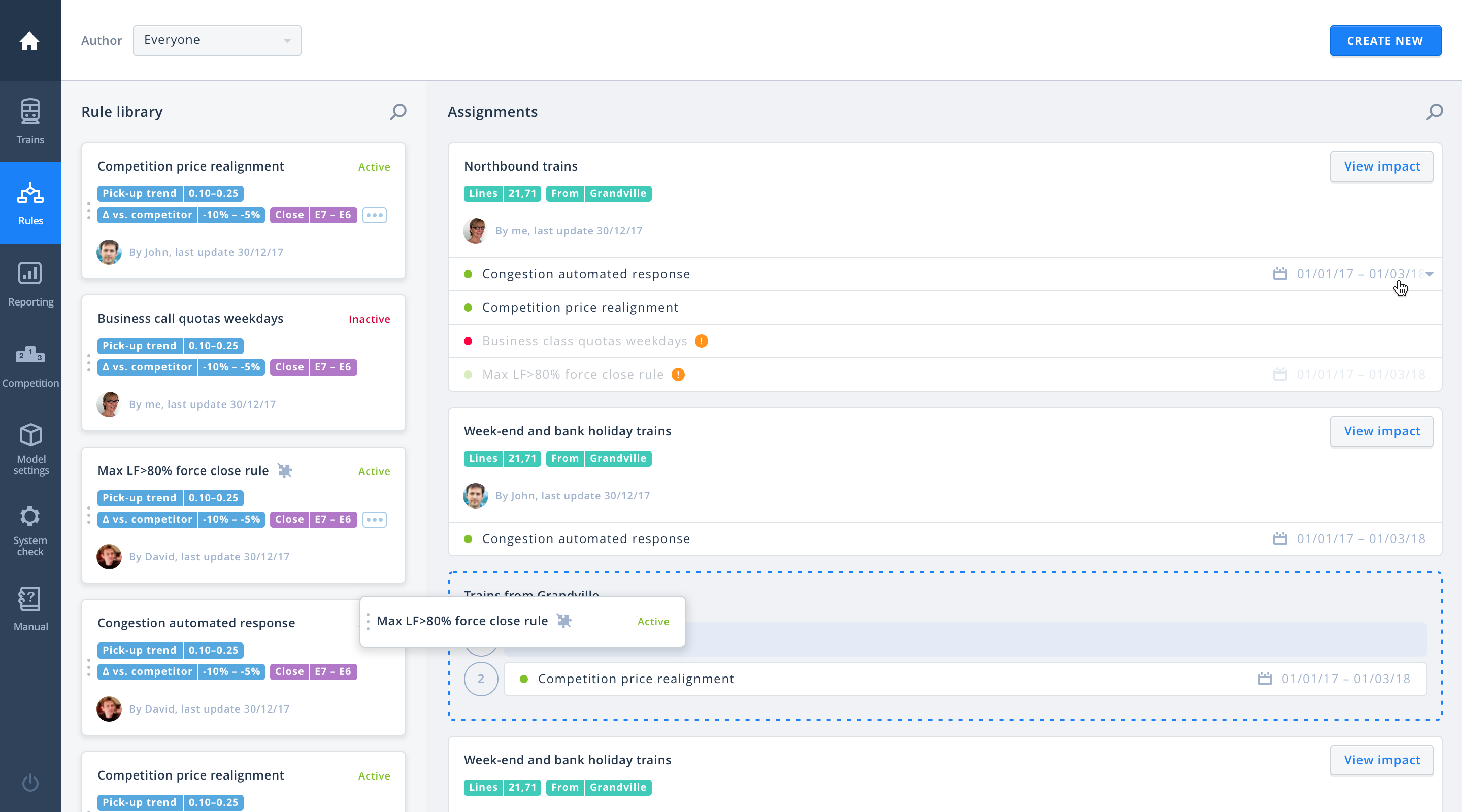
As the direction for the tool started to coalesce, we focused out attention on specific components, such as the search/filter function, the map and a mass-override feature.
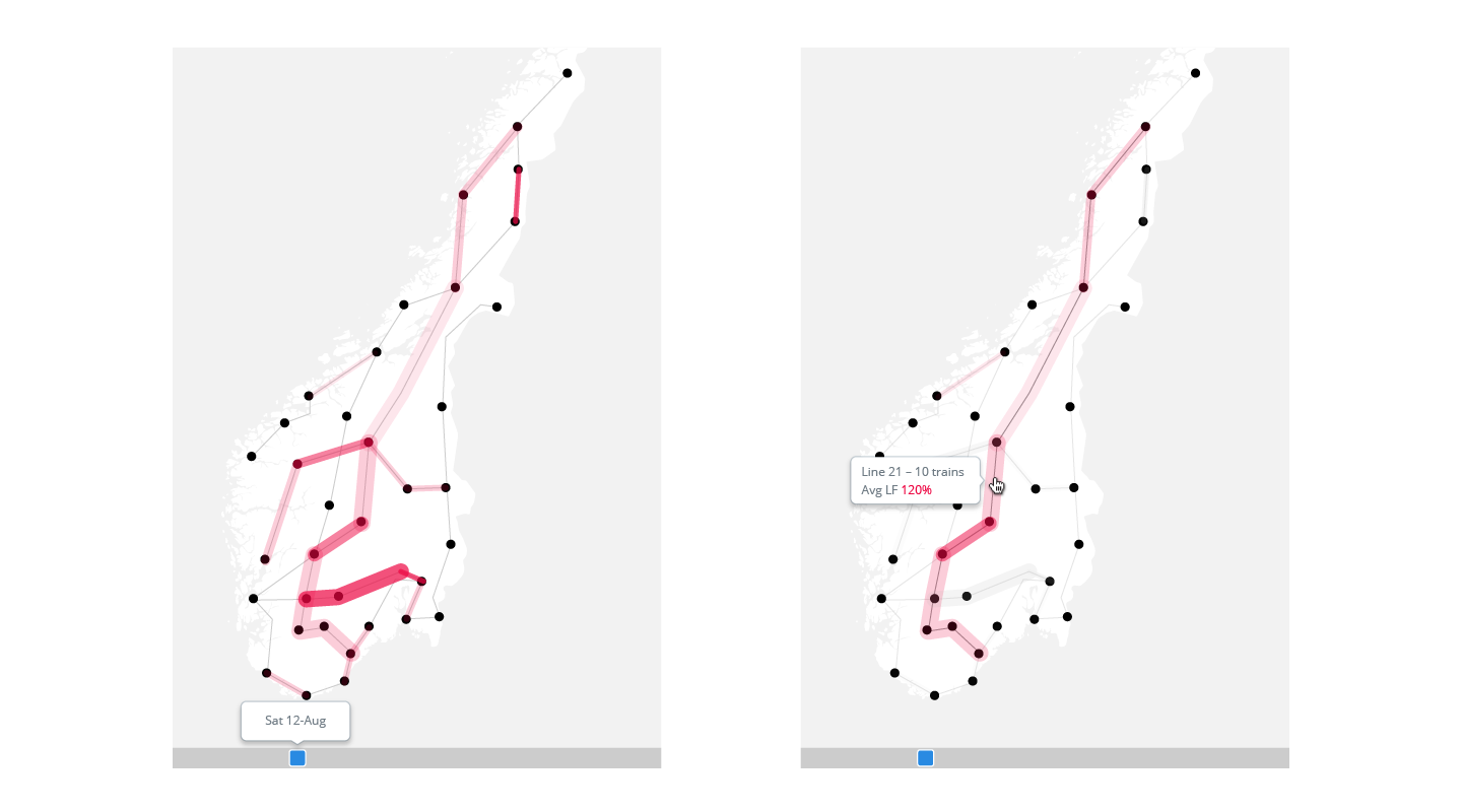
The map would help anchoring visually which legs of which lines were the busiest, and would interact with the train list, highlighting and filtering it.
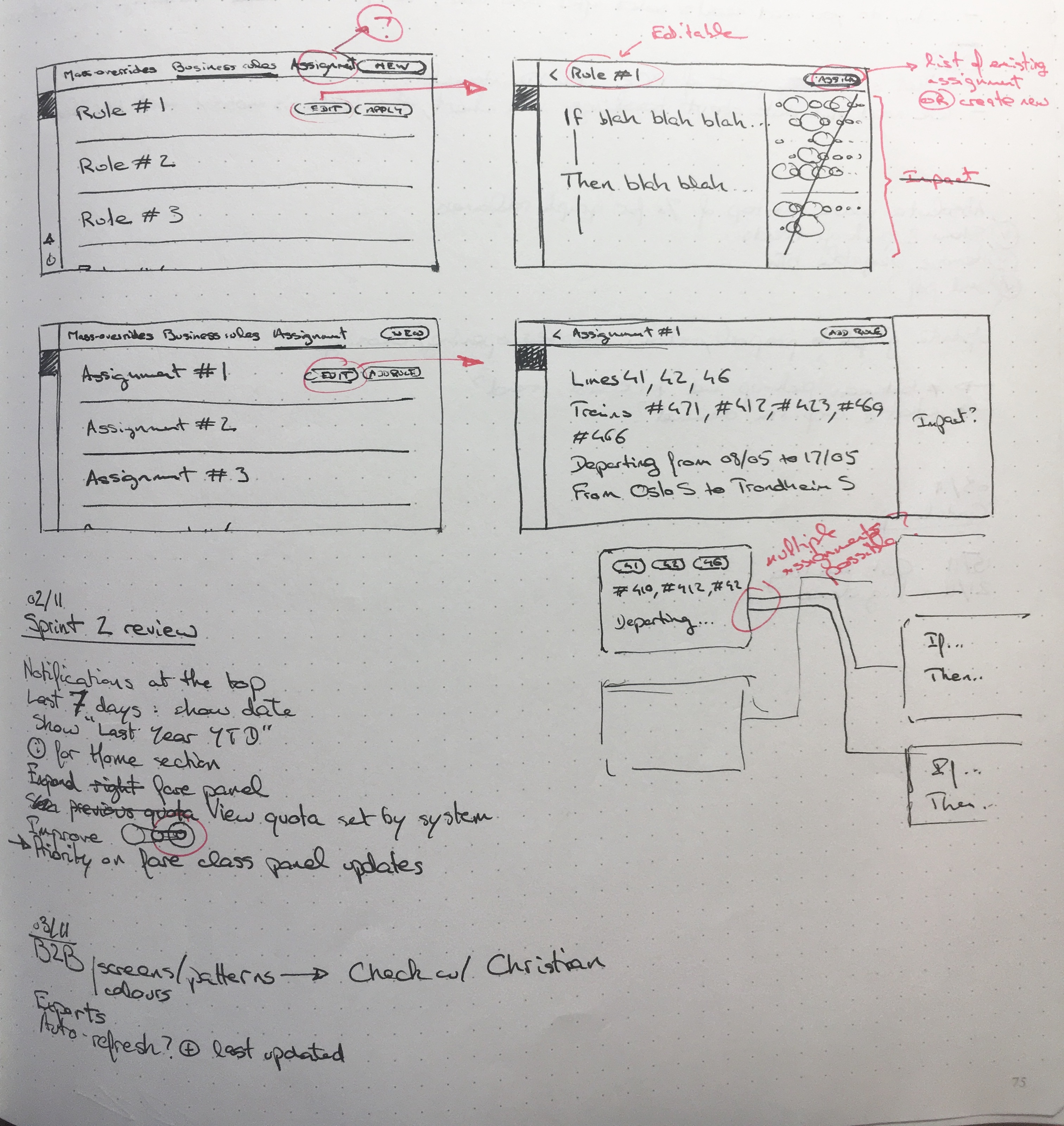
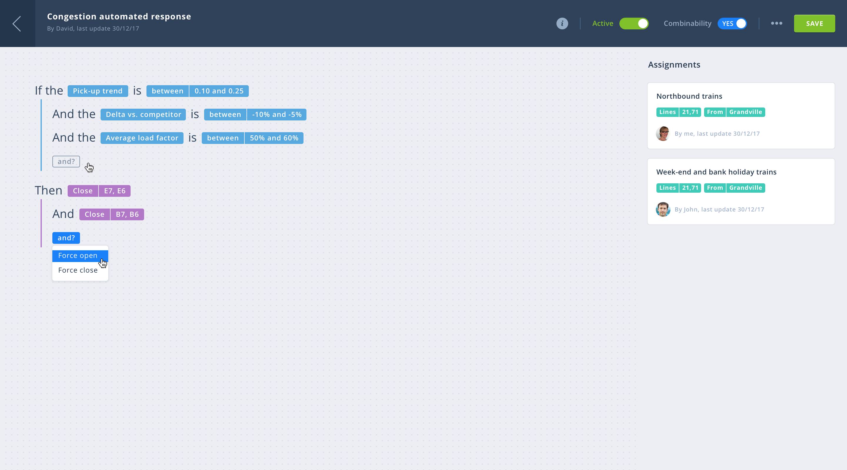
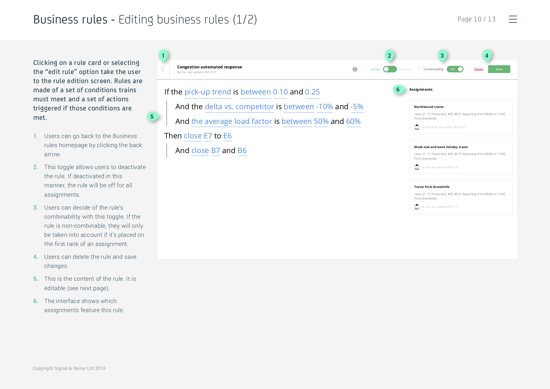
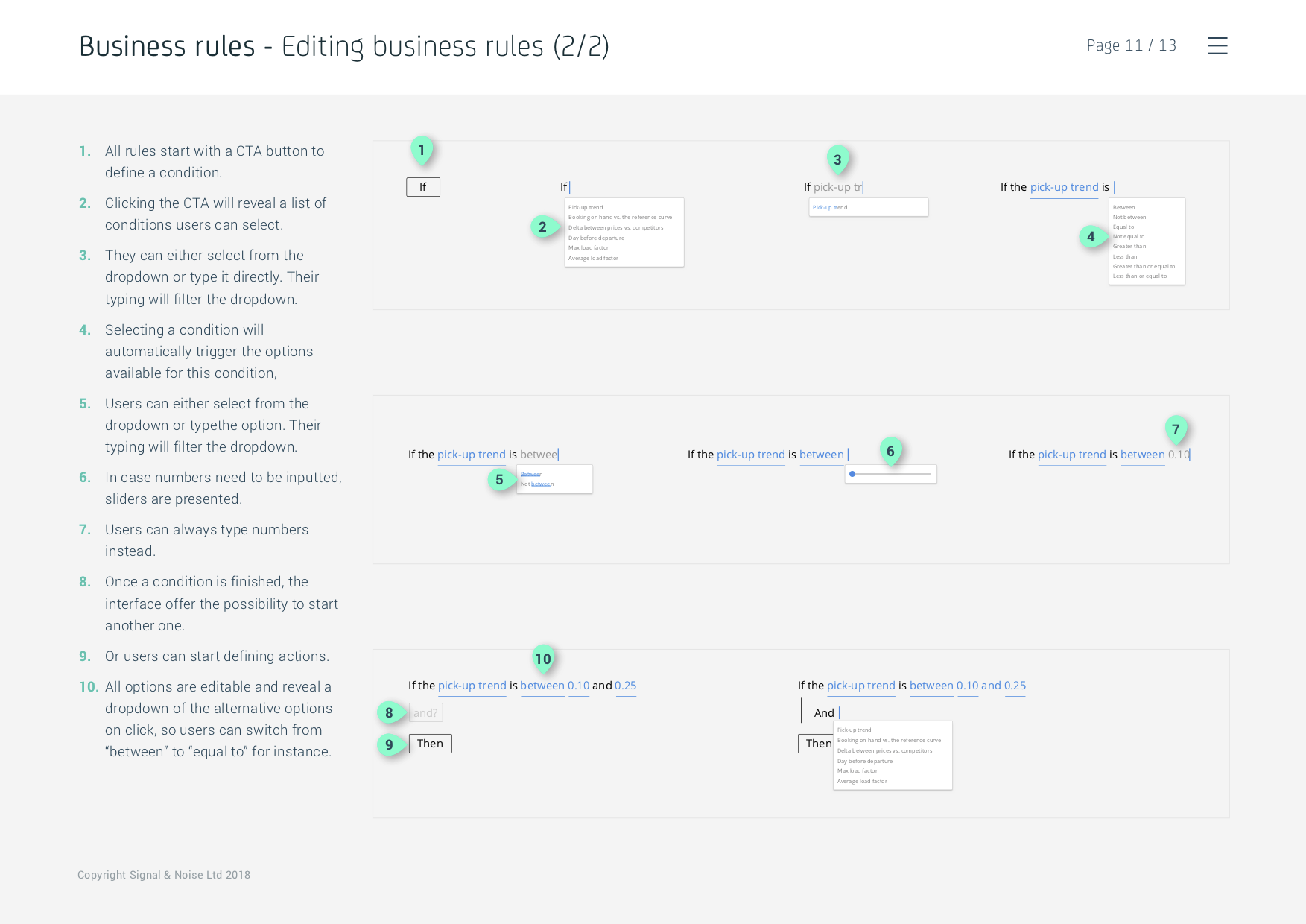
Mass-overrides were identified as essential for the success of the tool, as it was clear that the biggest hurdle was painfully editing trains after trains. We started thinking about simple nature language algorithms that users could write in order to automate some of their tasks.
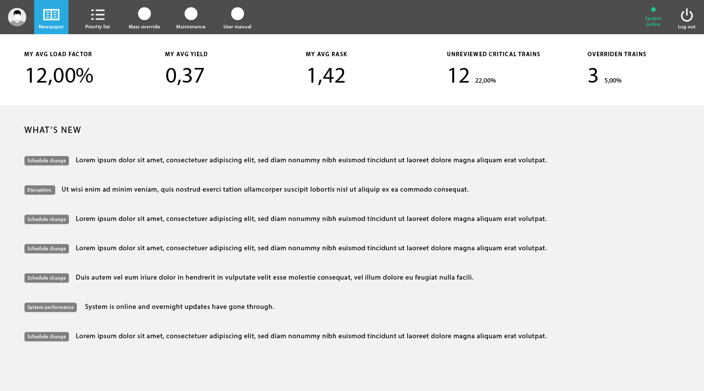
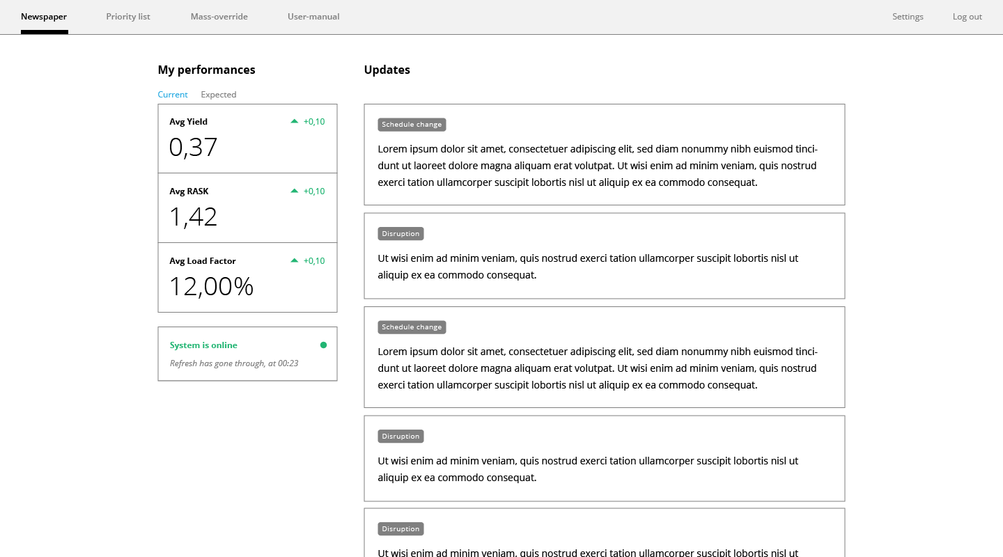
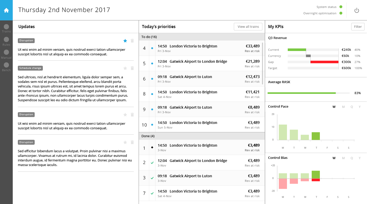
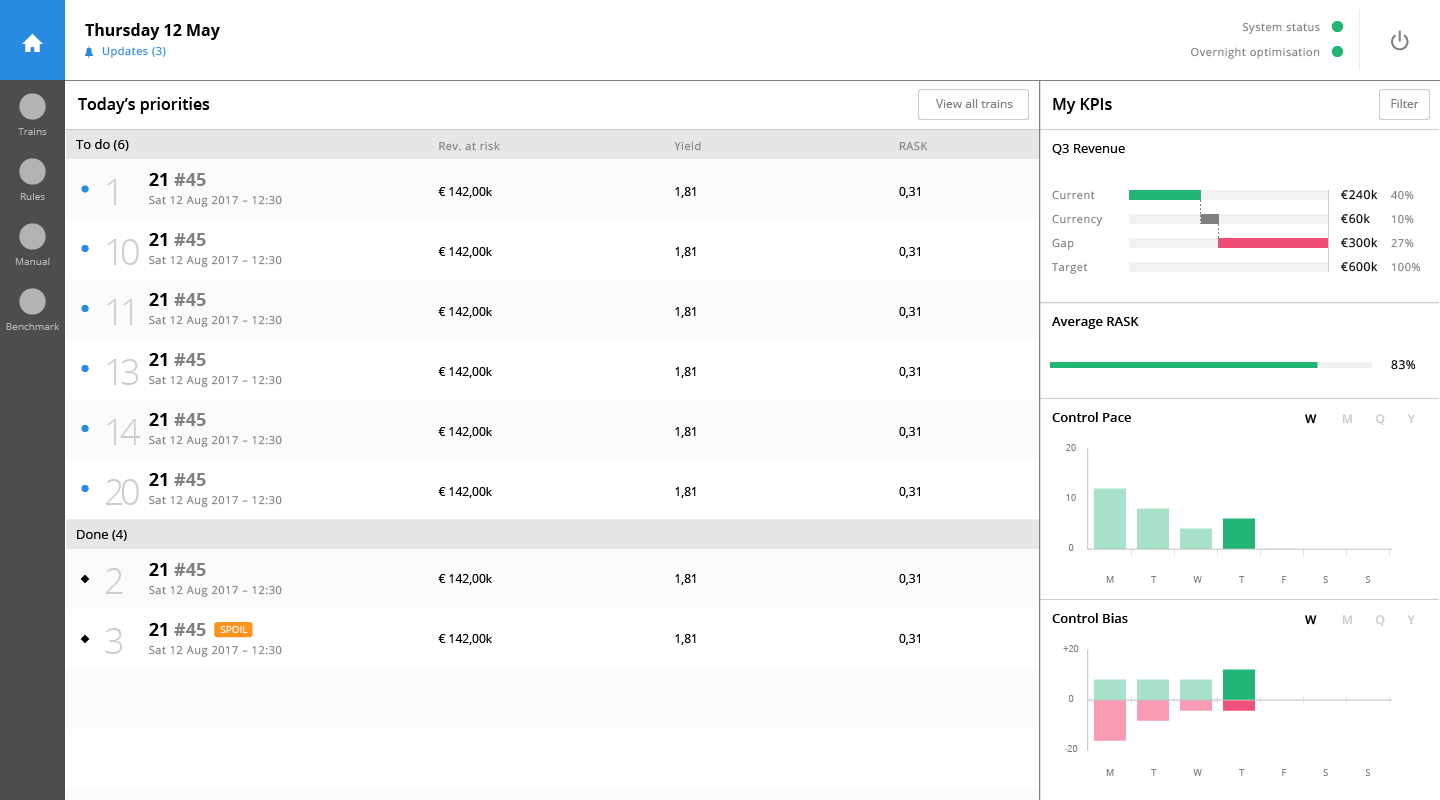
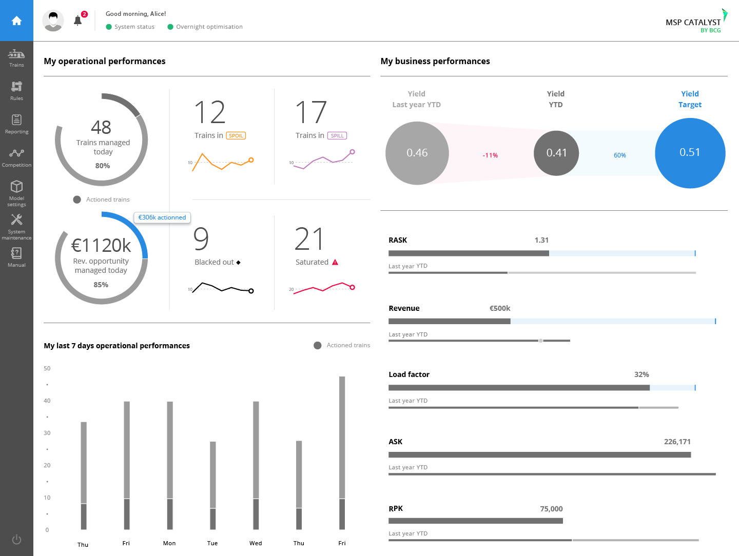
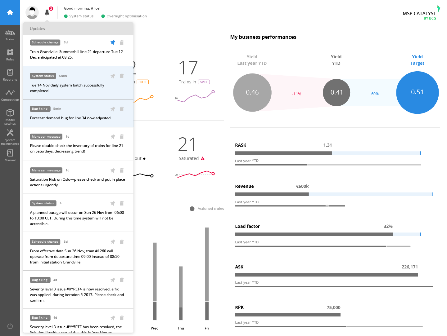
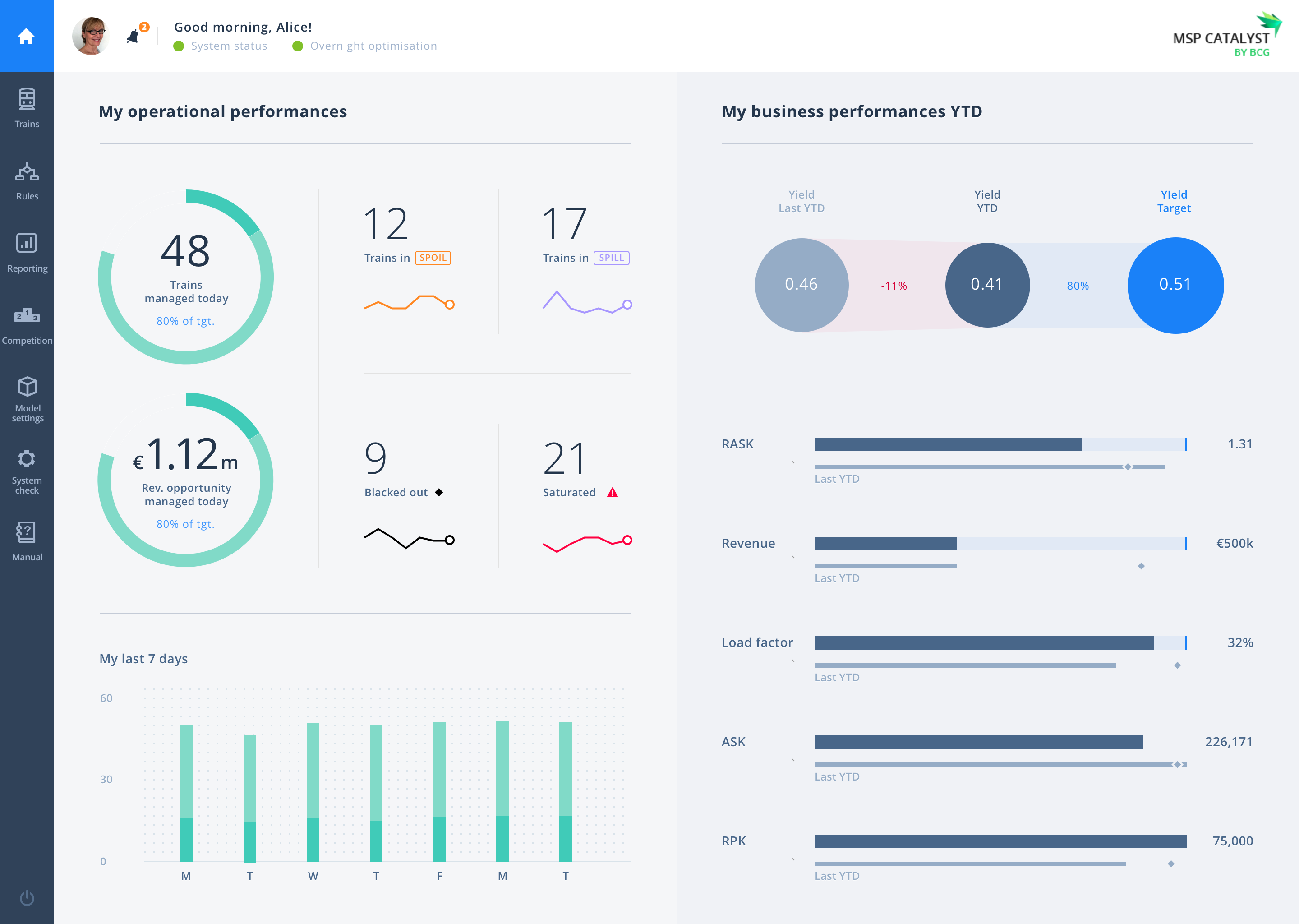
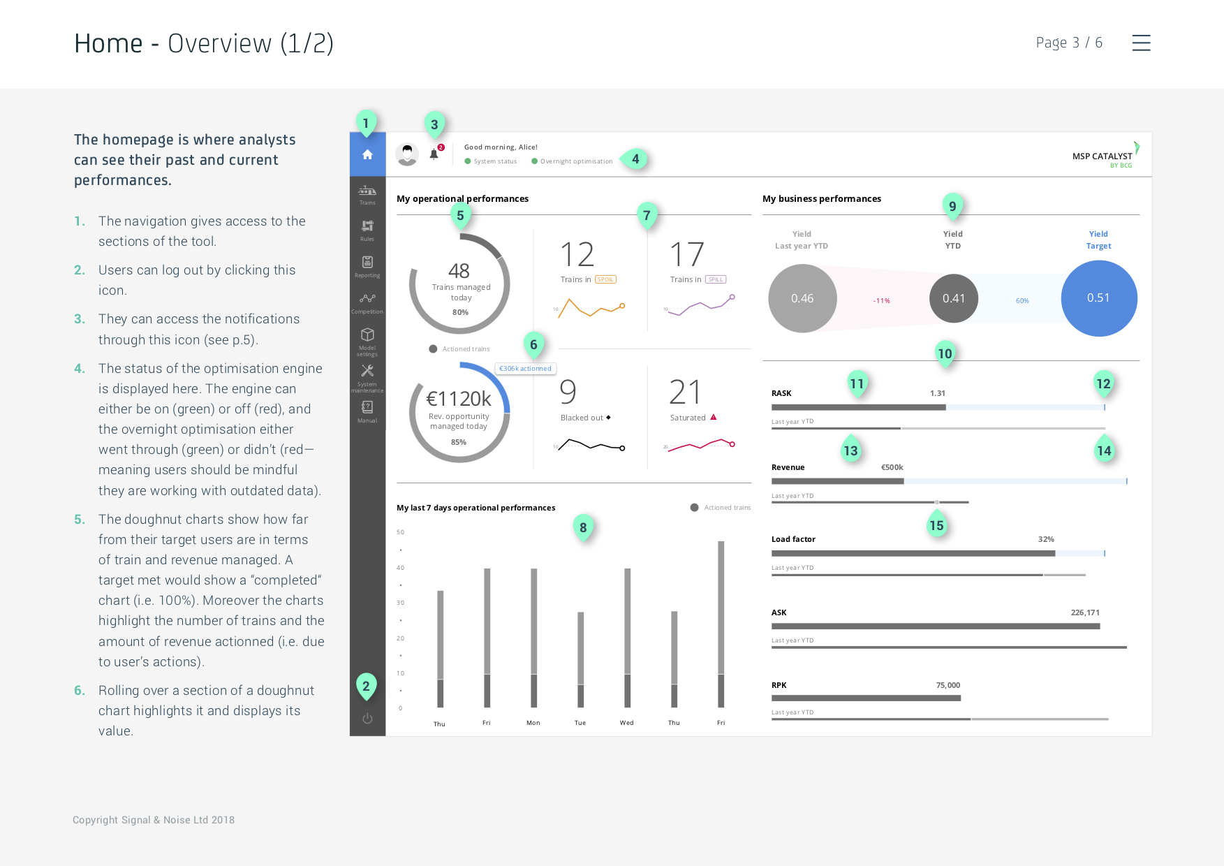
Meanwhile the homepage experienced many iterations as we formulated what core information users would need to see upon logging in.
WIREFRAMES
As the concept for the tool was now firmly in place, it was time to delve into the details and make sure each interaction build upon the other to make a cohesive whole.
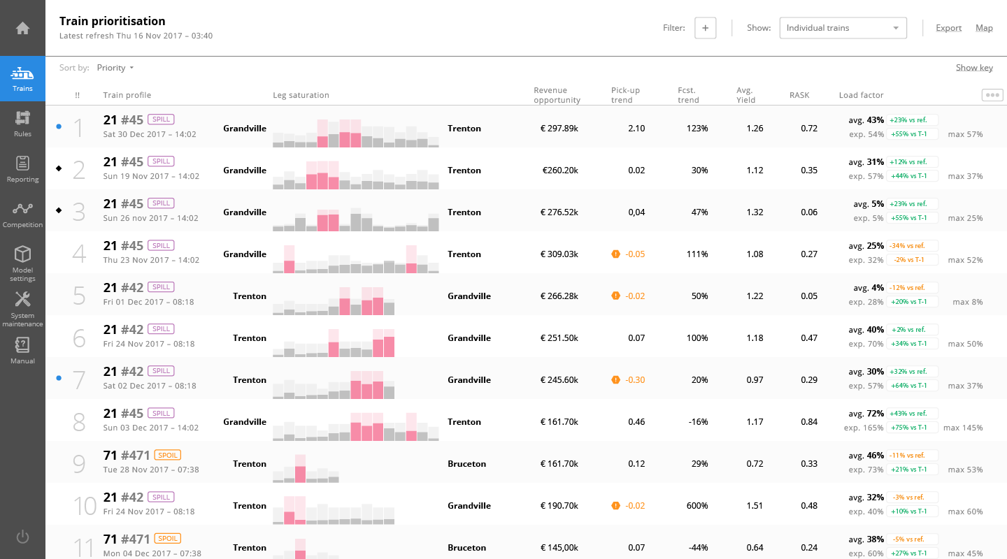
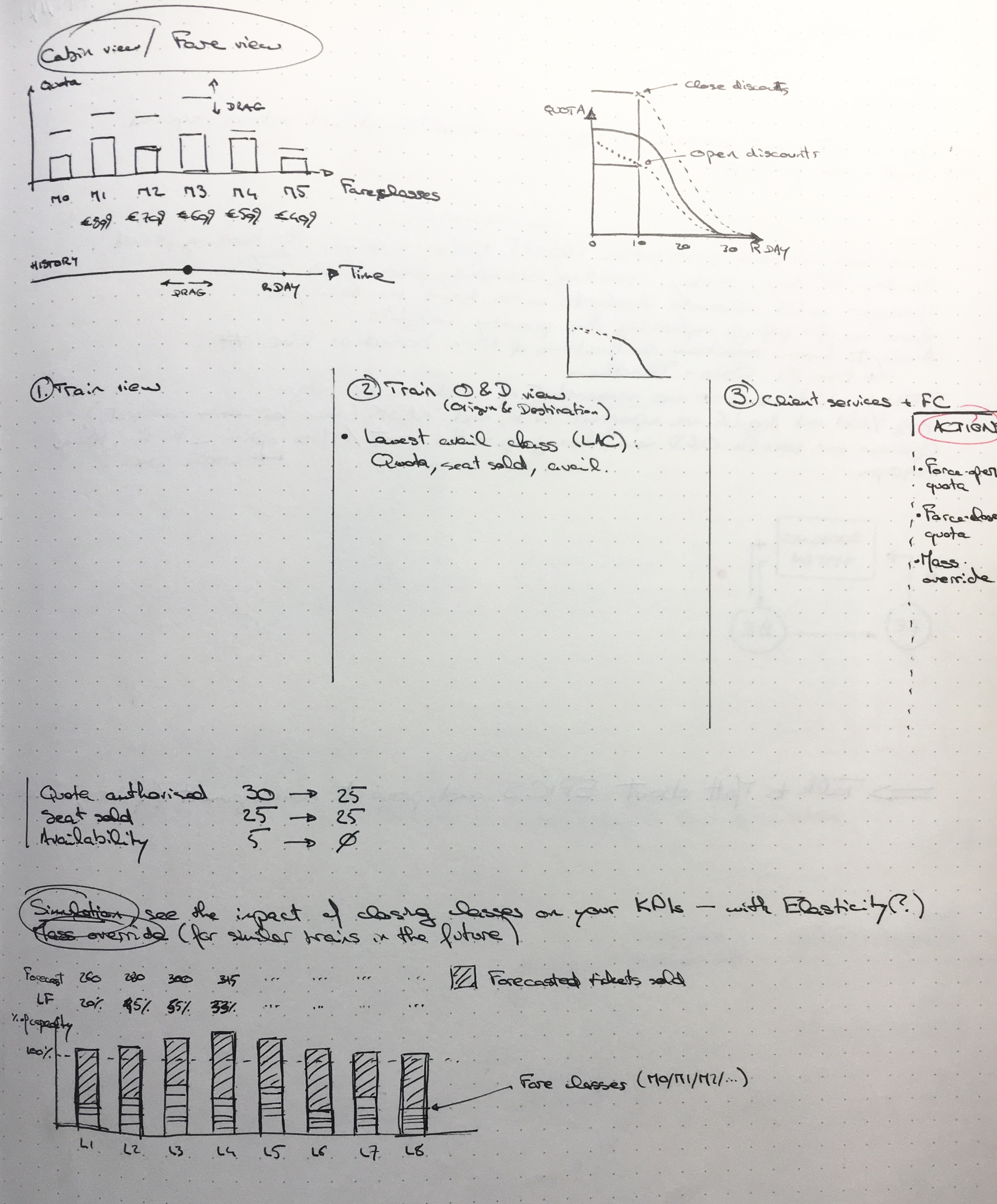
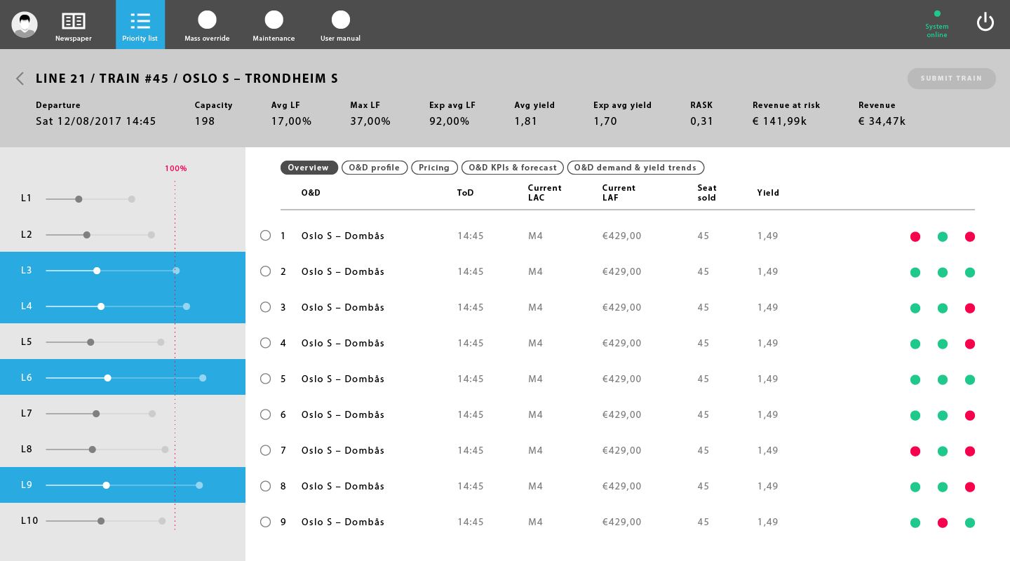
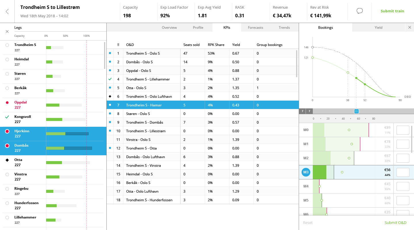
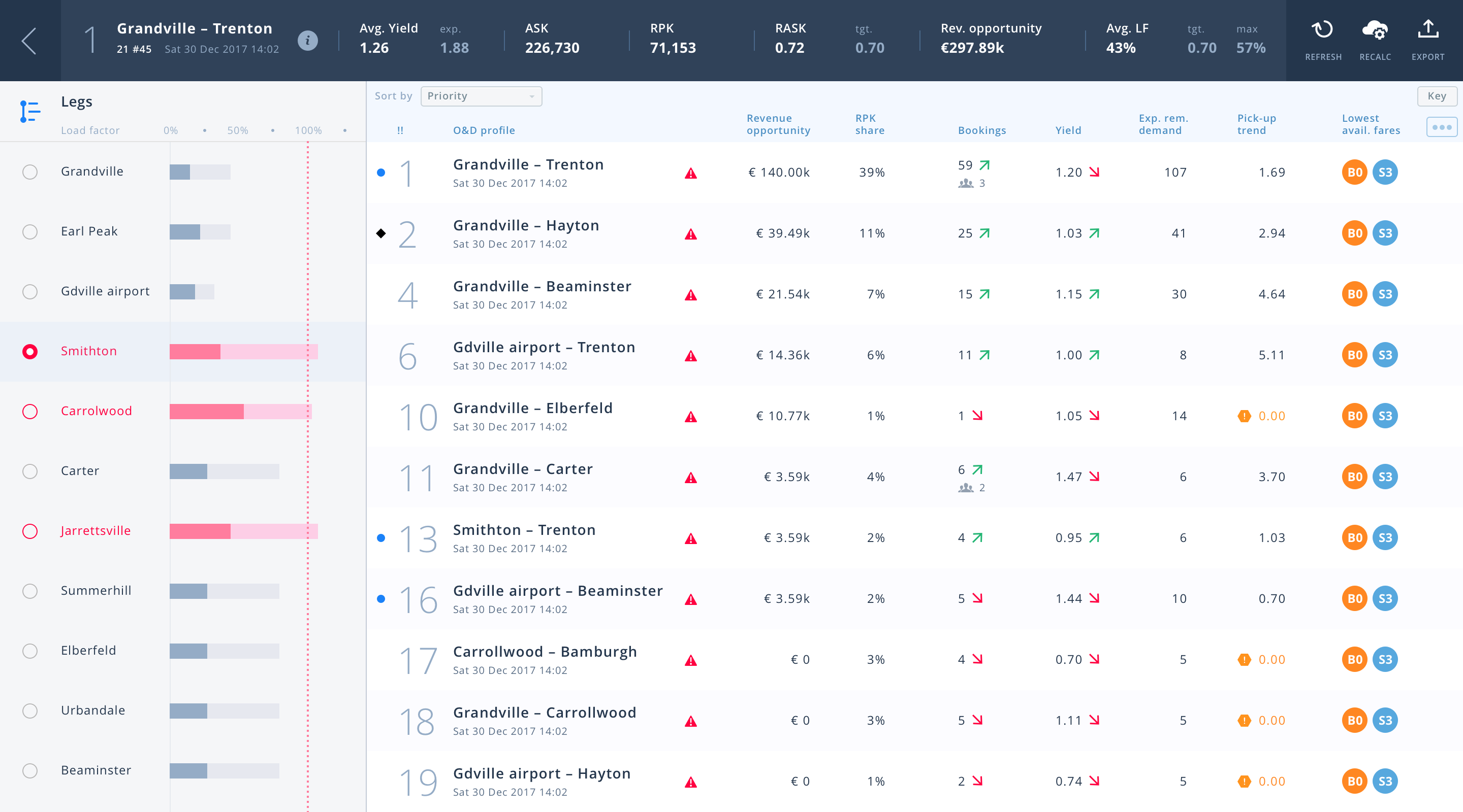
After selecting a train, users can filter its O&D list by legs, so as to focus on the most saturated ones.
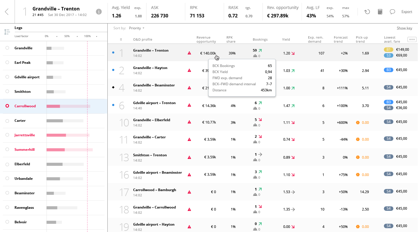
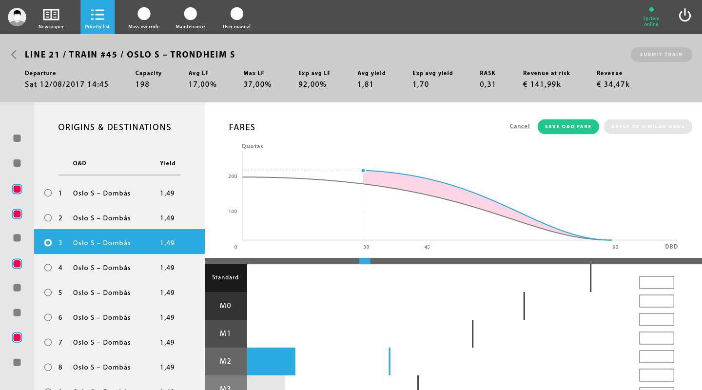
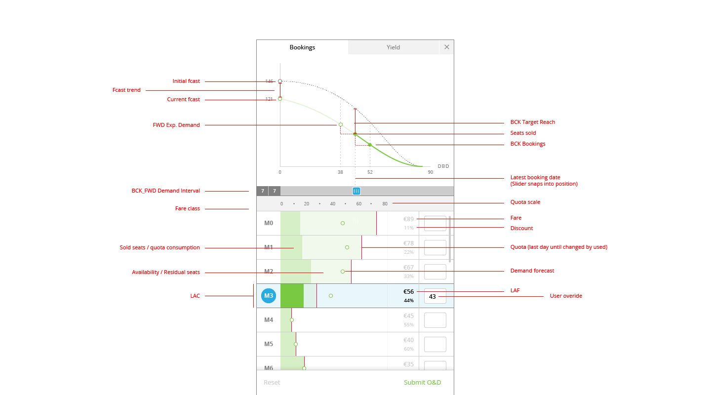
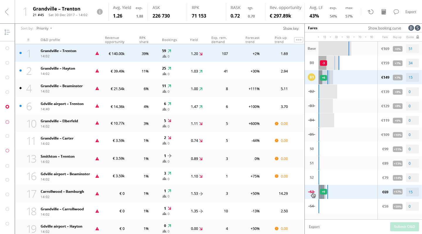
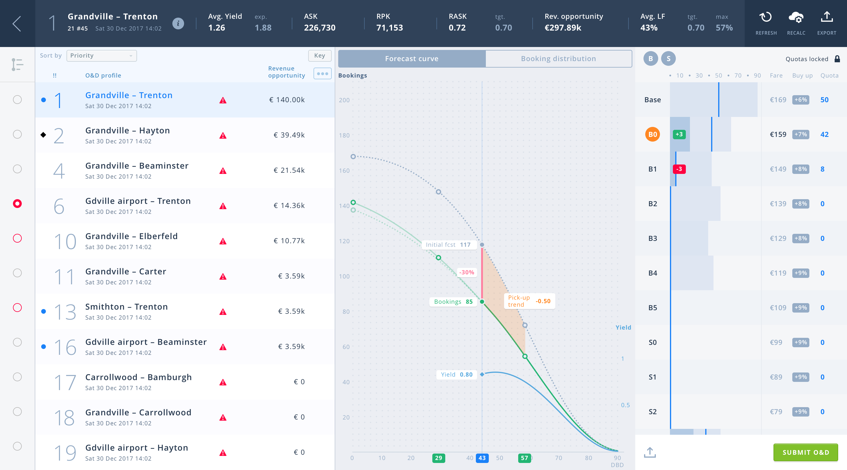
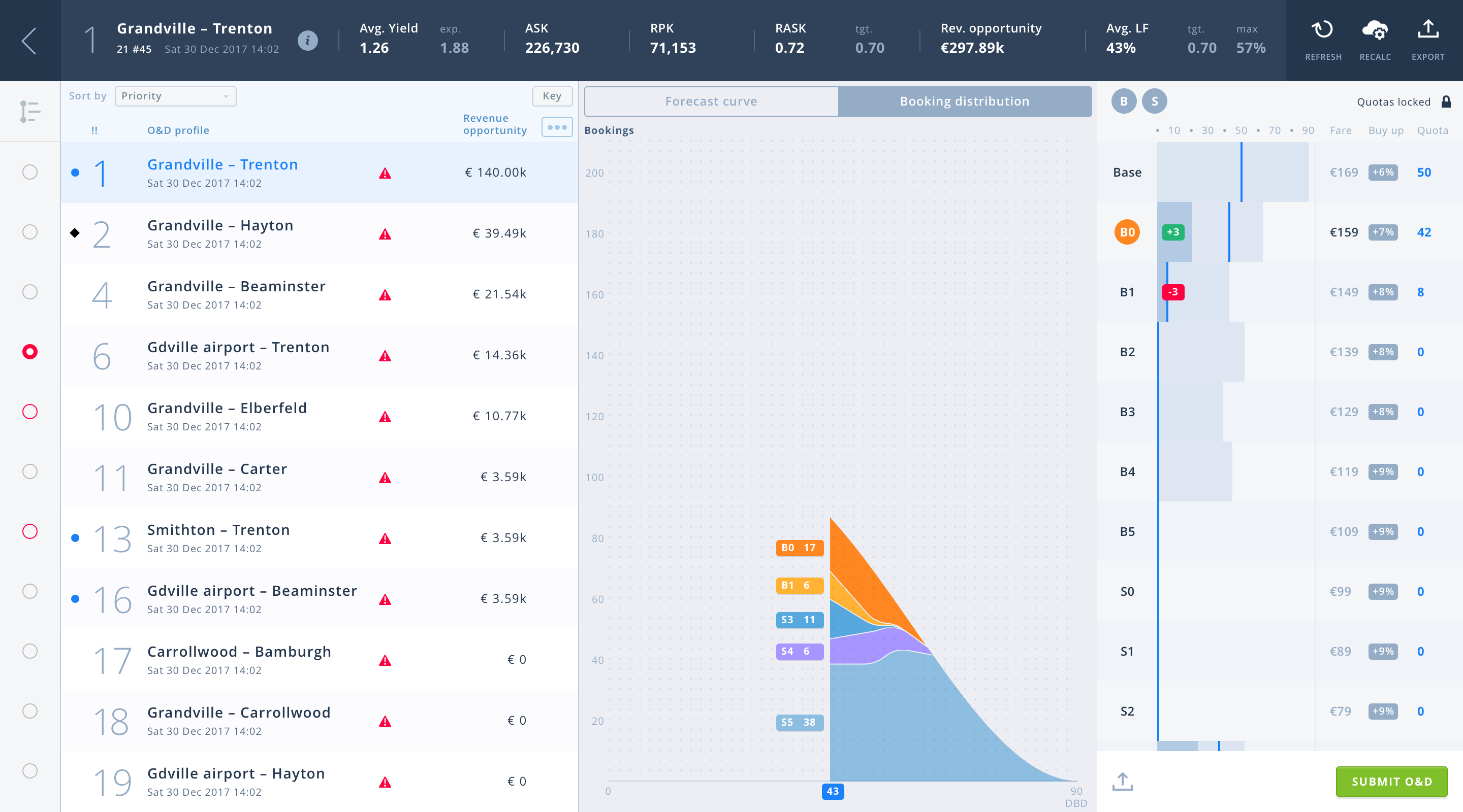
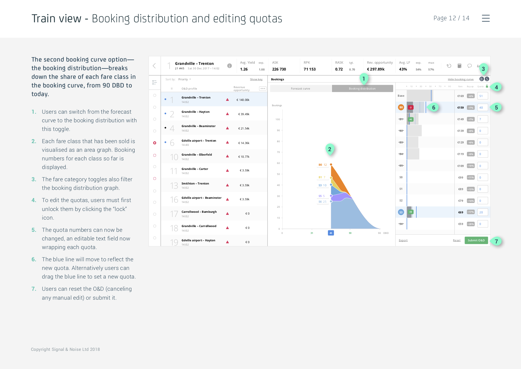
Selecting an O&D then opens the fare panel, where users can open or close fare categories (in effect increasing/decreasing ticket prices), and increase or decrease the number of seats available for each fare.
B stands for Business (class), S for Standard.
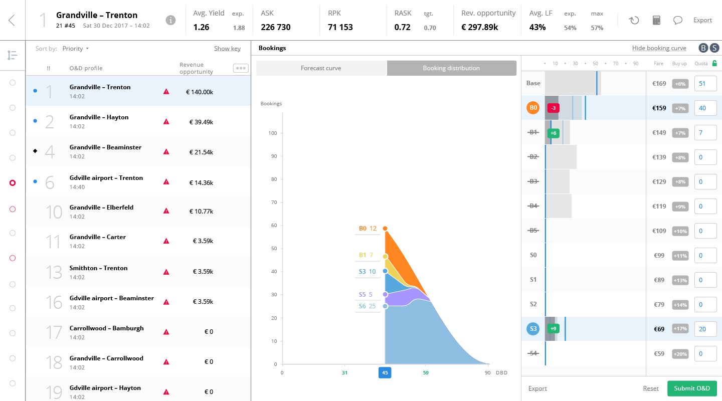
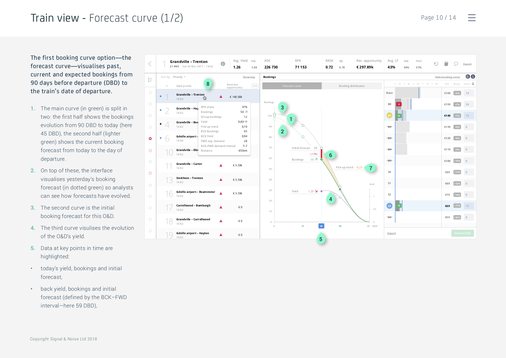
Users can visualise the booking curve, visualising how bookings are evolving over time (note that, per industry standard, the graph reads from right to left), as well as the initial projection, and an updated projection based on the 14 previous days.
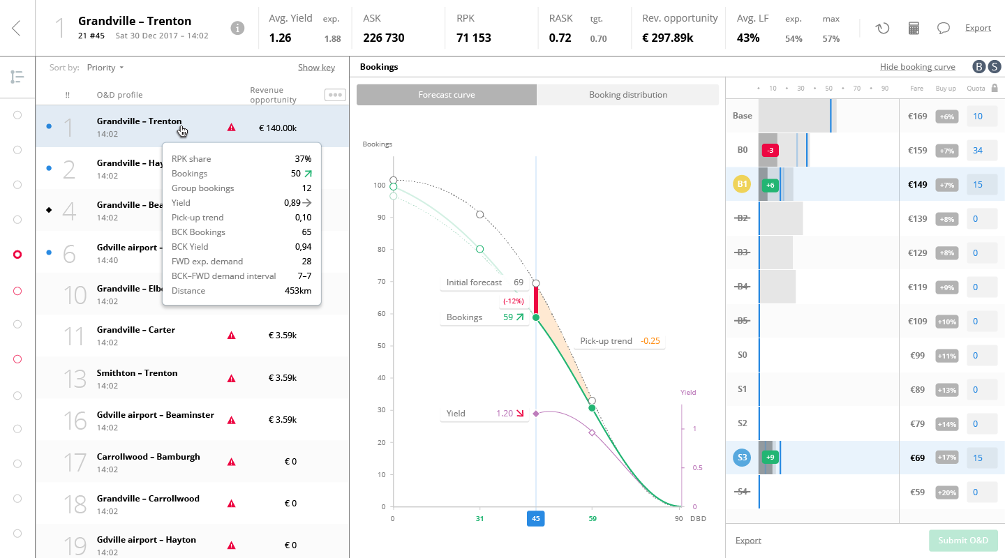
The curve can also be set to visualise the share of each fare categories.
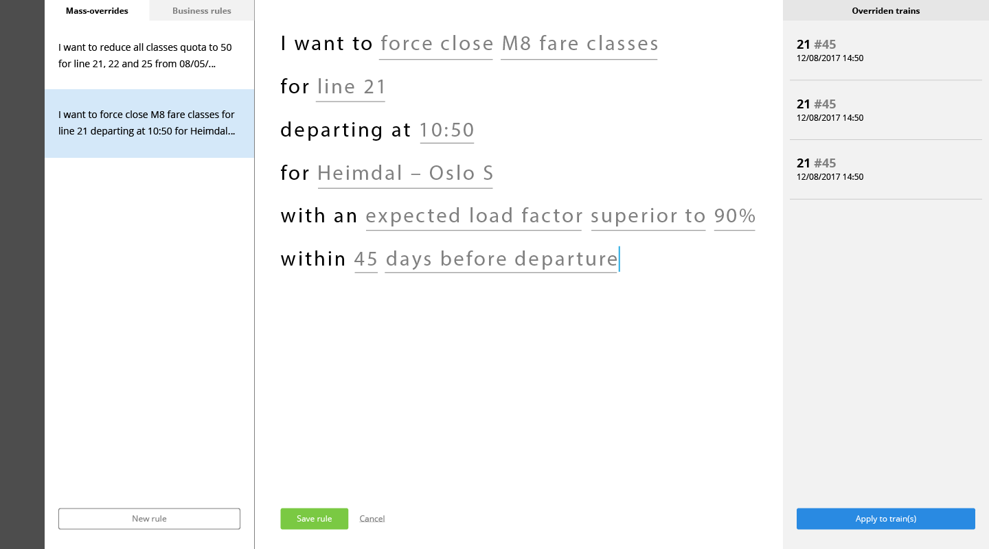
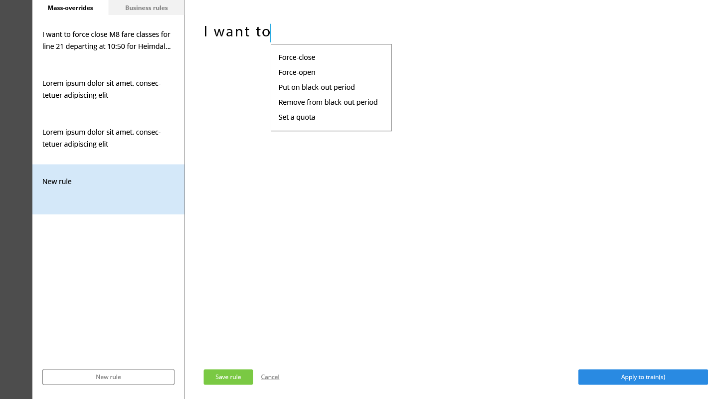
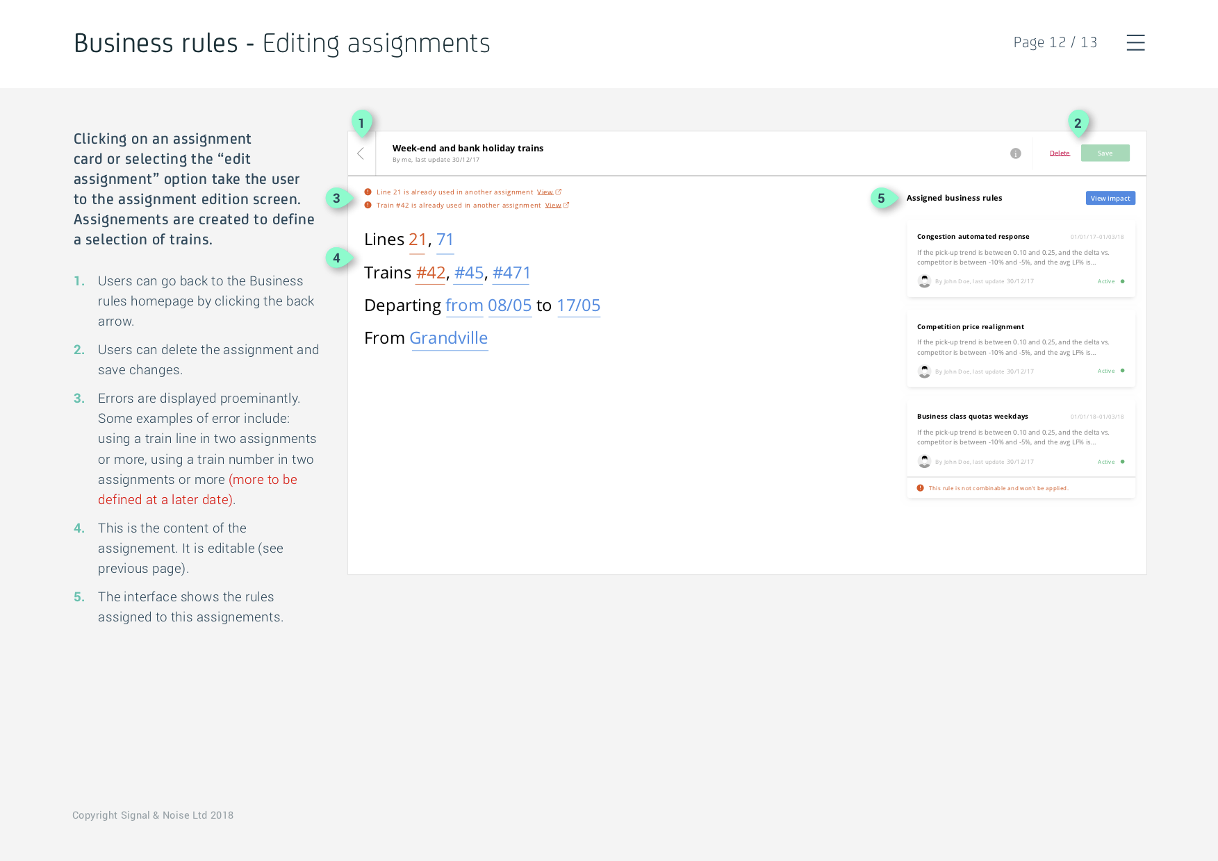
Lastly, the mass-override feature was fully fleshed out: users can assign the algorithms from their library to a train or group of trains.
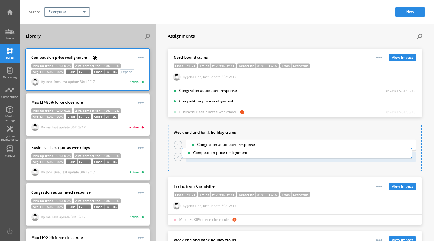
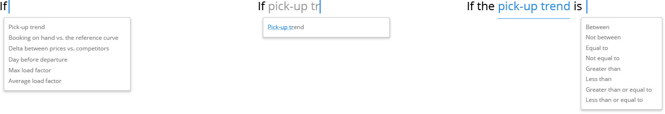
Users can easily define assignments and overrides with a natural language interface.
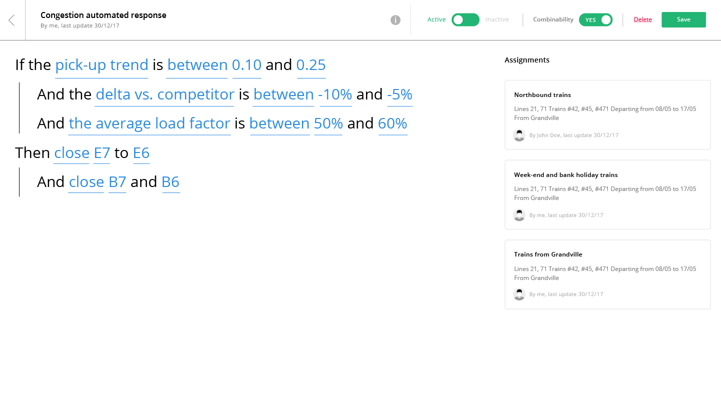
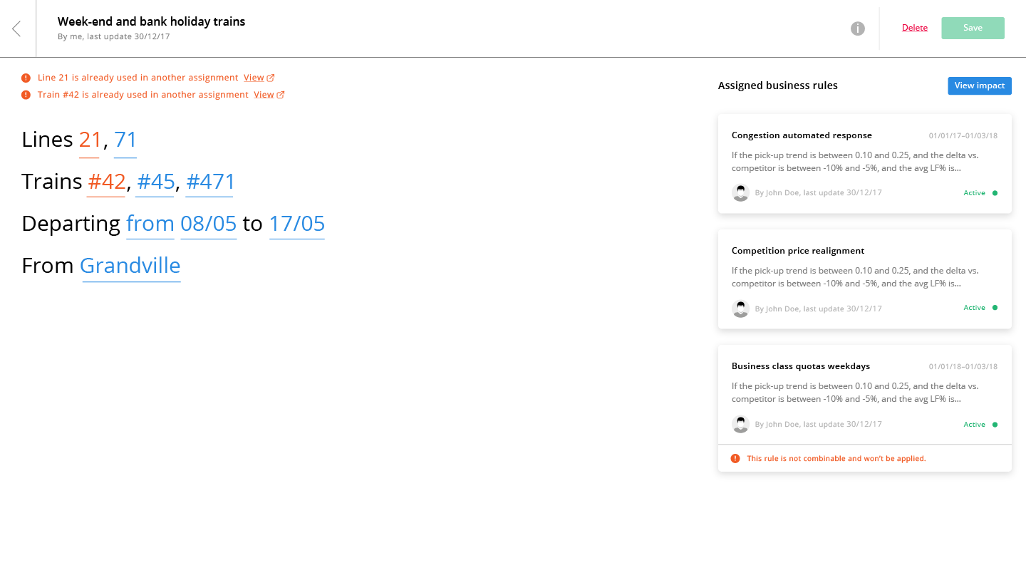
Logic operators and variables are automatically suggested in dropdowns as users type.
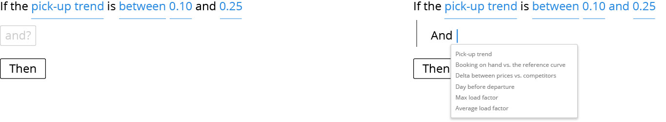
Users can this way, for instance, automatically close multiple fare categories for a specific saturated O&D during a peak period of the year.
VISUAL DESIGNS
The main task at this point was to create a visual rationale for the interface, where important informations such as train saturation are conveyed through subtle yet impactful contrast colours.
Extensive care was taken to make the fairly complex booking curve as easy to read as possible.
DOCUMENTATION
Annotated documents of each screen and component, as well as clickthrough prototypes were provided to help BCG analysts and developers understand the user-experience.
CONCLUSION
The challenges we faced for this project were manifold. The amount of data needed to be displayed on a single screen was certainly the most obvious one, and while I believe we could have gone a bit further in the simplification of the interface, sometimes you just have to accept a client’s pushback and appreciate the natural inclination of designers to oversimplify. Additionally, getting to understand the logic of train managers (least of all the inverted curve!) took quite some time.
For this project I was tasked, on top of UX and UI design, with management, writing user-stories and updating the project’s JIRA, prioritising tasks and organising the backlog of functionalities and the schedule of weekly sprints, travelling to and fro Milan to act as a point of contact with BCG.


