BJÖND HEALTH
UX & UI design, Information design, Product lead, Information architecture, Project management
A radical new way to manage medical tasks, from patient assessments to treatment and administrative duties.
Bjönd is a start-up which aim was to help automate and manage complex tasks. Having received their first round of fundings from insurance companies and hospitals, the app was to focus on the handling of medical tasks, managing patient records, generating assessment to complete by the patients themselves or nurses, organising schedules, visits, meds distribution, etc.
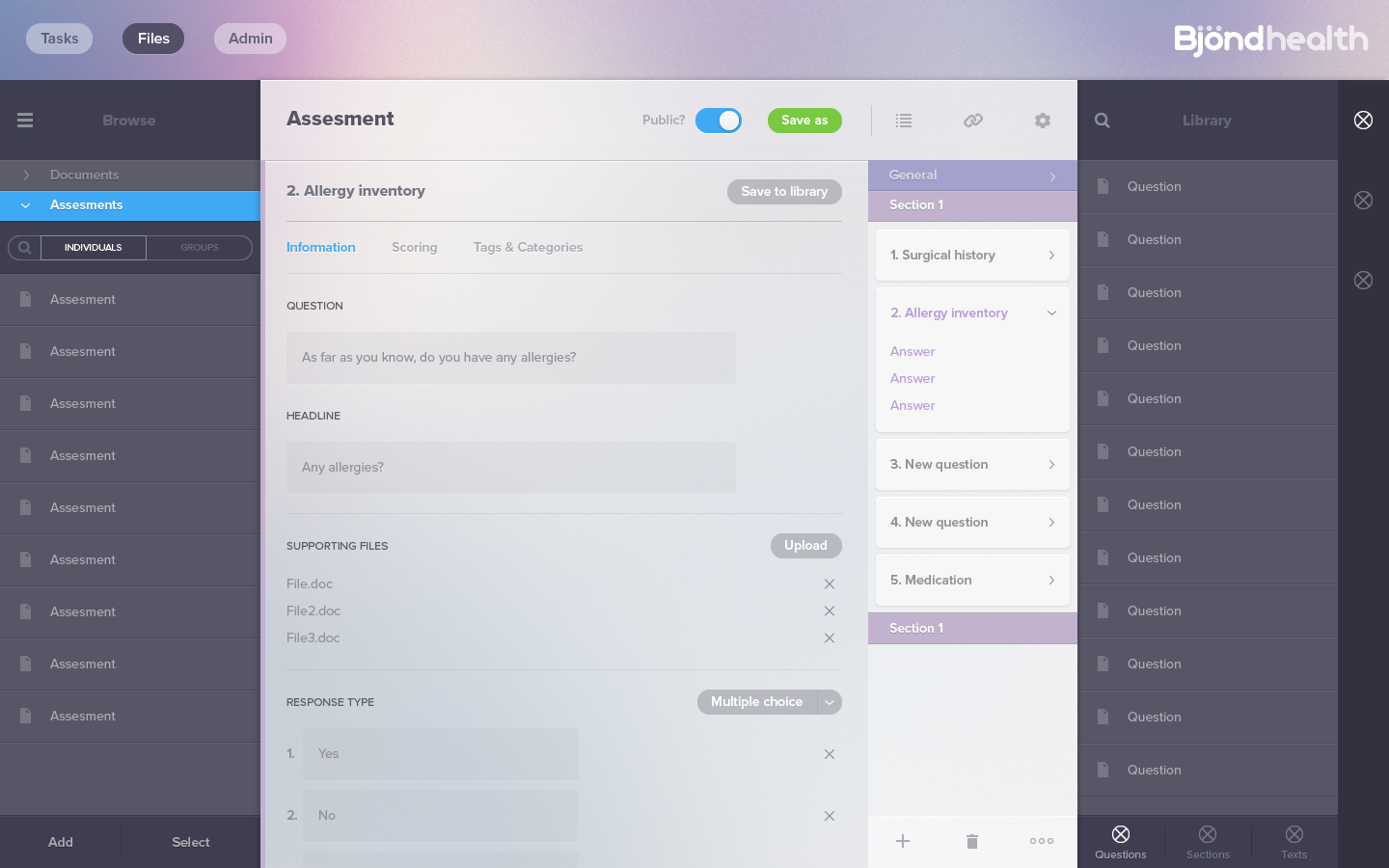
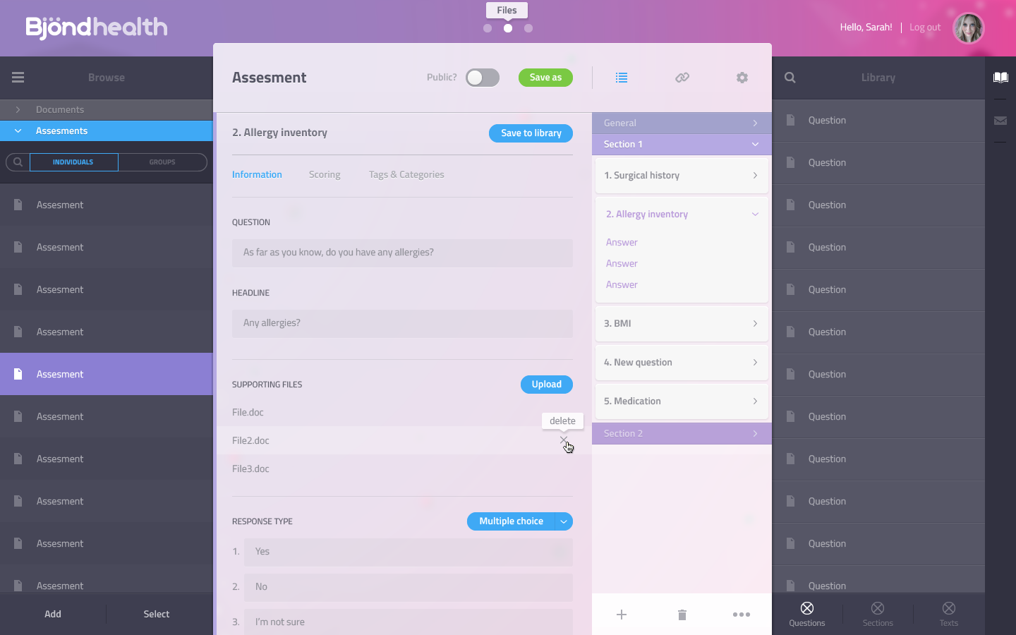
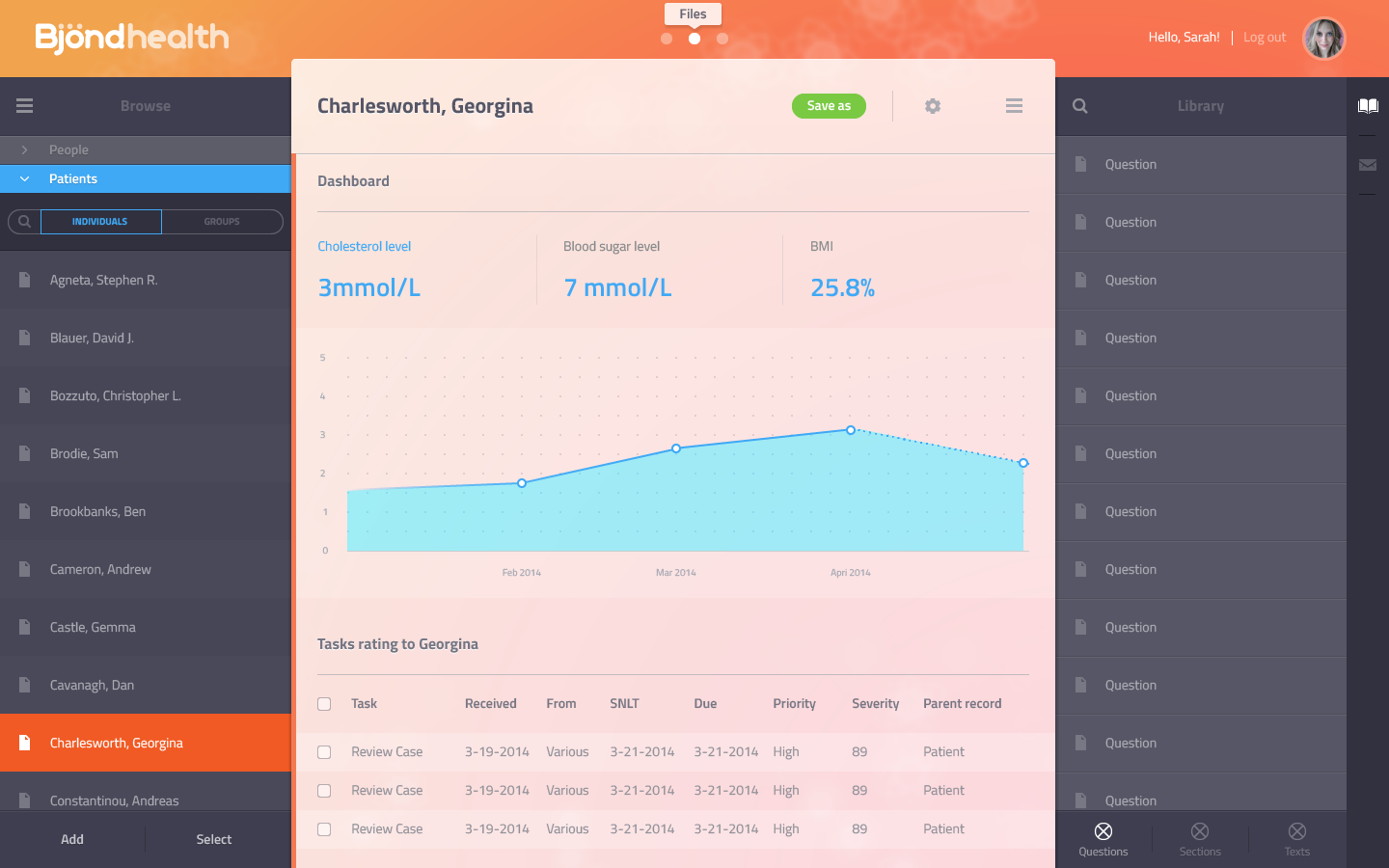
This project was quite an undertaking as it spanned 3 years. I was initially brought into the fold as a UI designer in March 2014 to produce moneyshots and visual design proves of concepts, as the UX was still a work-in-progress…
The no-so-great moneyshots that started it all…
GROUND WORK
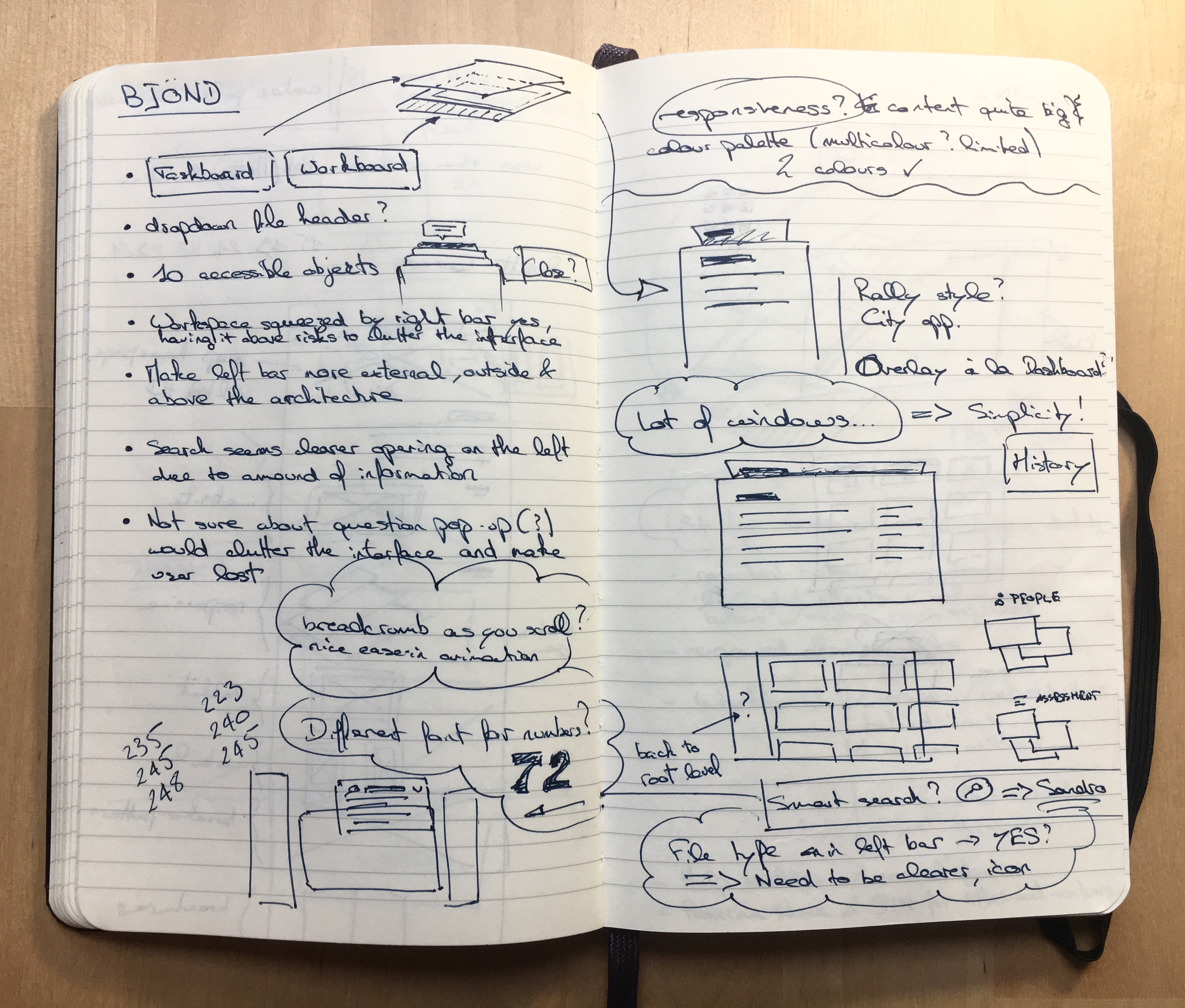
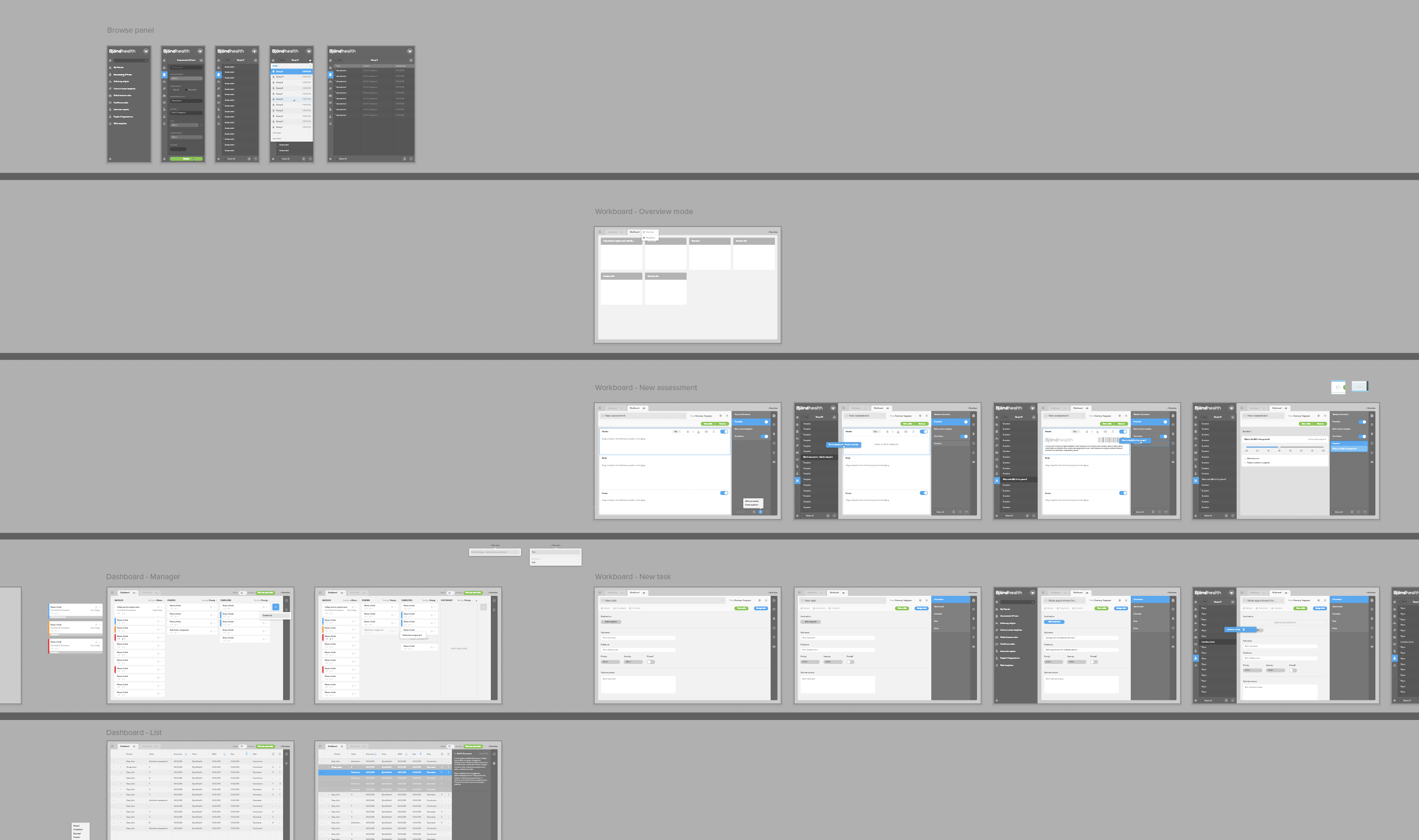
As the project dragged on, I was given the task to lay down the work done until now, spanning more than a hundred screens and screen variations, and to rationalise the whole UX and information architecture of the project. I proceeded to organise the main screens and components across their respective ‘levels’ in a refined mental model.
Back on the drawing board
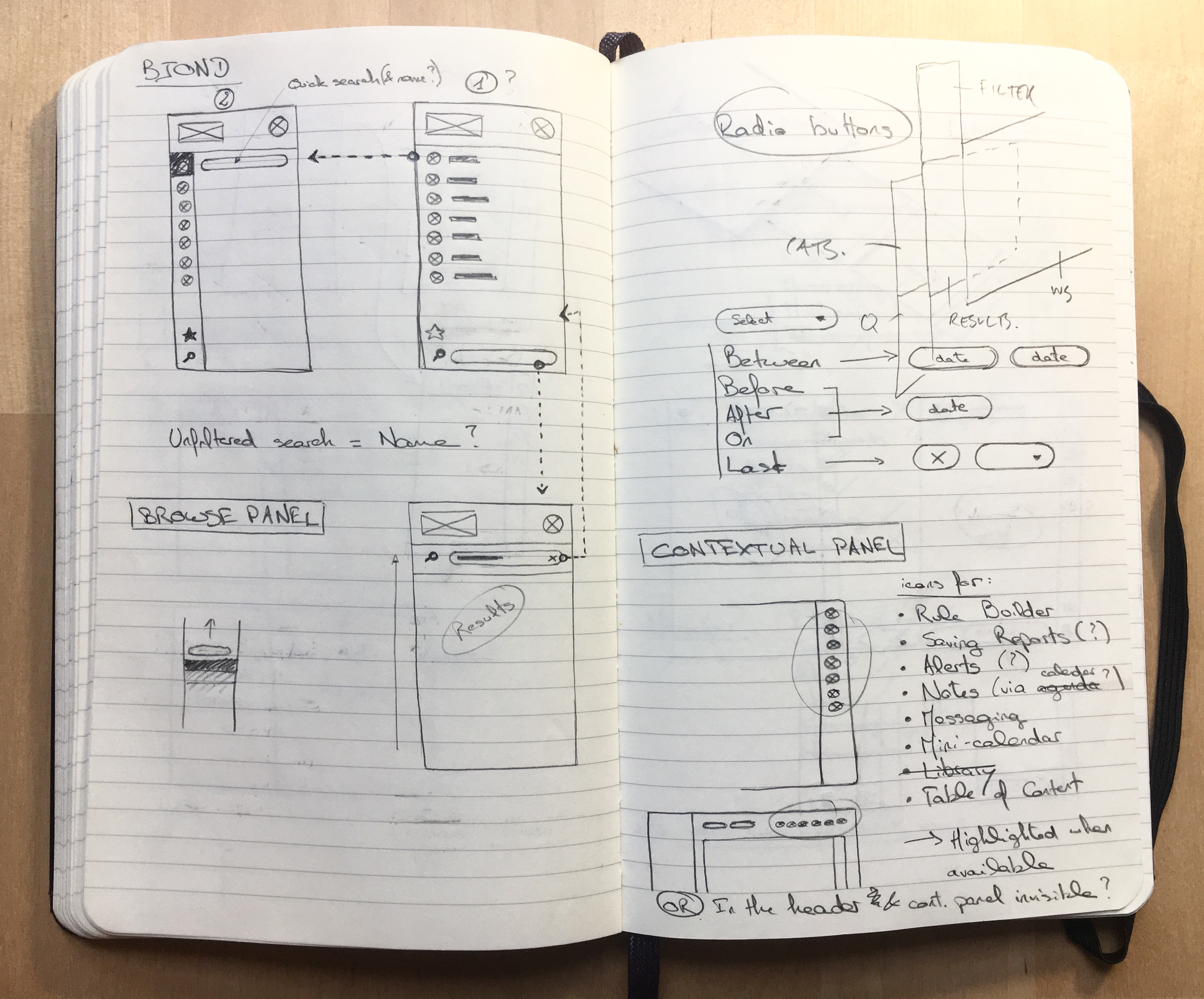
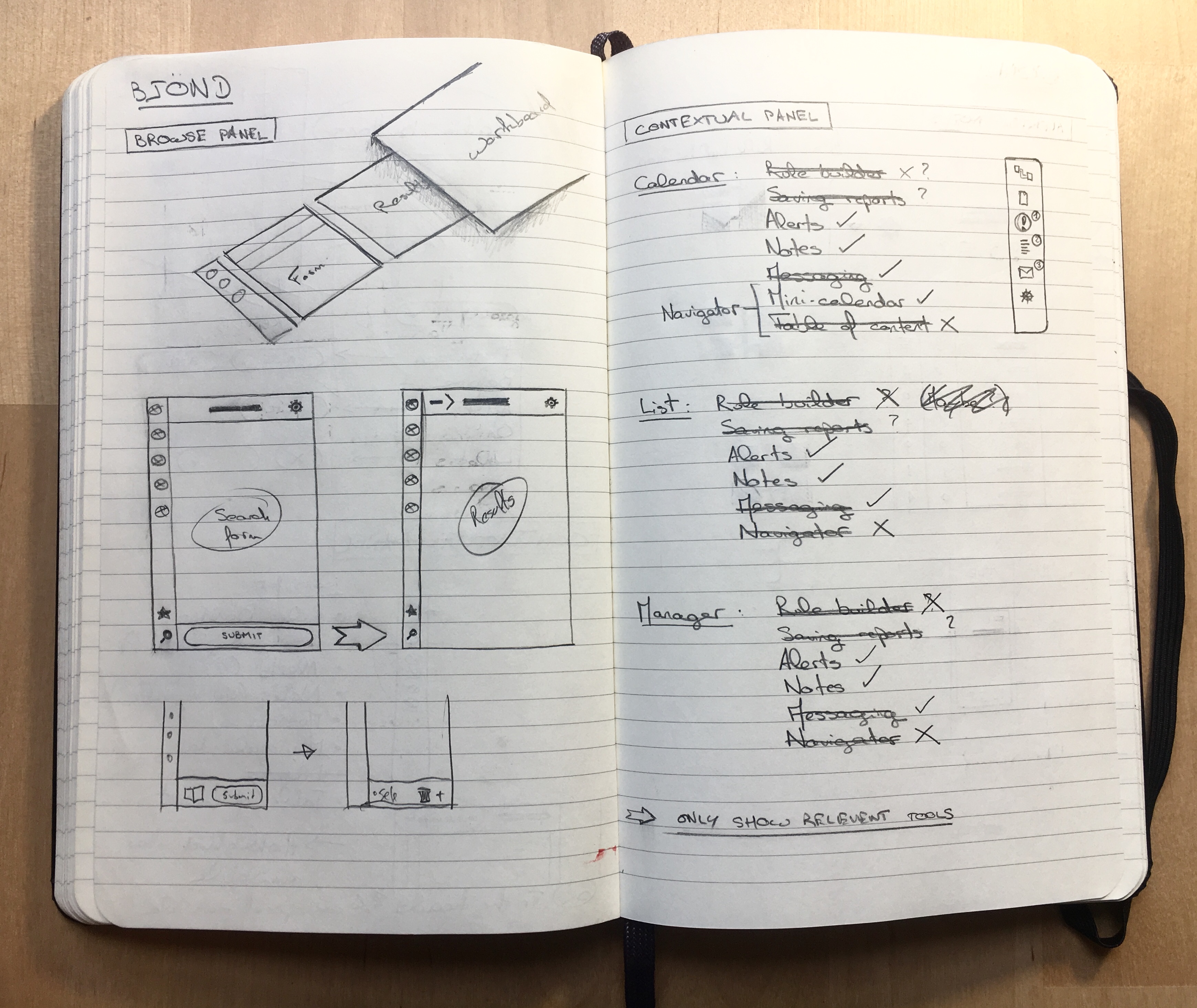
Putting the architecture in place
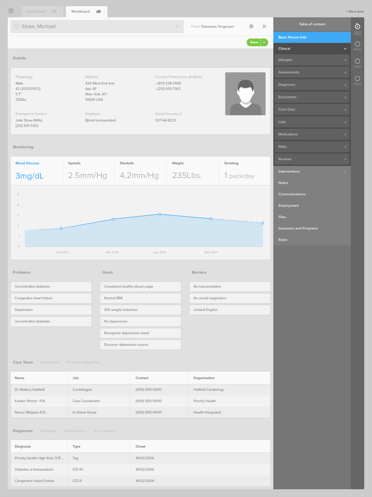
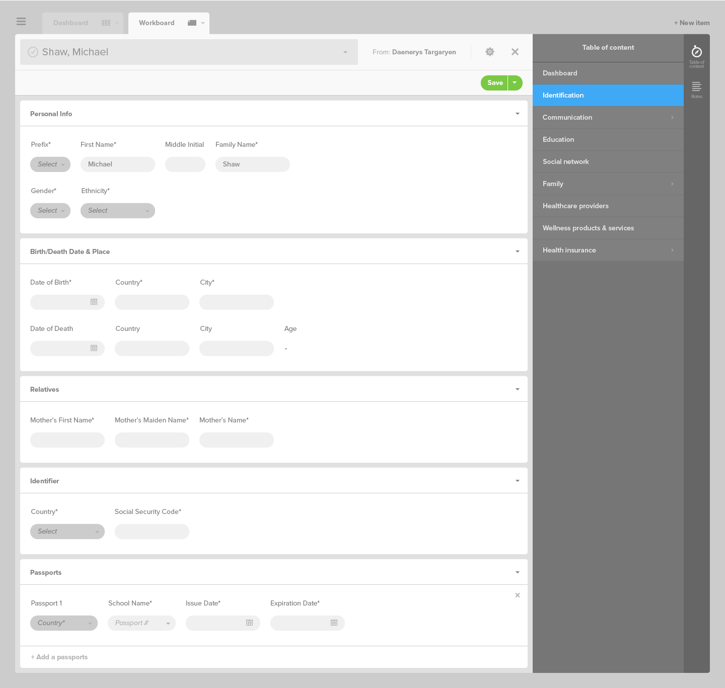
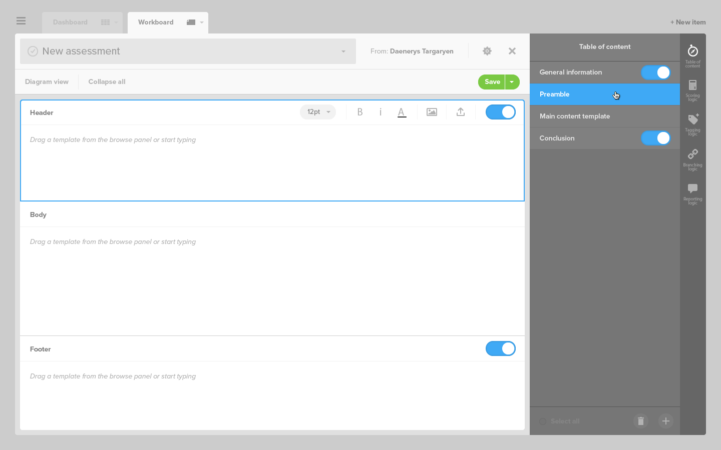
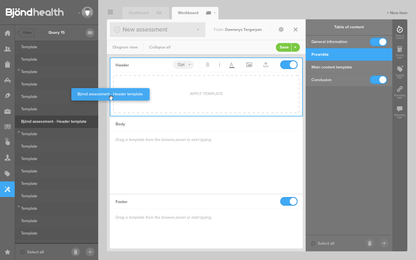
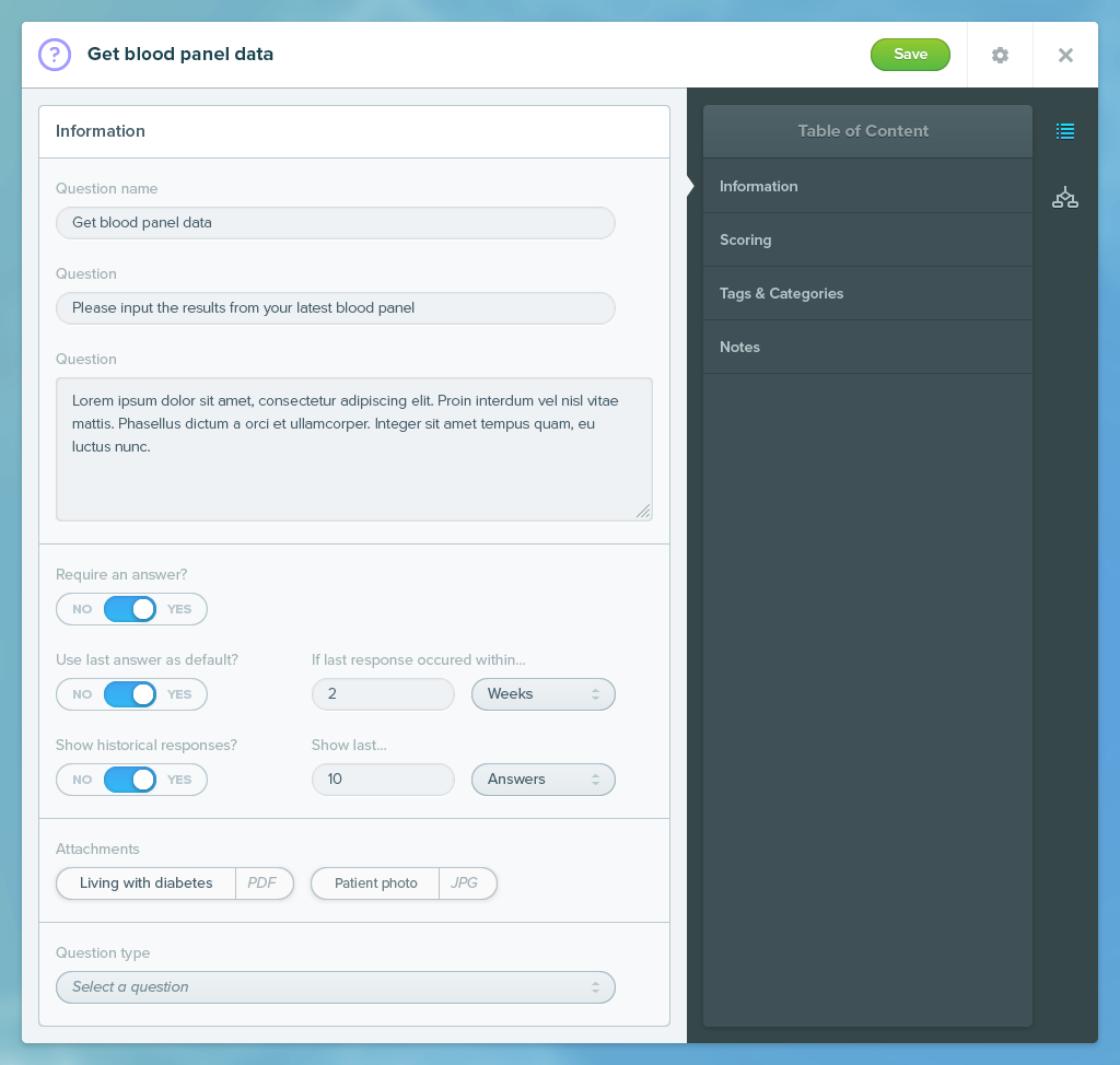
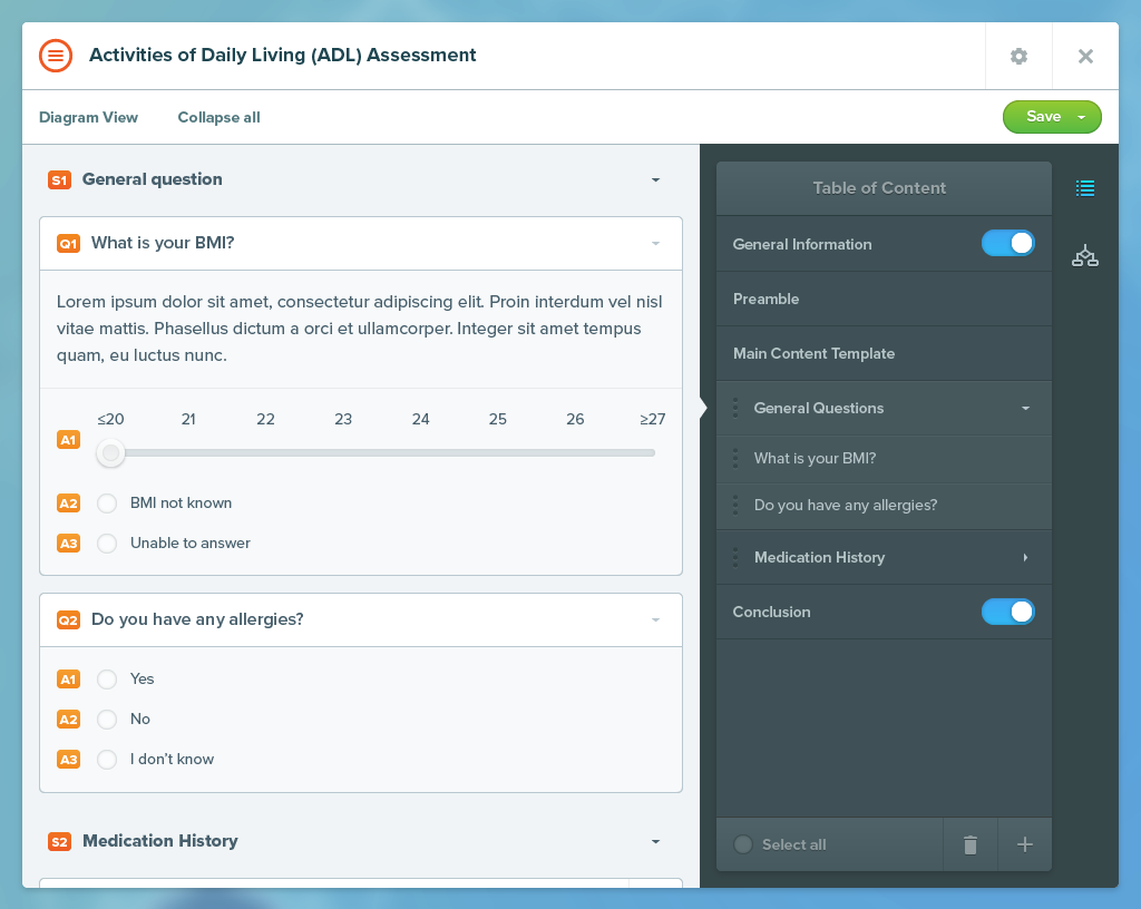
As the CMS to create patient records and create assessments were given priority by the client, it gaves us a good opportunity to settle on an interface that would be flexible enough to accommodate a summary of sections and sub-sections, a toolbar, metadata, various options such as preview, save, duplicate, and a library of templates.
'Creating assessments' CMS
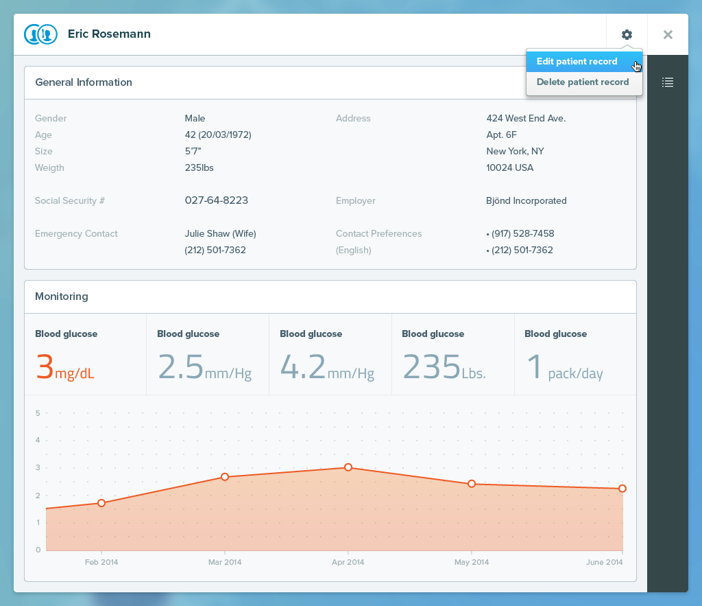
Patient record
GEARING UP
After adopting a macro view of the interface, the next step was to delve deeper into the details of the interactions. Building an assessment, creating a task and taking an assessment were to be at the center of attention.
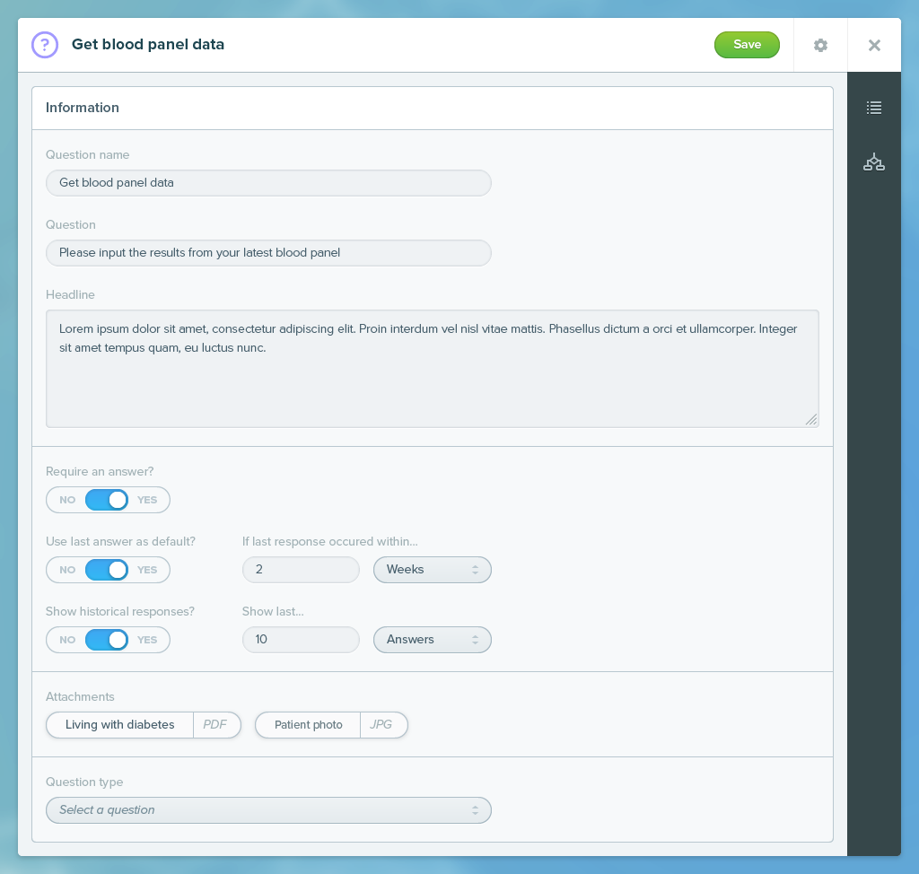
'Building assessments' CMS
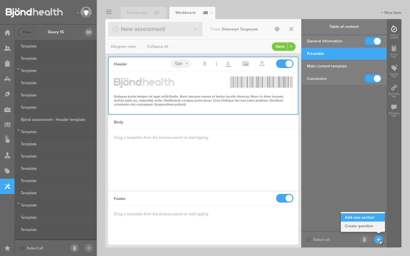
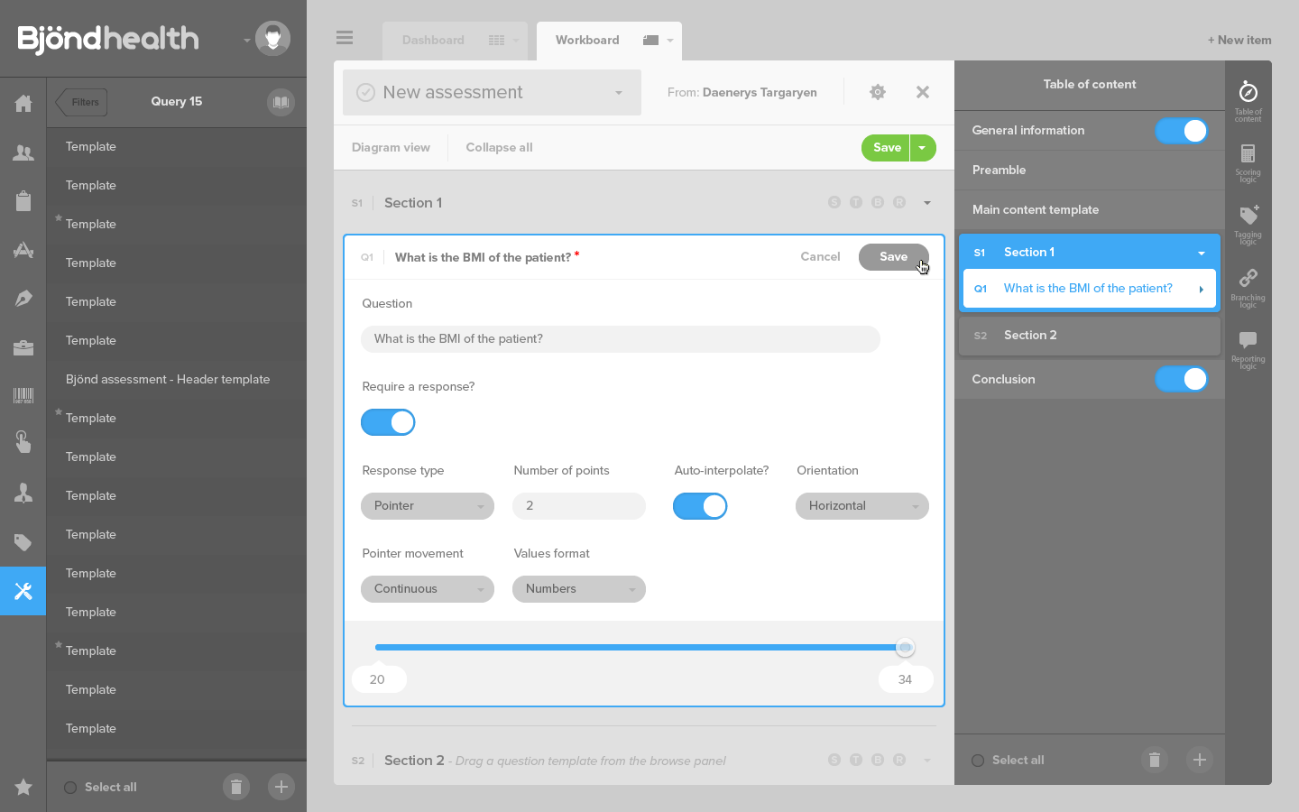
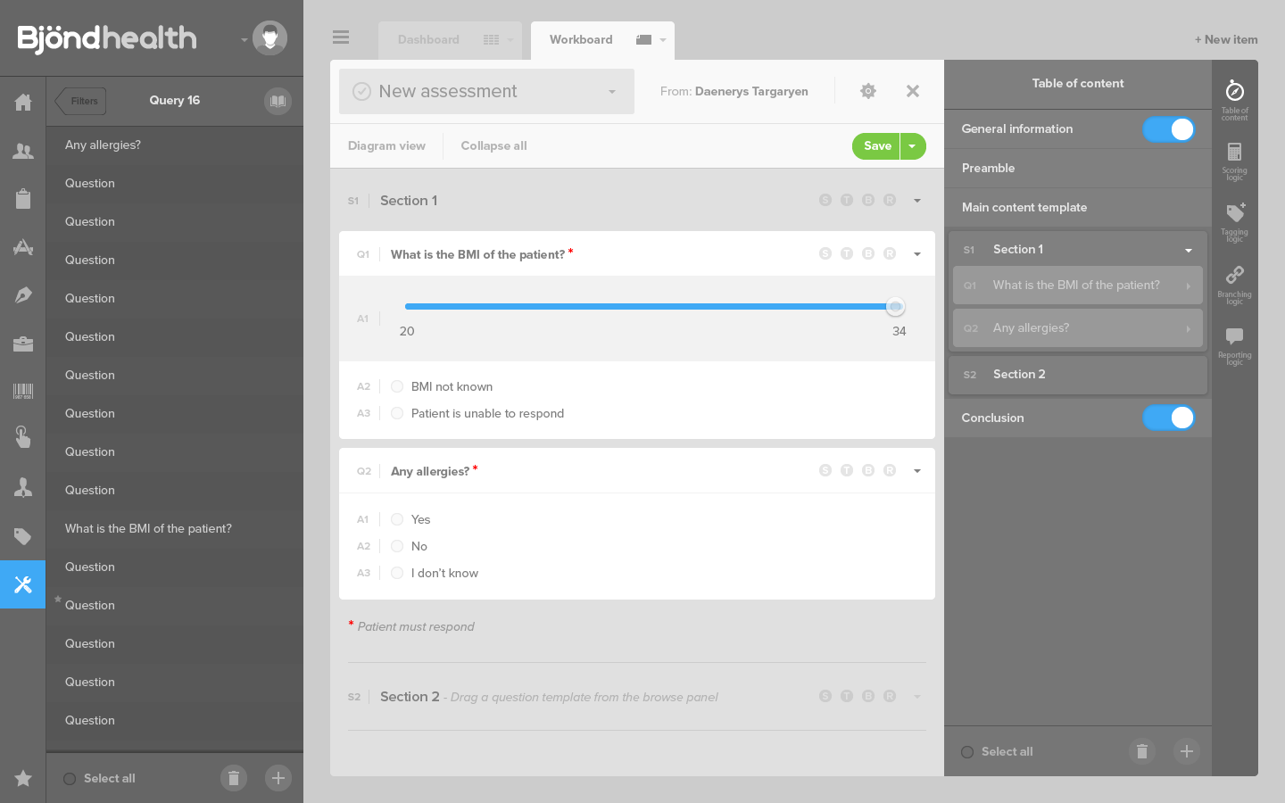
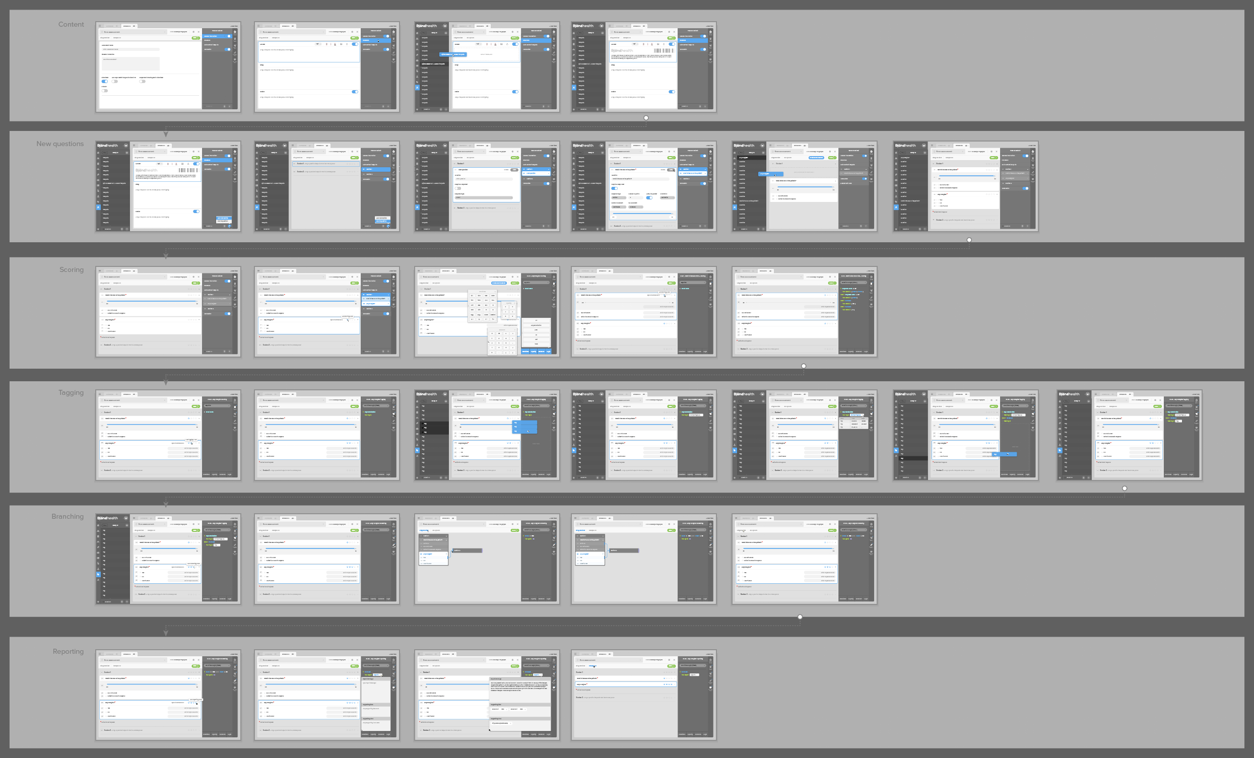
Assessments are questionnaires patients must fill regarding their medical conditions, and are sometimes filled by nurses too. Fours important features were:
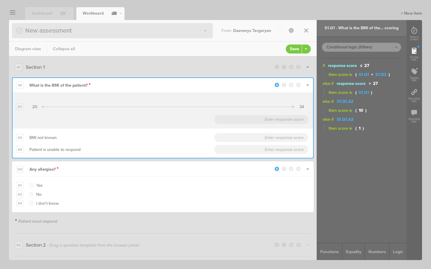
- the scoring logic, with a number of points attributed to each answer,
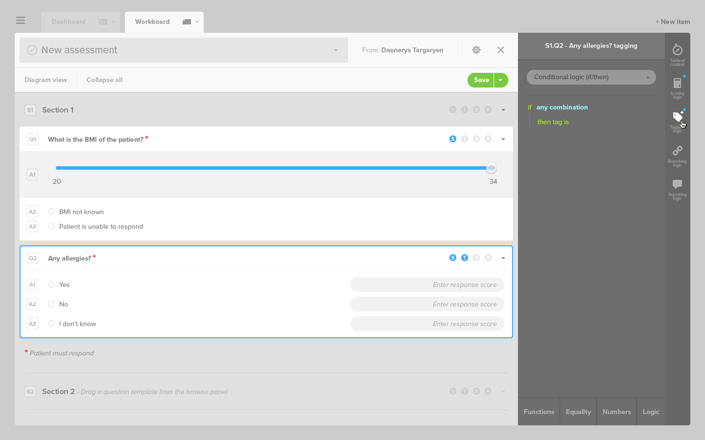
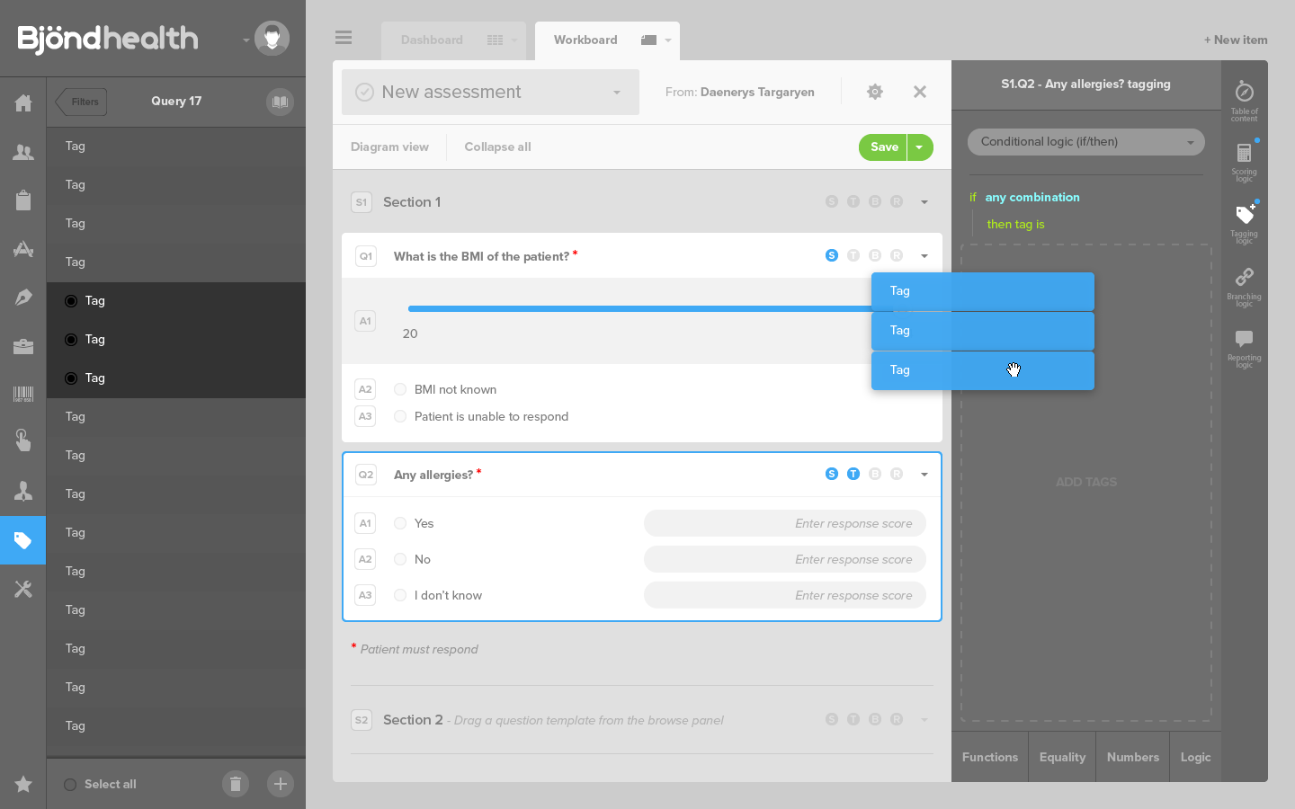
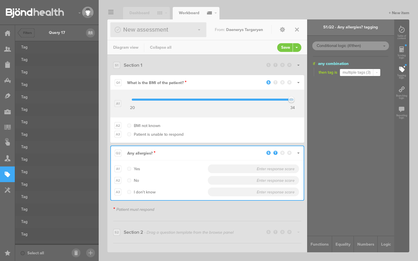
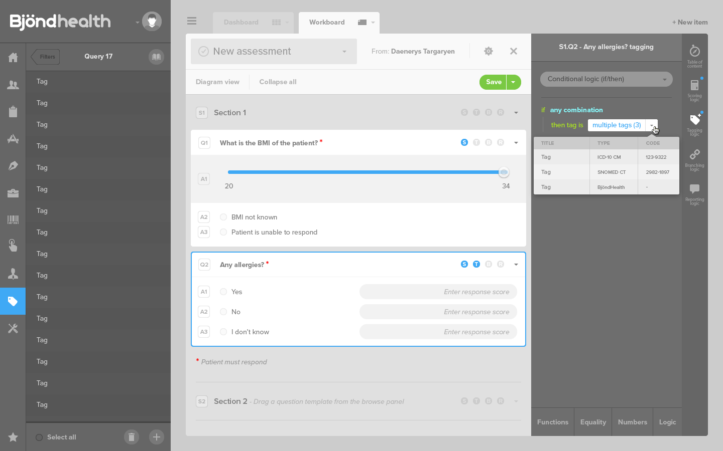
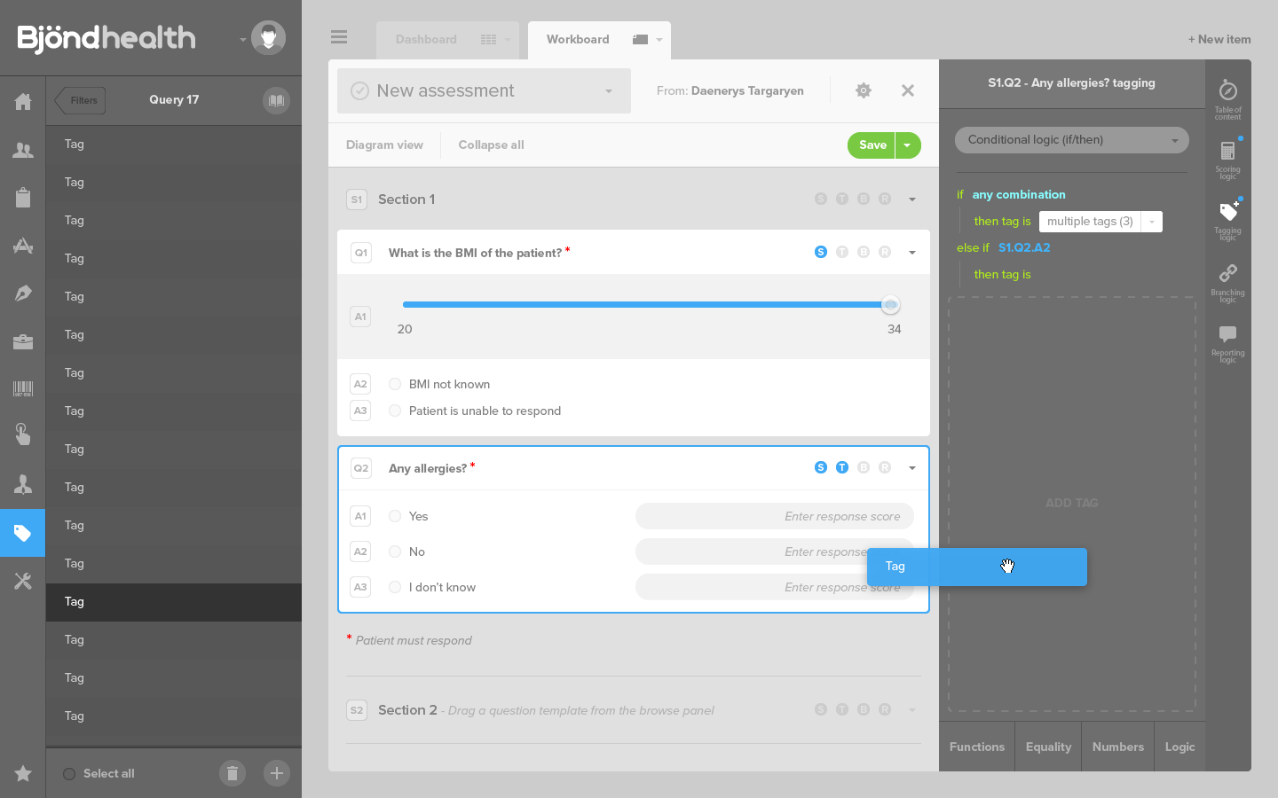
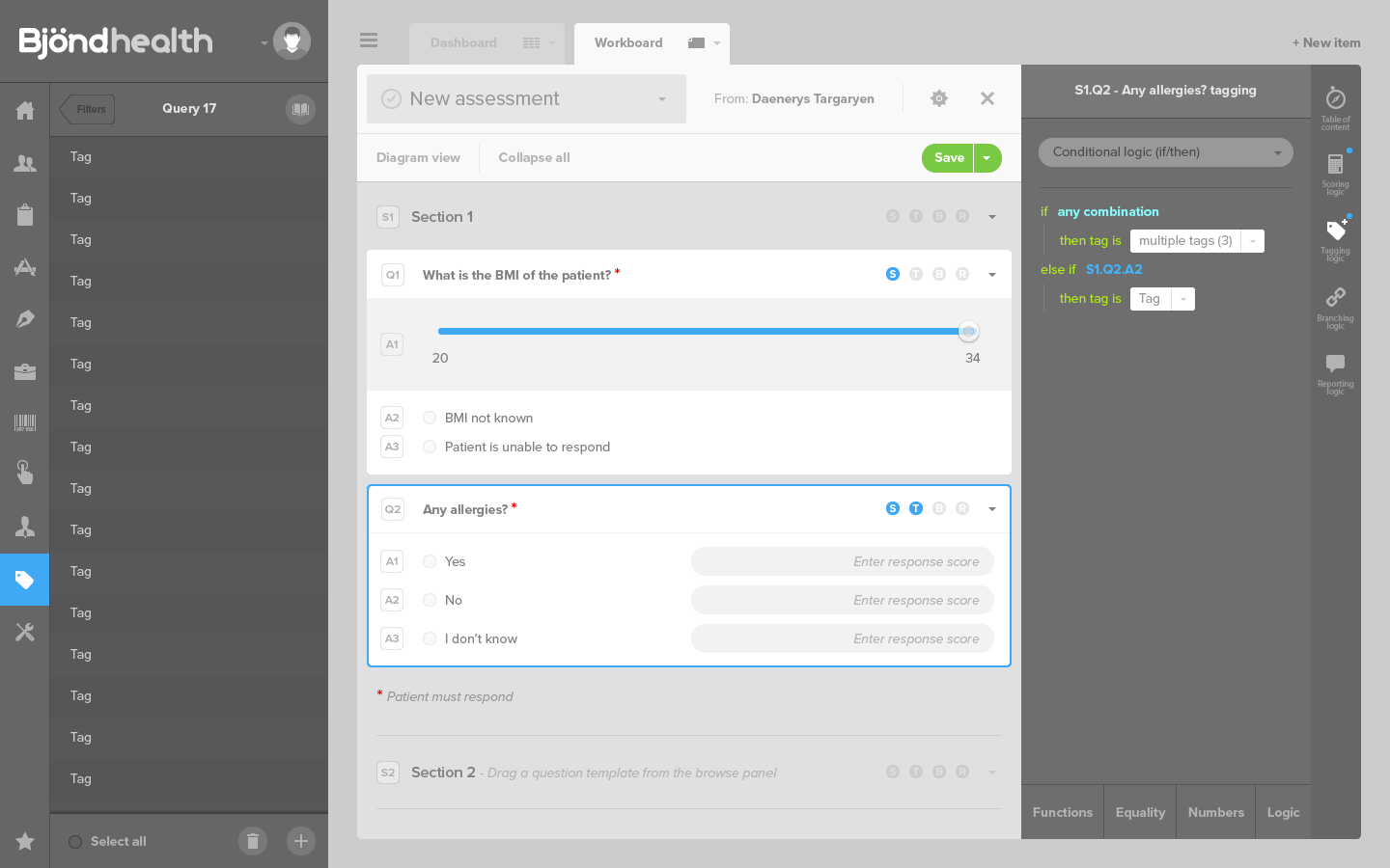
- the tagging logic, where an answer adds tags to the patient, the medical condition, the treatment, etc.
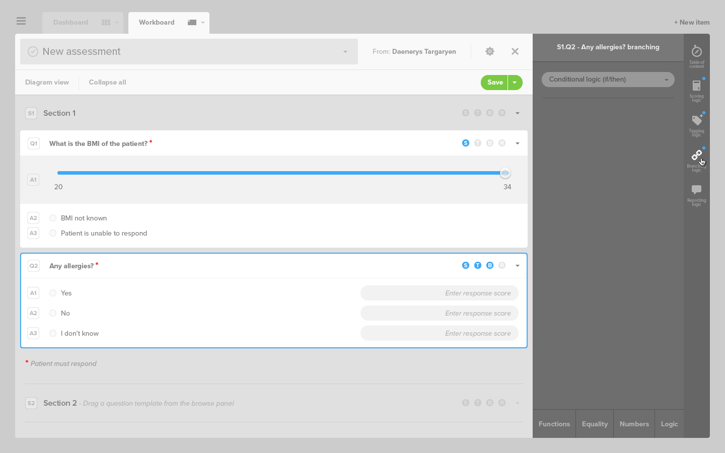
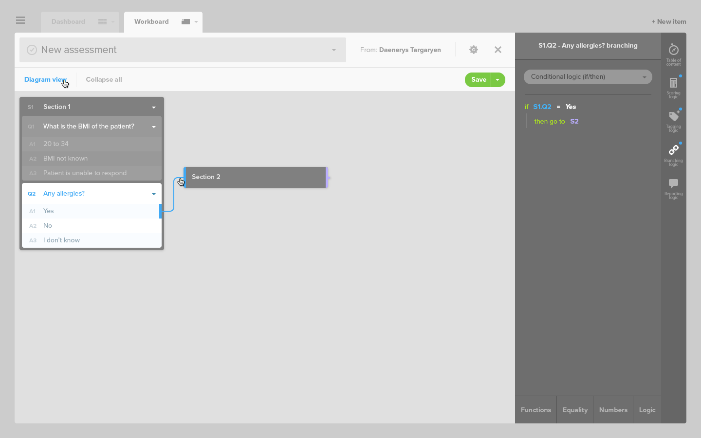
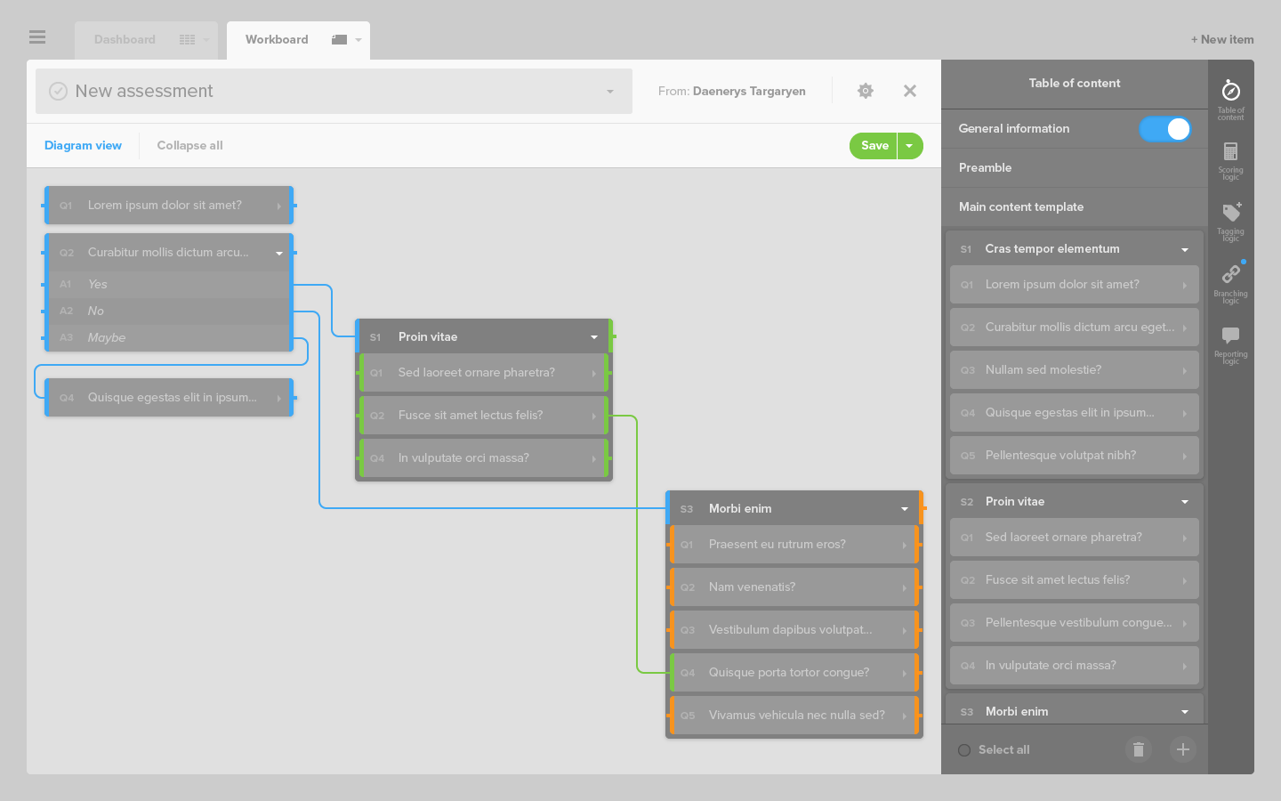
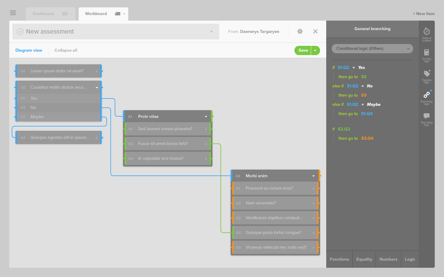
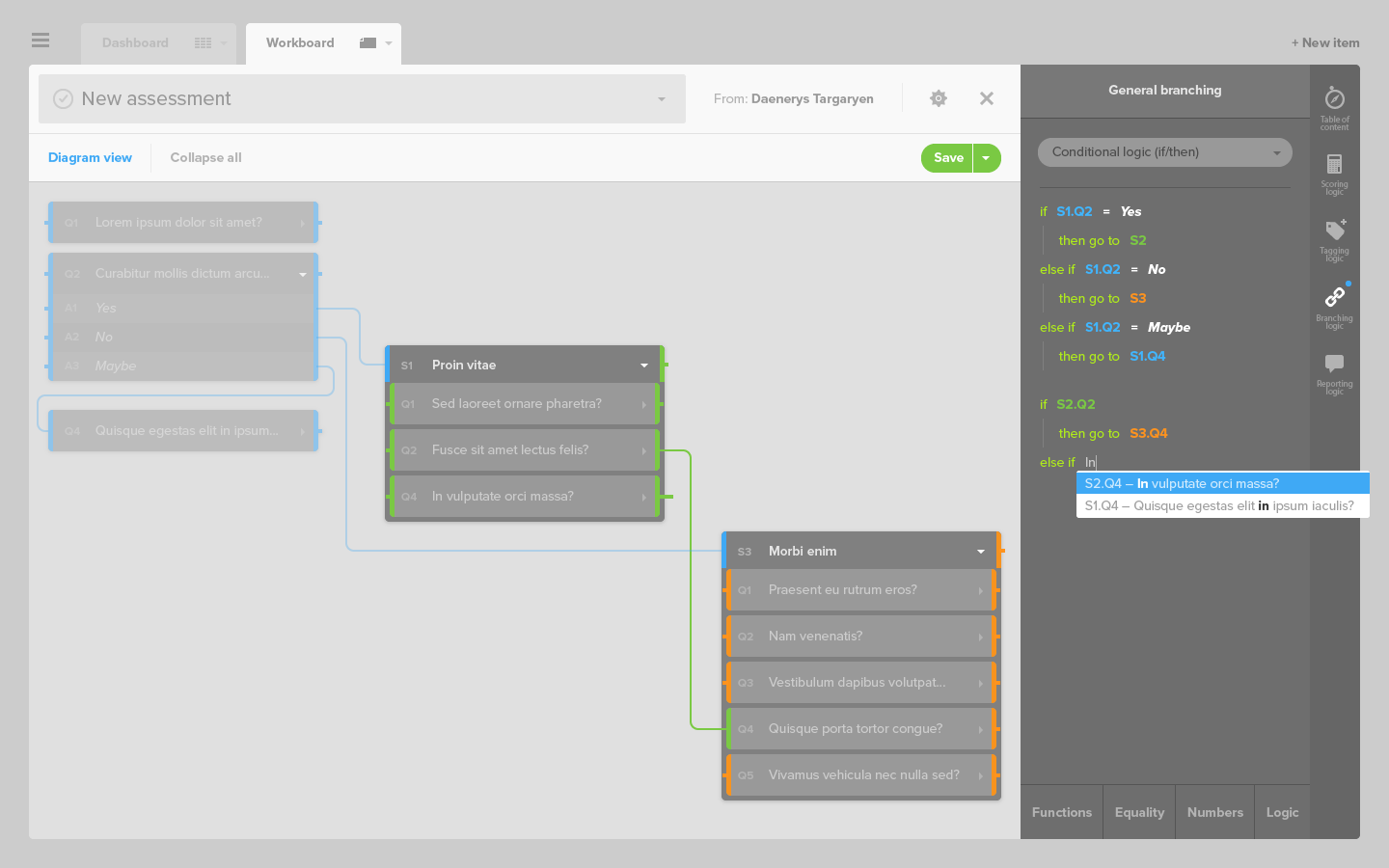
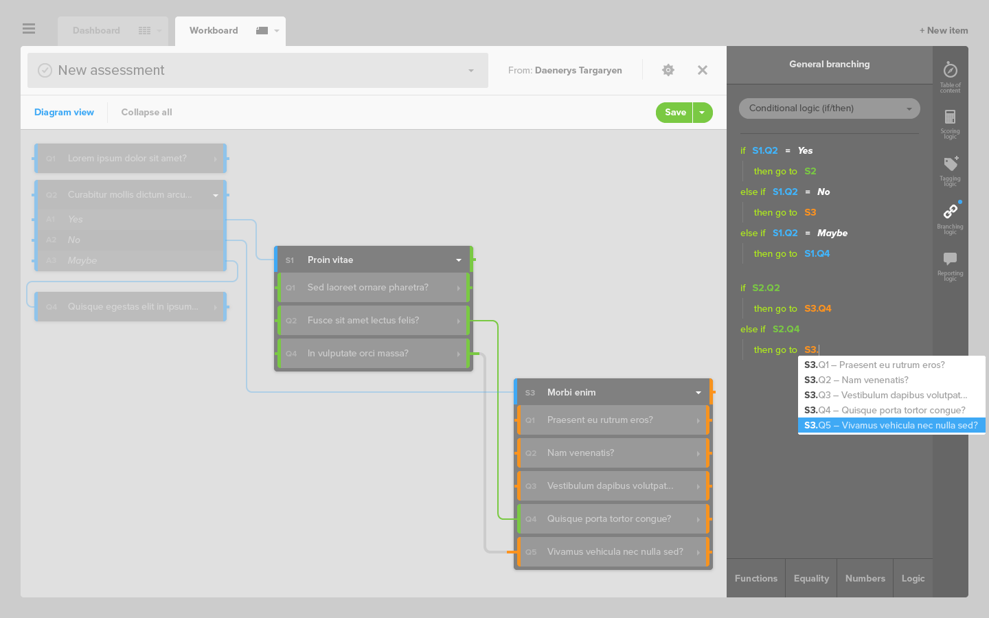
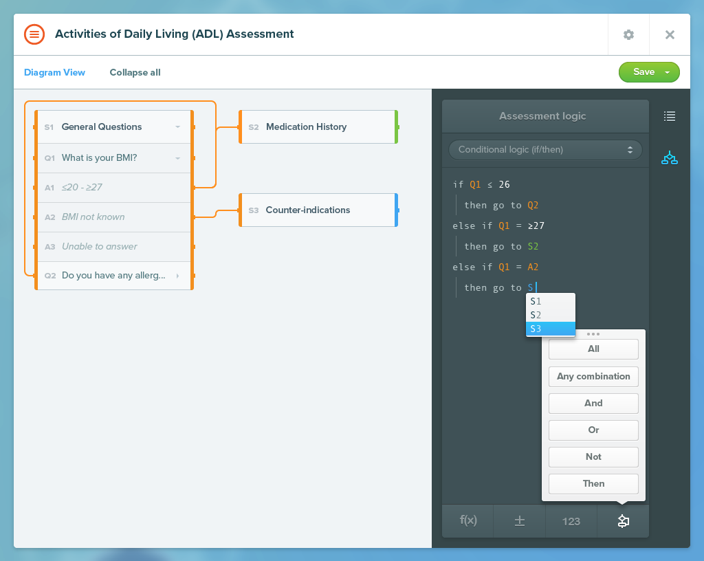
- the branching logic, where an answer leads to a complementary question or section,
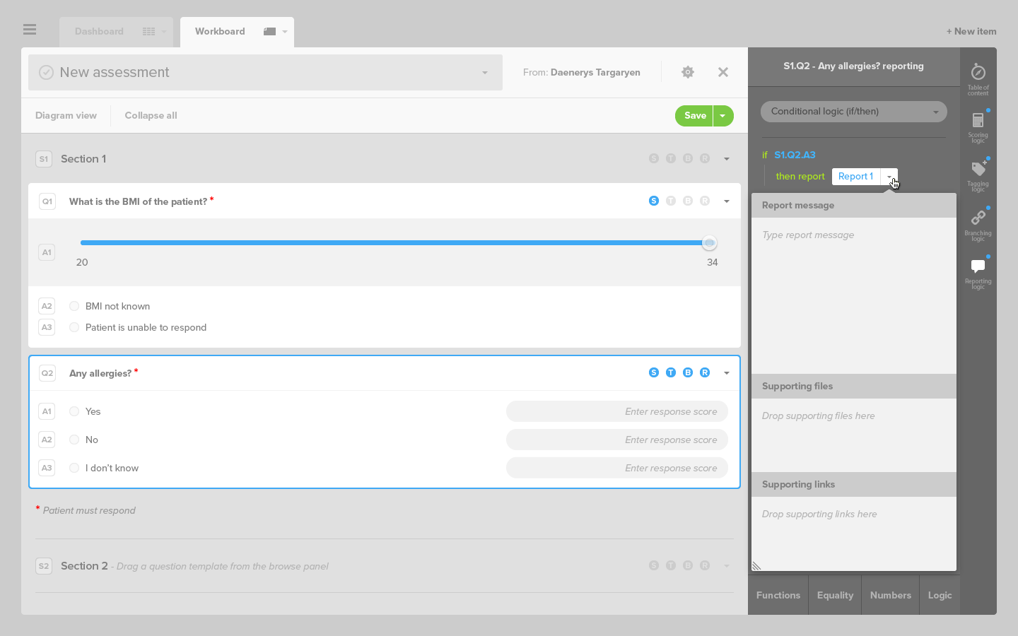
- and the reporting logic, where an answer generate an automated report send to the care-taker.
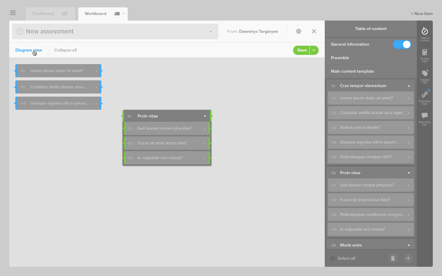
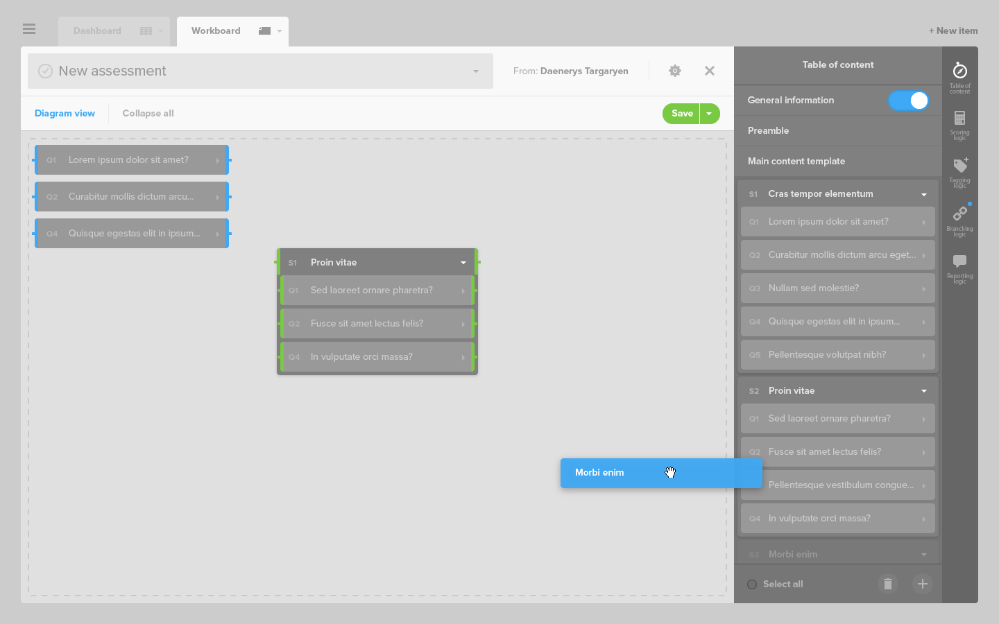
To this end, a simple algorithm editor was developed.
Scoring logic
Tagging logic
Branching logic
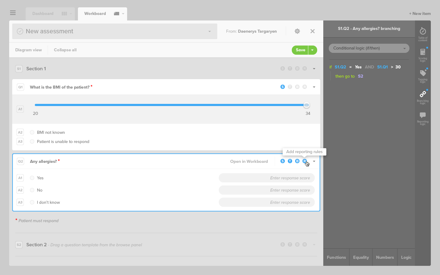
Reporting logic
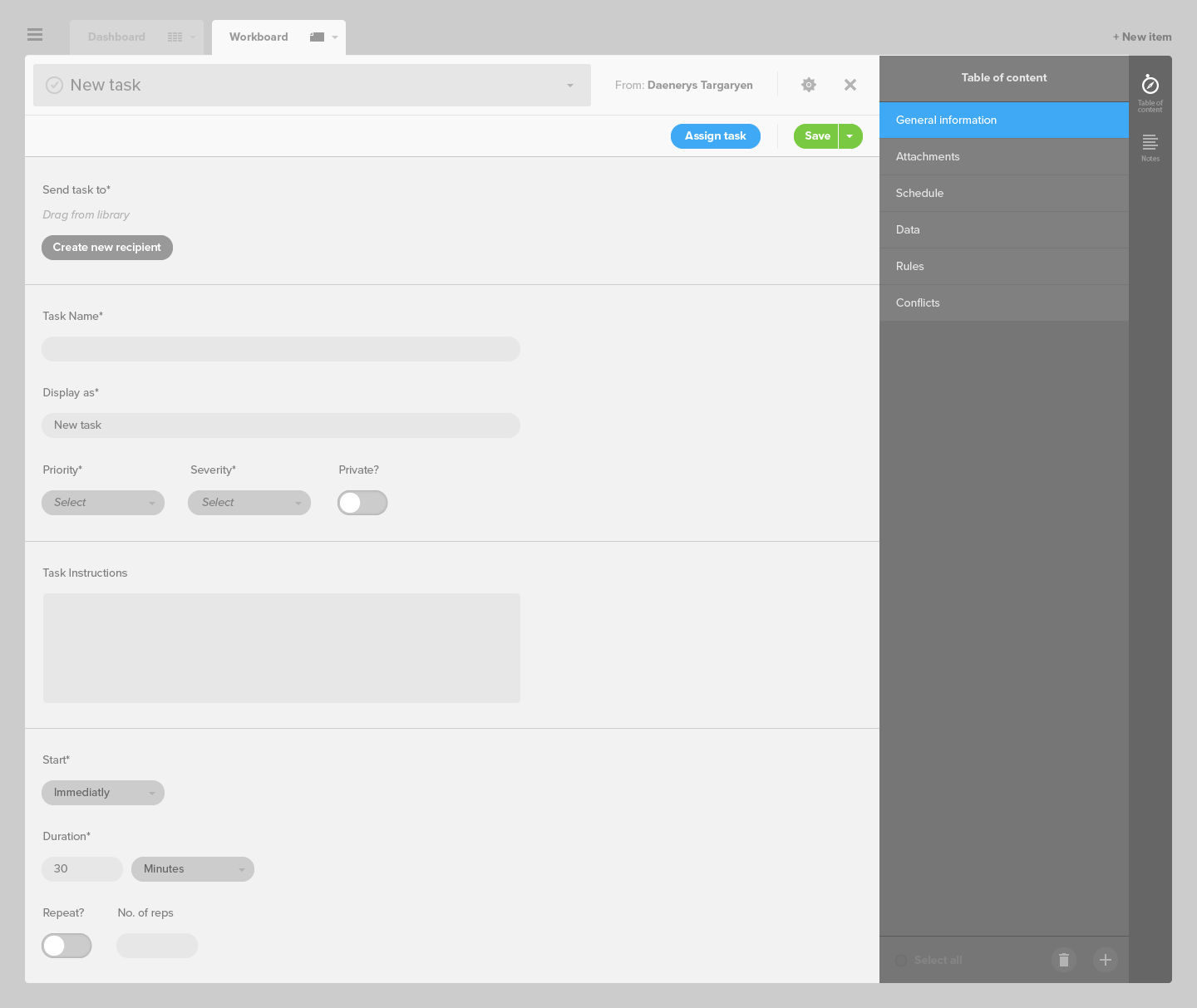
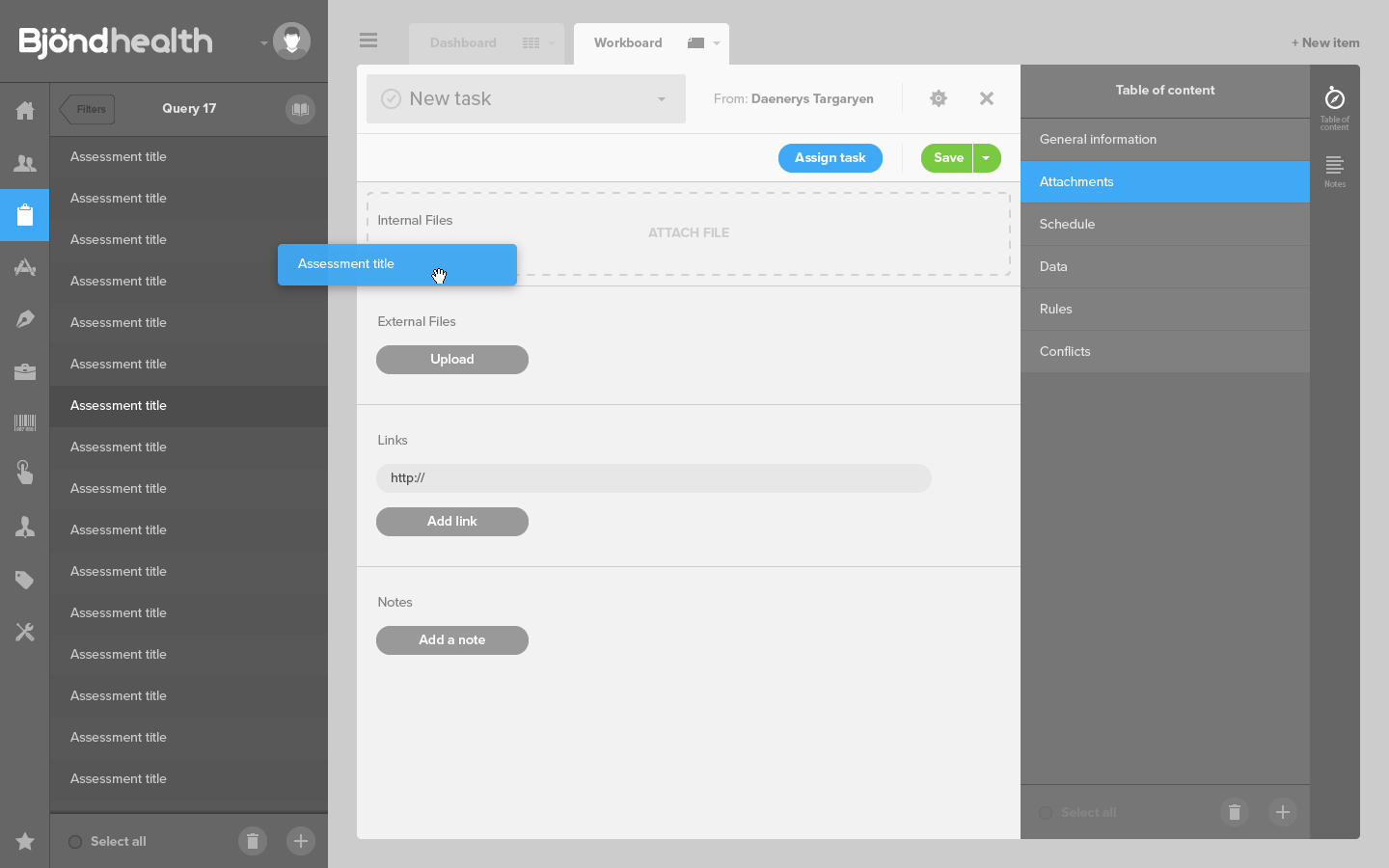
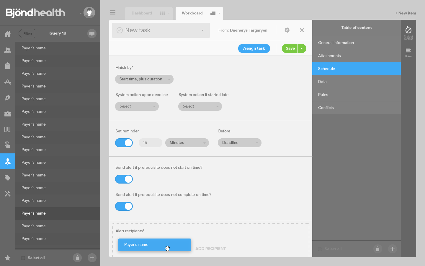
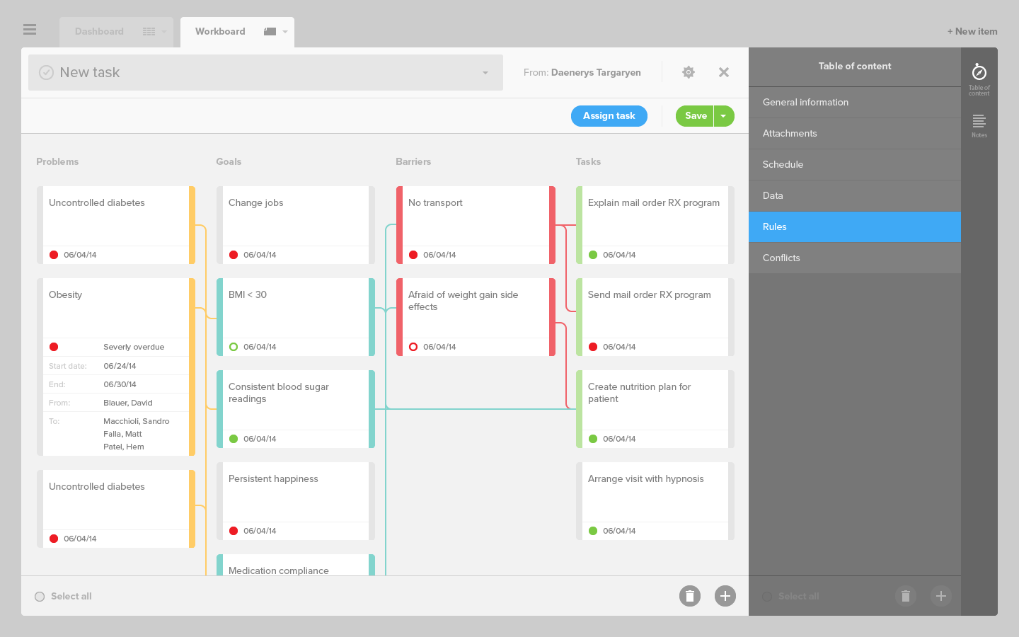
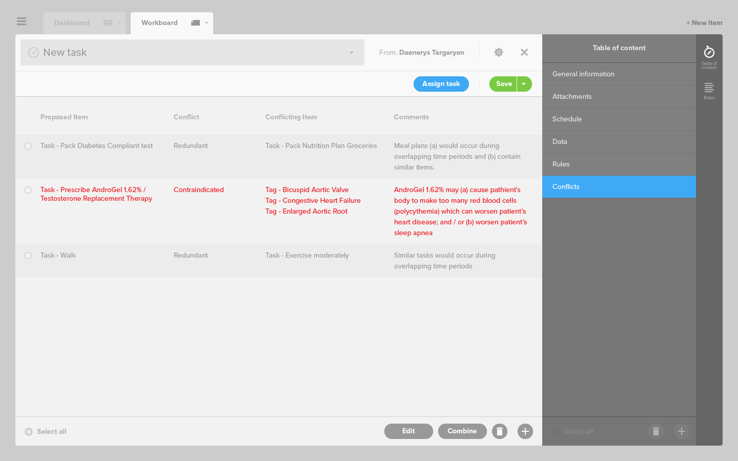
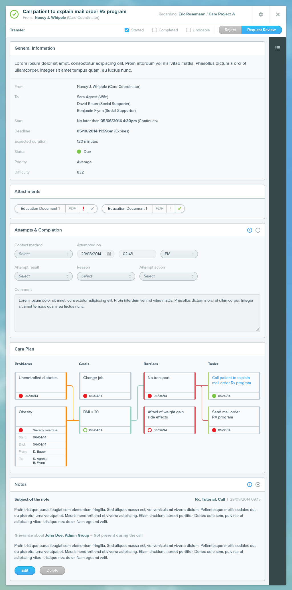
Tasks are very basic objets, simple inputs that remind users of the platform that an assessment must be filled, documentation read, appointment made, etc.
Attaching an assessment
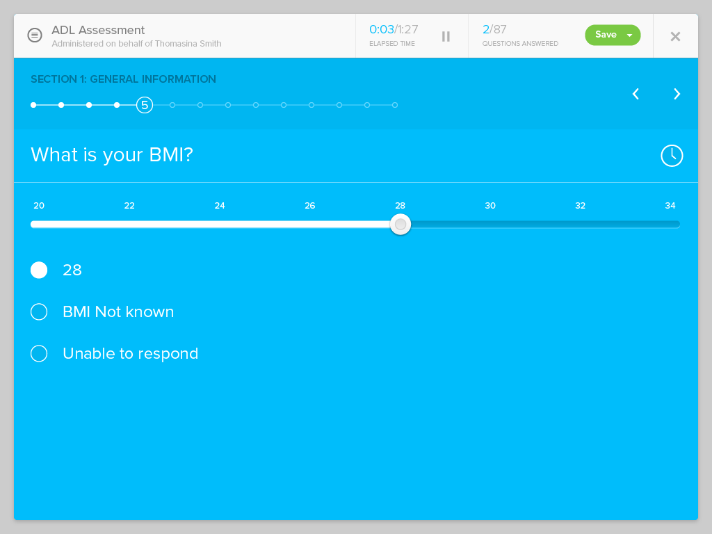
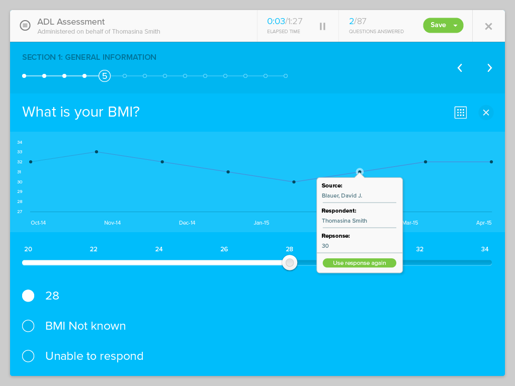
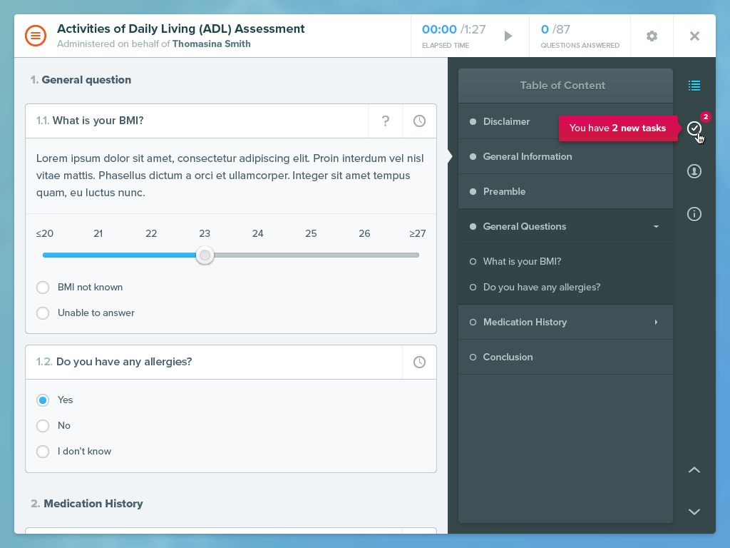
Once assessments are generated, they are sent to patients or nurses to be filled. Obviously the interface form-factor changes depending which of those two user-types is at the receiving end.
The interface for taking an assessment by a nurse
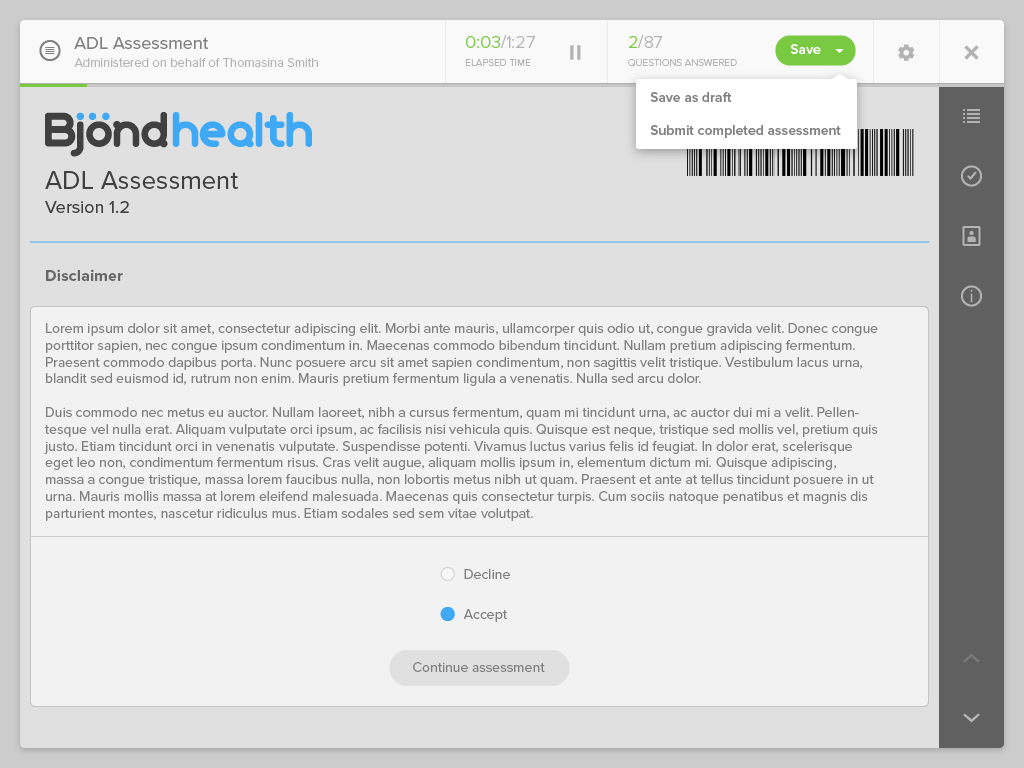
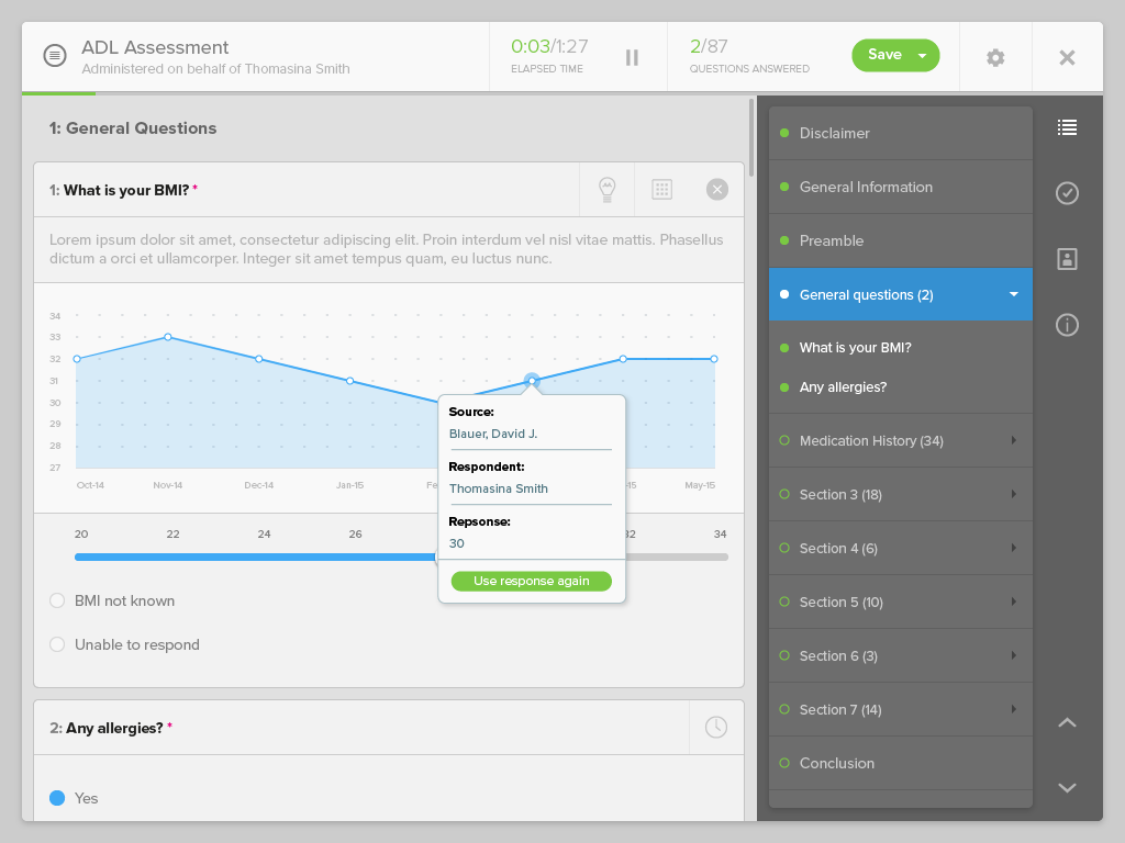
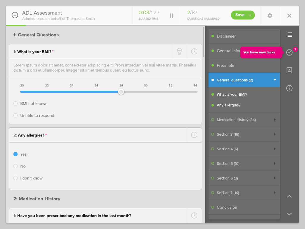
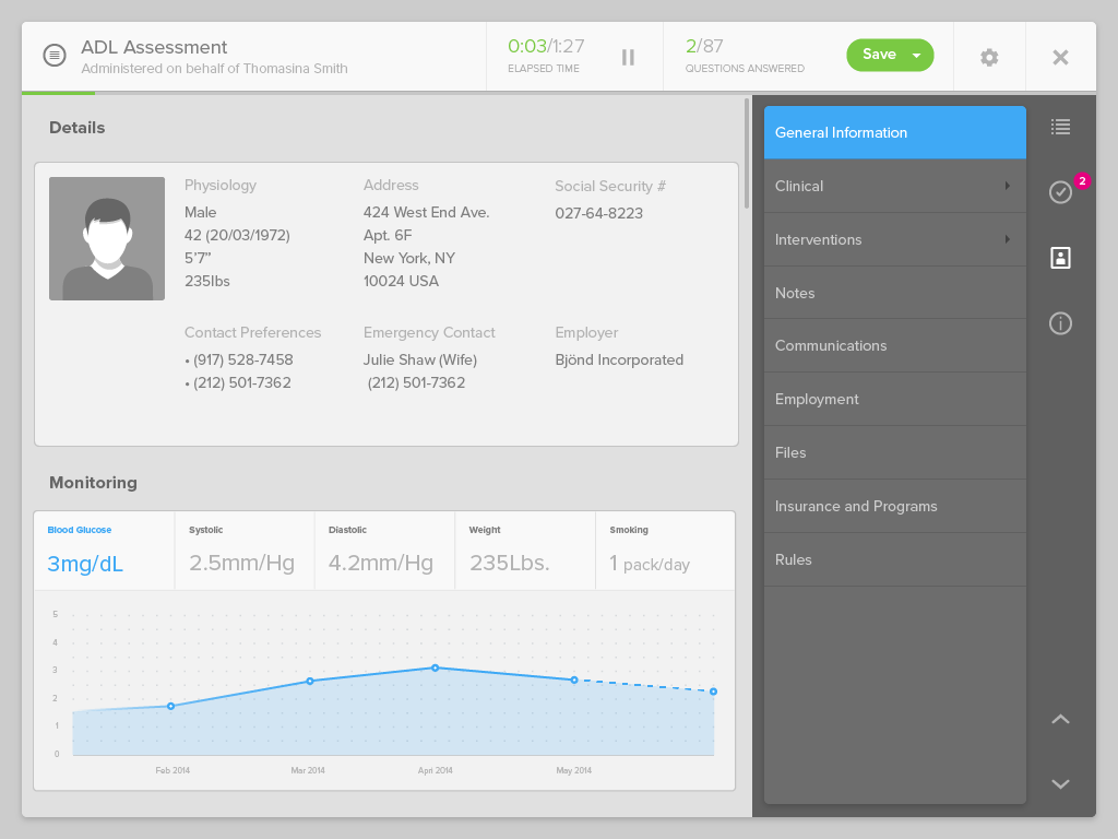
The interface for taking an assessment by a patient
VISUAL DESIGN
CONCLUSION
This project was tentacular from start to finish, necessitating me to develop ways to deal with a large amount of material, screens, ideas and client requirements. It is perhaps one of the project I’m the most proud of, given the large autonomy I experienced during its development, the new UX paradigms I got to experiment with, and the notions of project management I started to discover. It furthered my wish to adopt a more holistic understanding on my projects, and developed my taste for setting up backlogs, writing user-stories, documenting requirements and managing design sprints, and understanding client requirements and expectations.


