"Benjamin personifies the best qualities one would look for in a designer and colleague. For anyone who is looking to hire him, he would be a great asset that would be able to deliver value right from start."
Two tools in one for marketing specialists: an extensive consumer survey database merged with a target audience editor.
INTRODUCTION
Global Web Index is market research company with technology at the heart. They approached us so we could help them shape a tool intended for marketeers and making the most of their market research database: GWI Pro Tools.
REPORT BUILDER
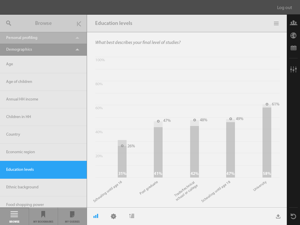
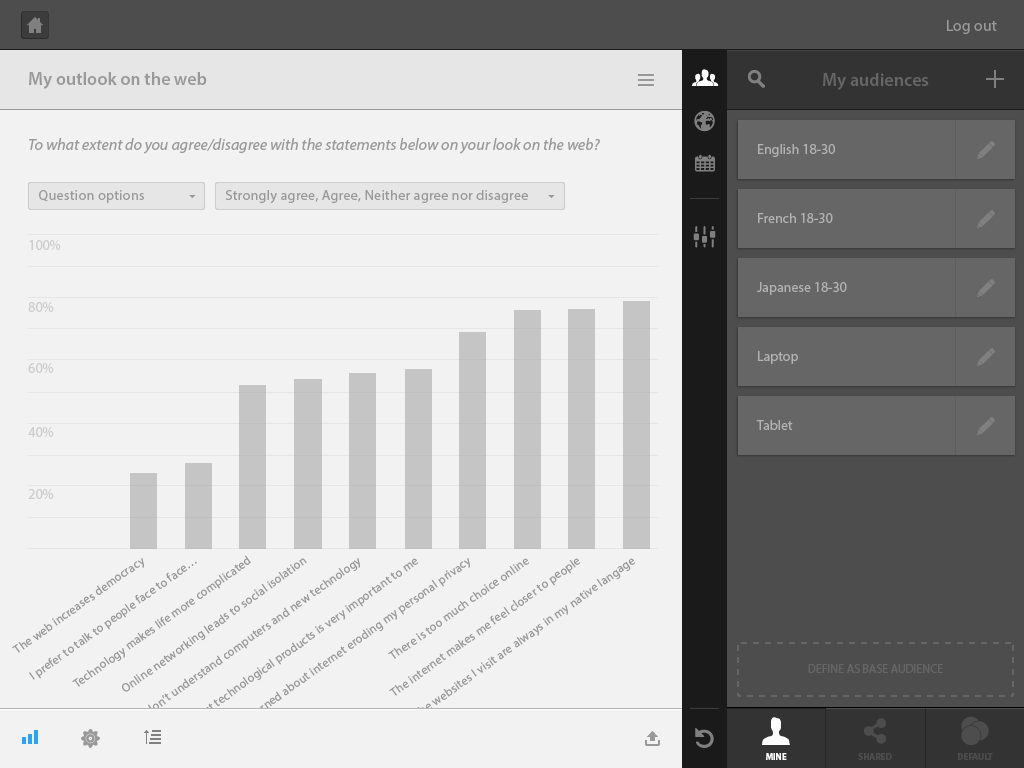
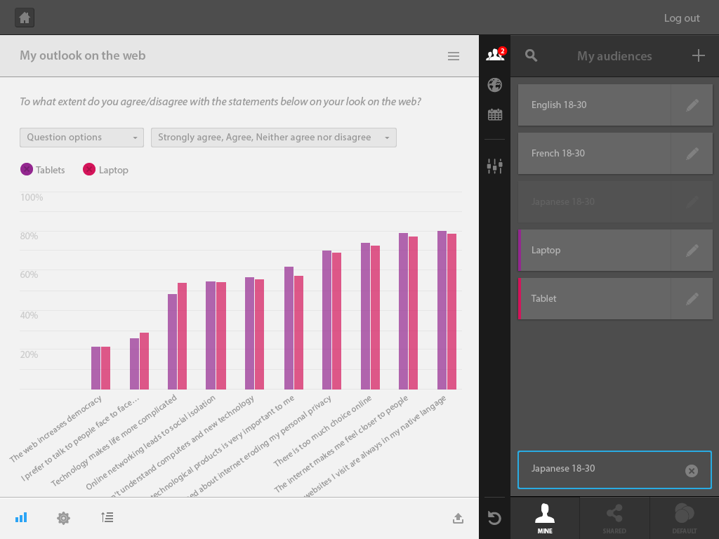
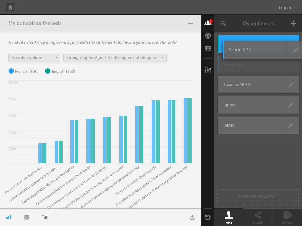
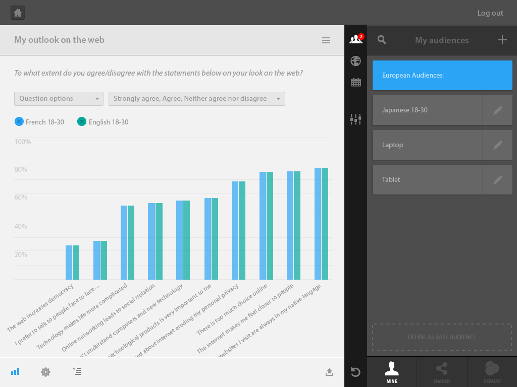
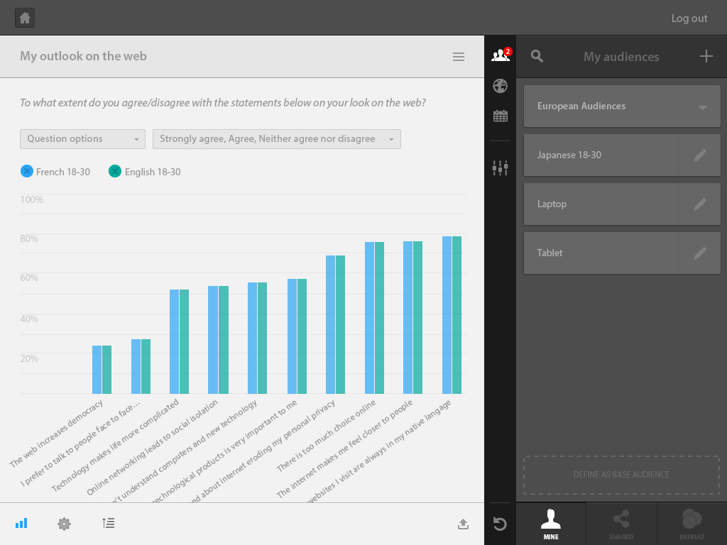
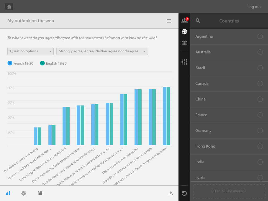
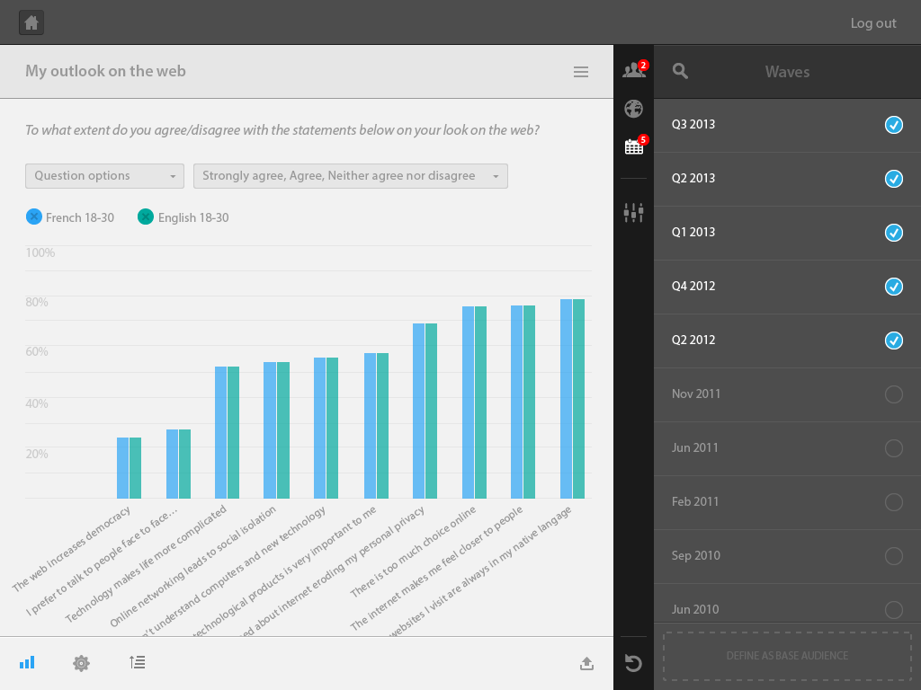
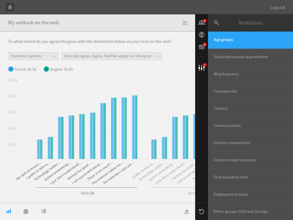
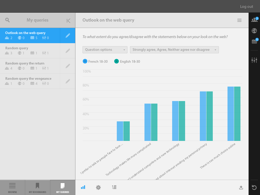
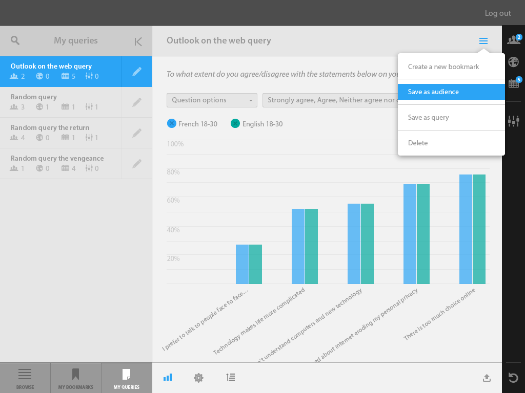
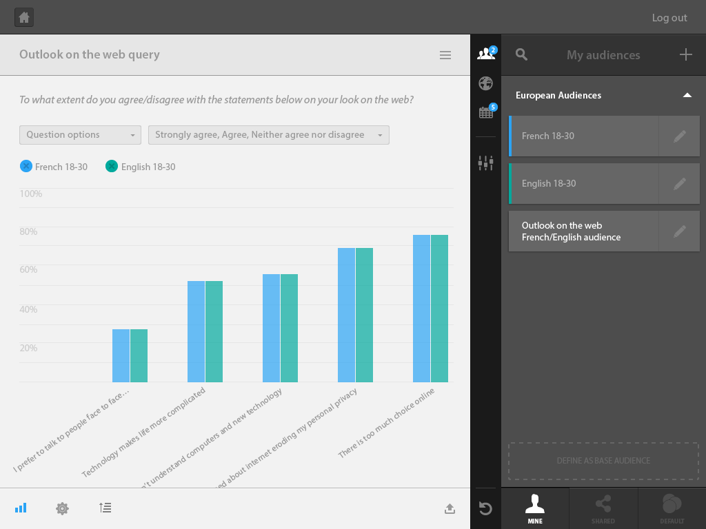
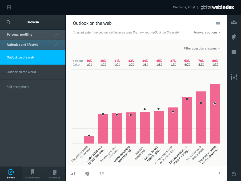
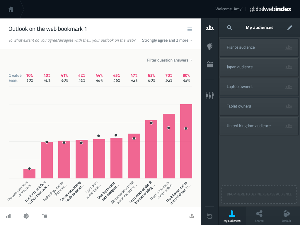
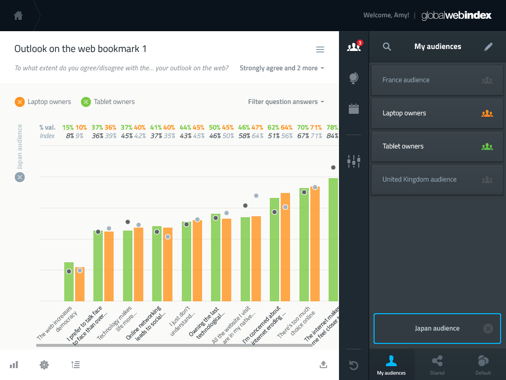
The first half of the platform is a tool allowing users to combine consumer survey questions with audiences. The first task was to define a mental model for this interaction.
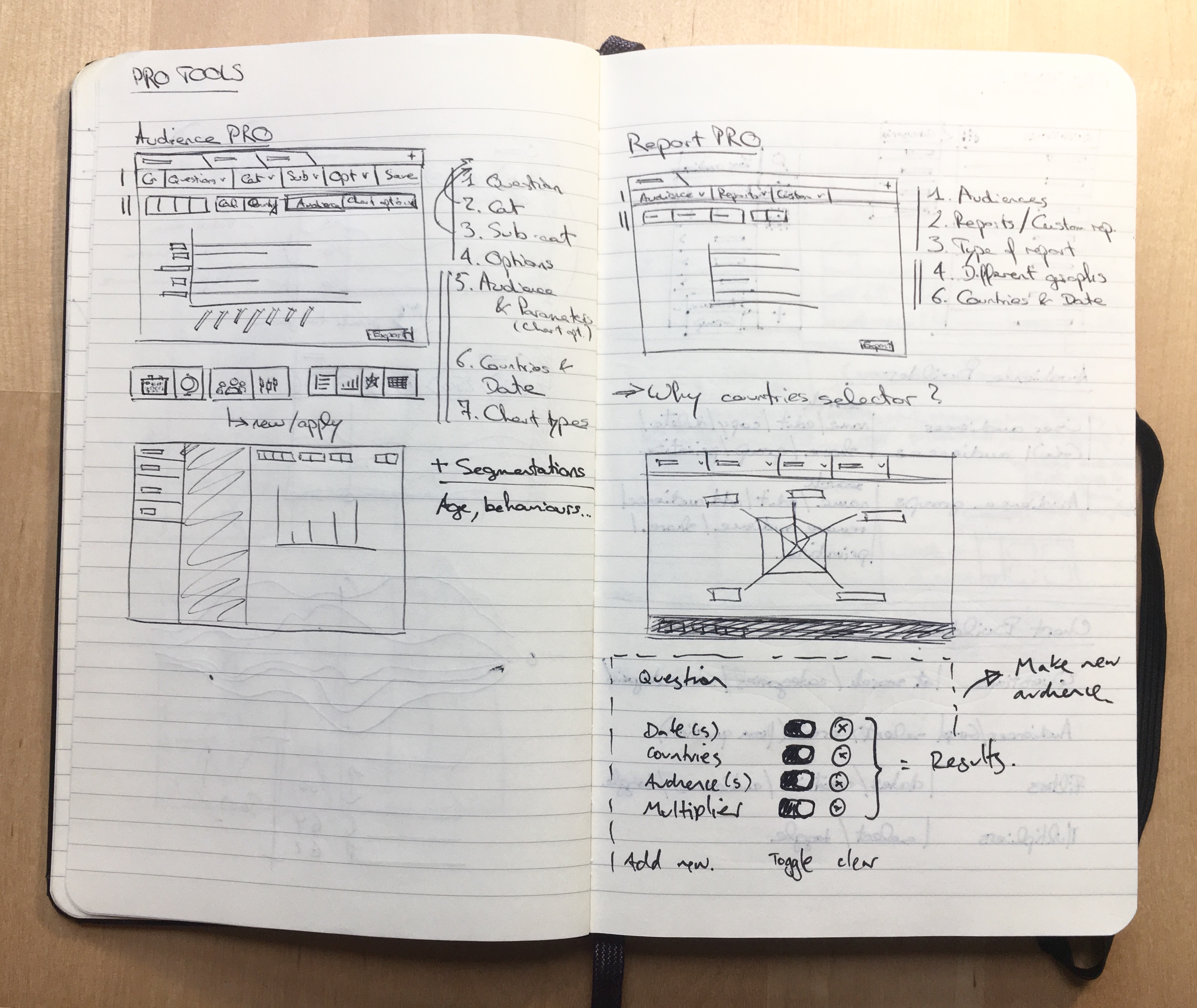
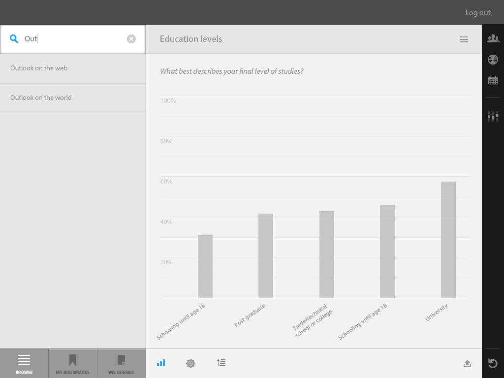
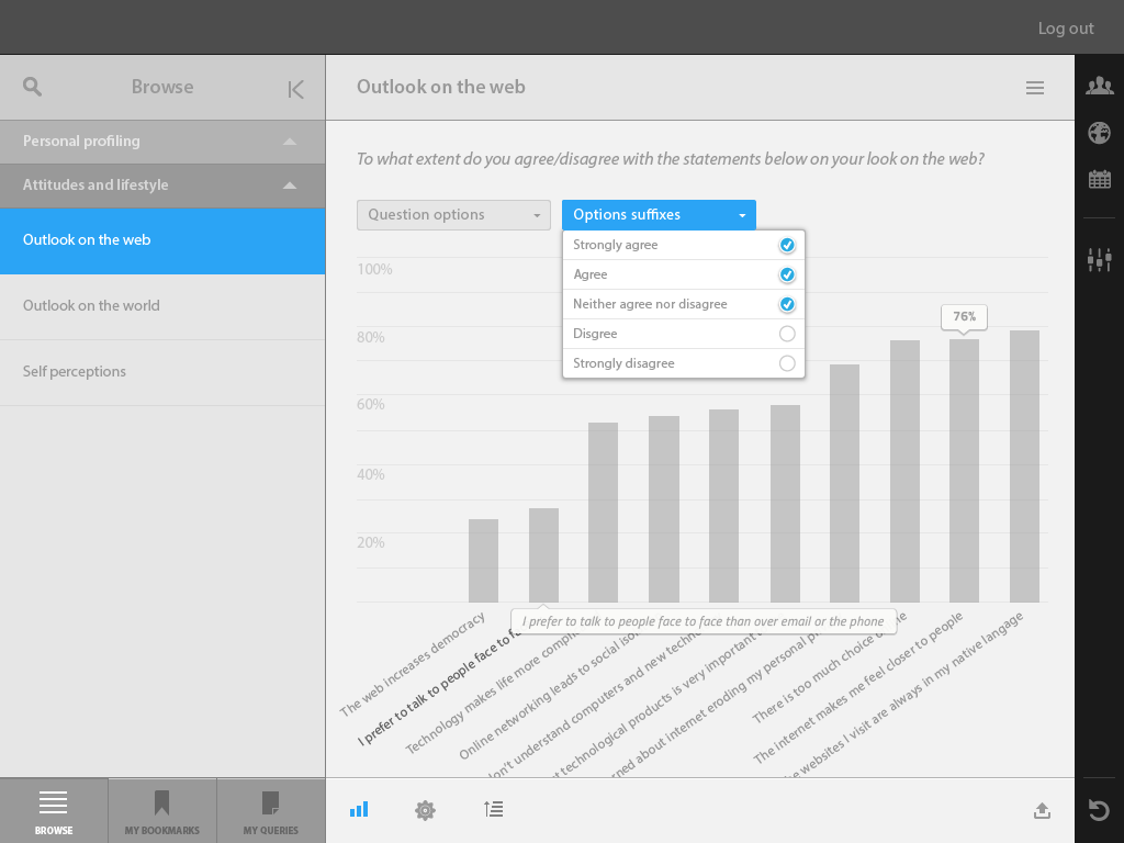
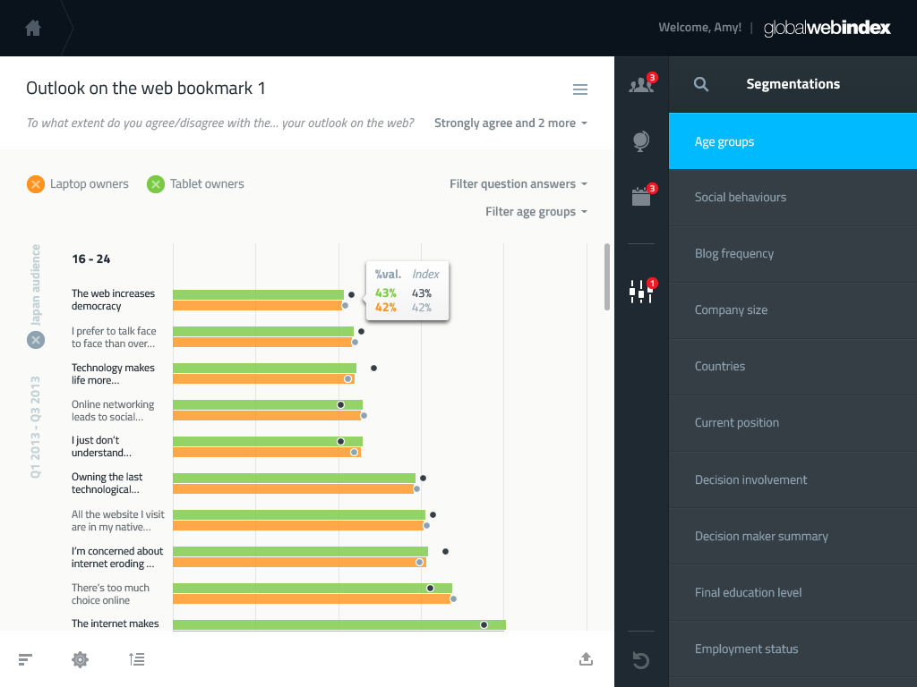
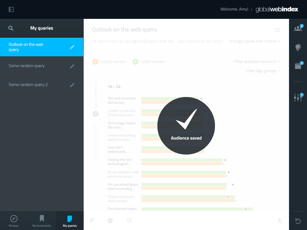
We settled for left-hand side panel allowing users to select a question and administer their preferences (bookmarked questions, tailored queries), a central area where the graph is presented, and a right-hand side panel where audiences can be selected, merged, and where their settings can be edited (when did the survey take place, and other multipliers).
AUDIENCE BUILDER
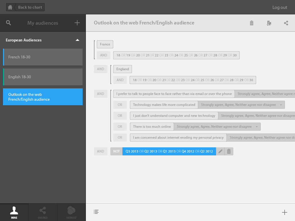
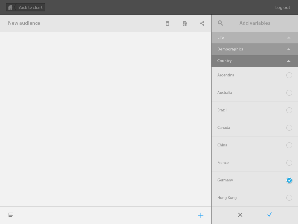
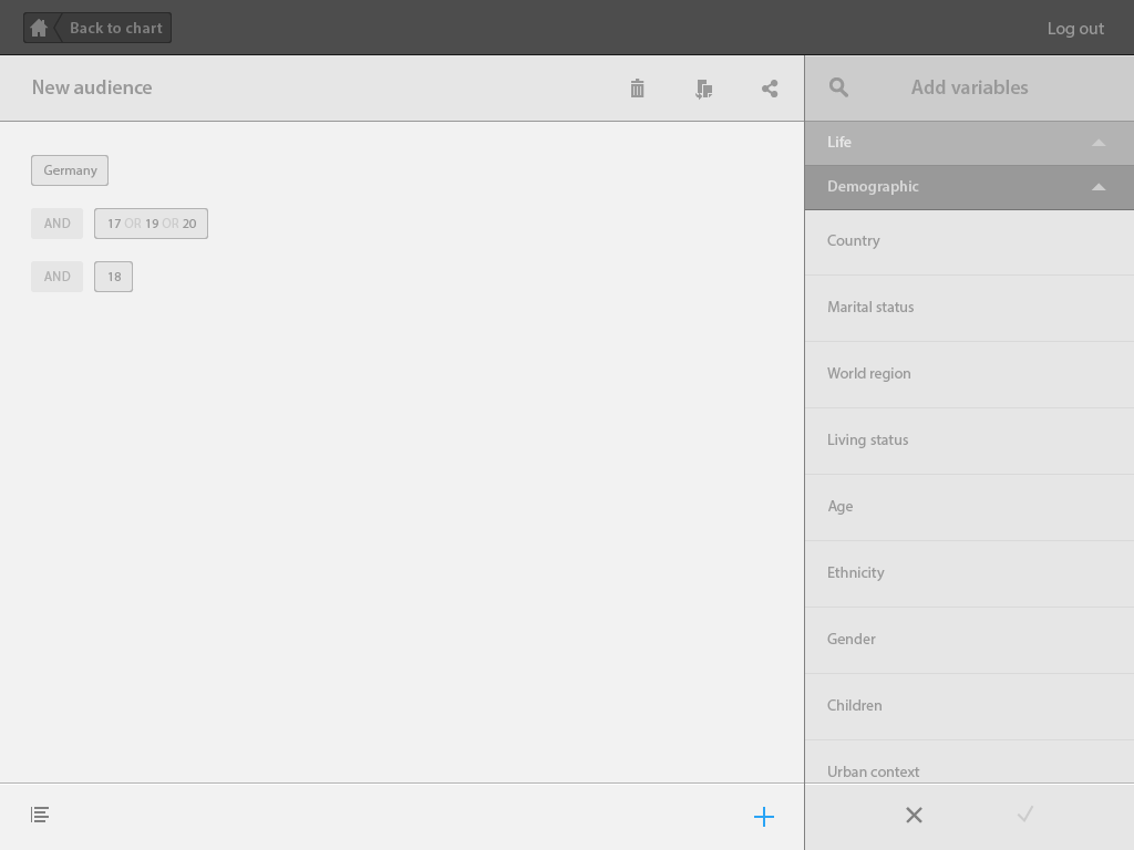
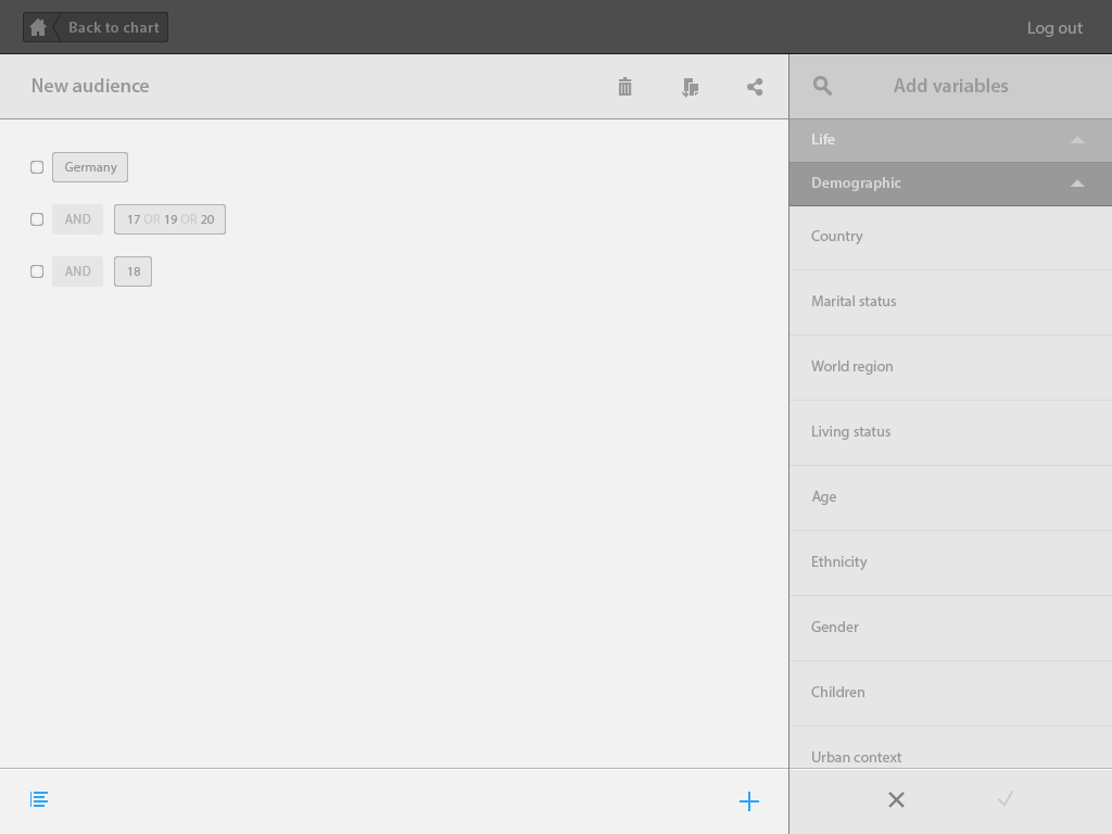
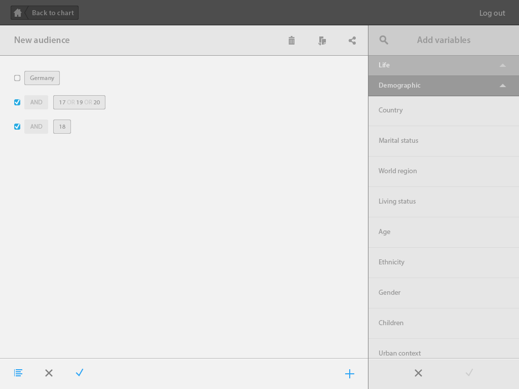
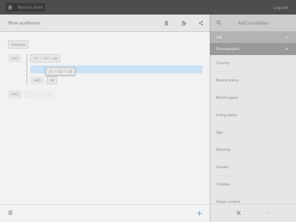
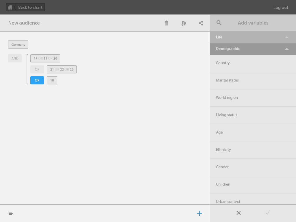
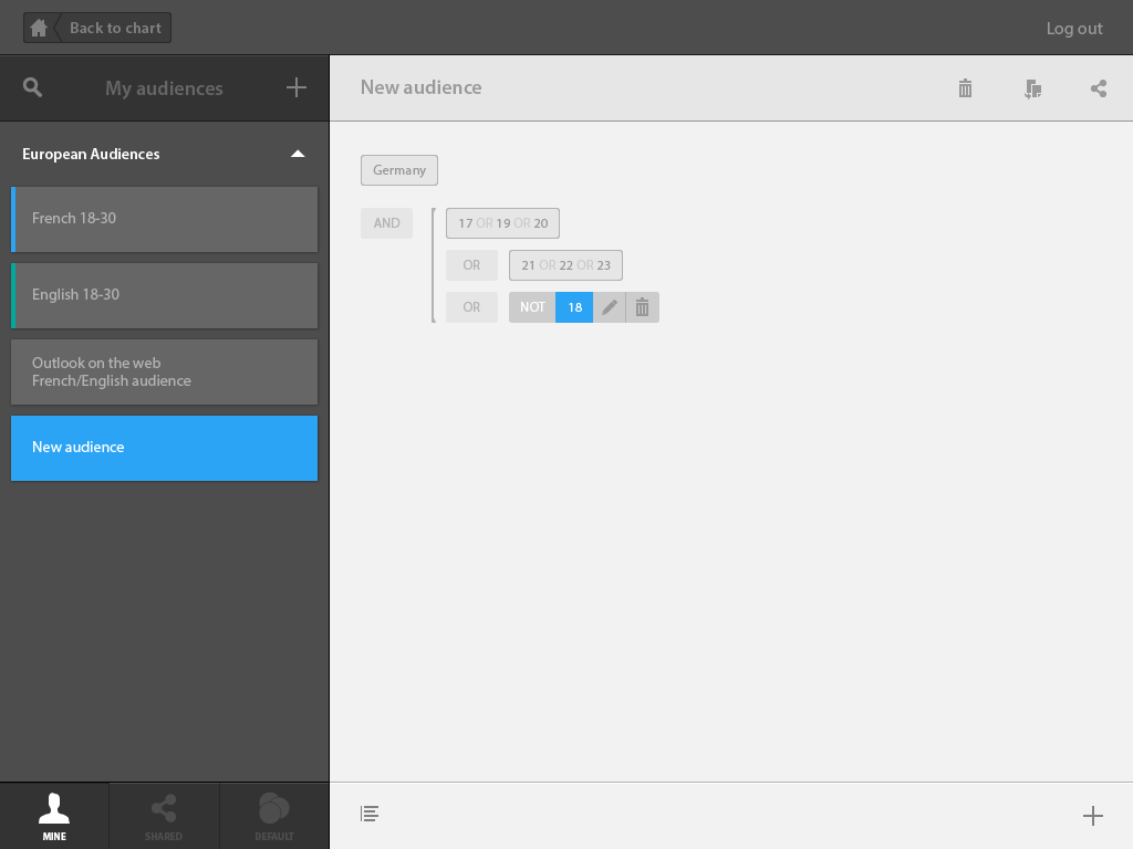
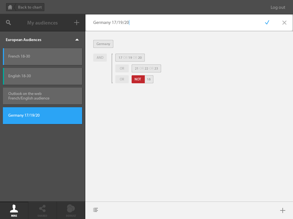
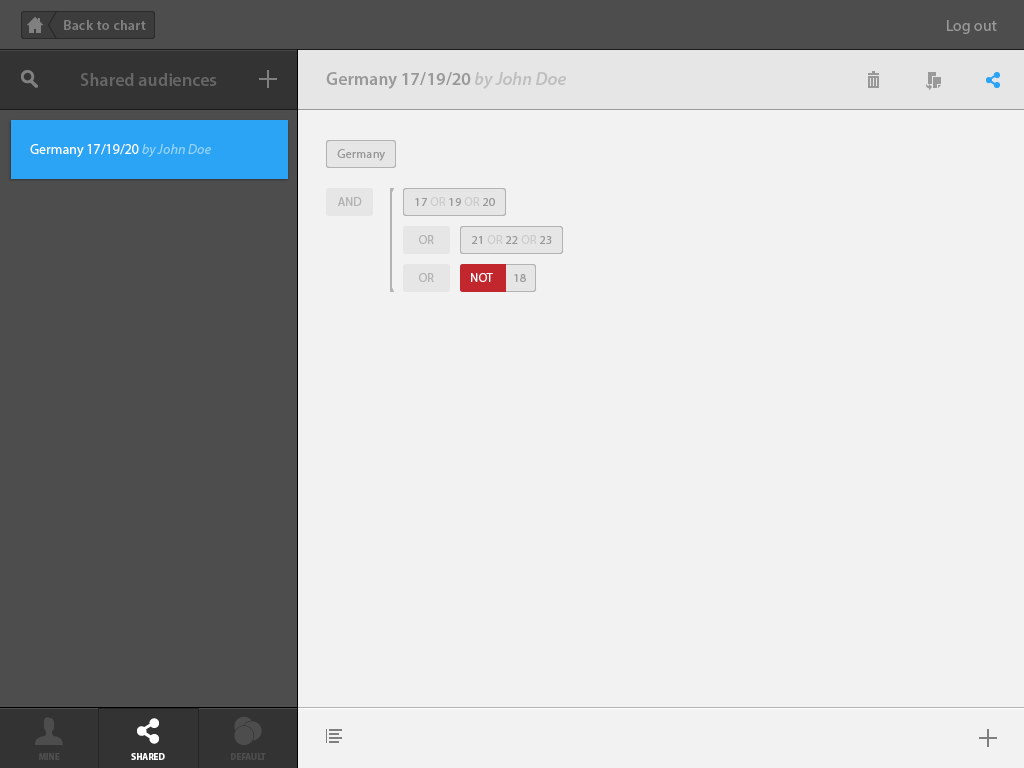
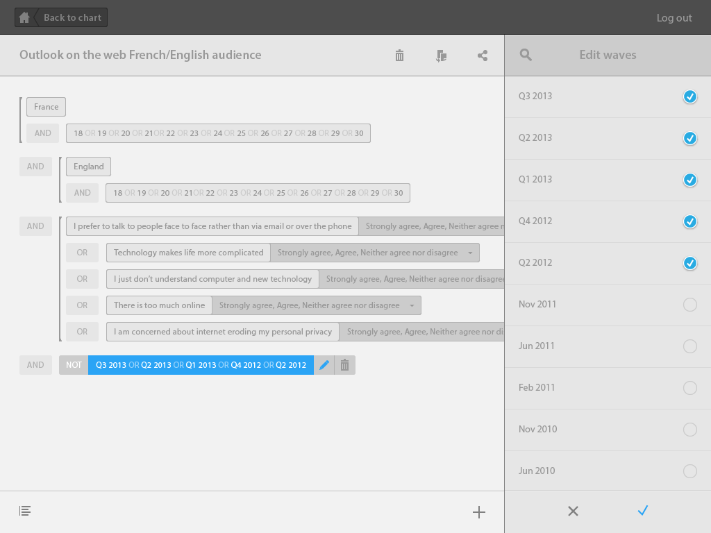
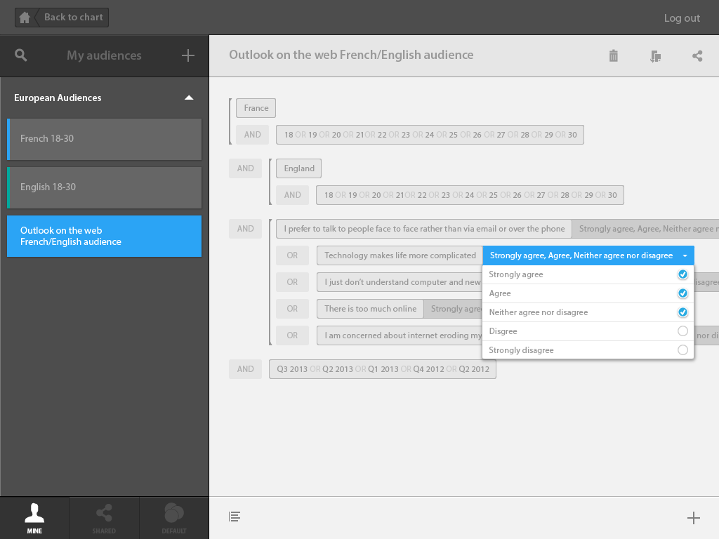
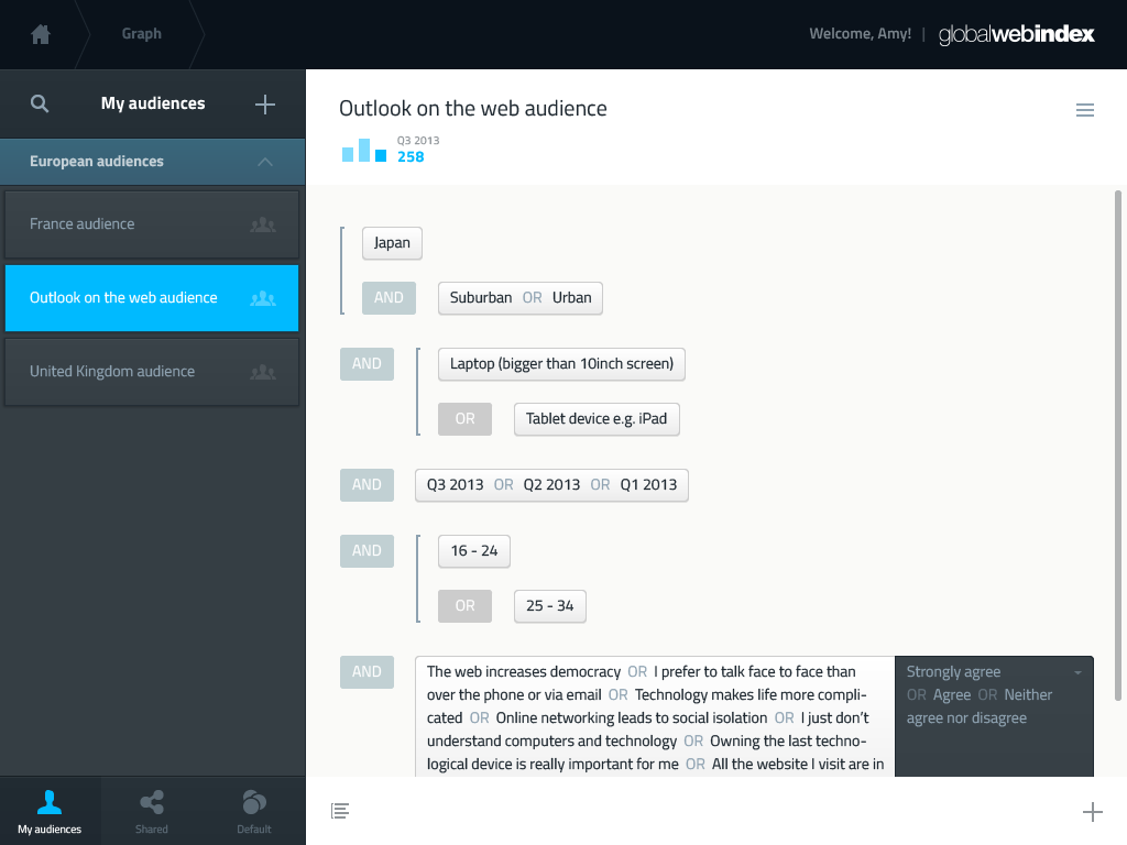
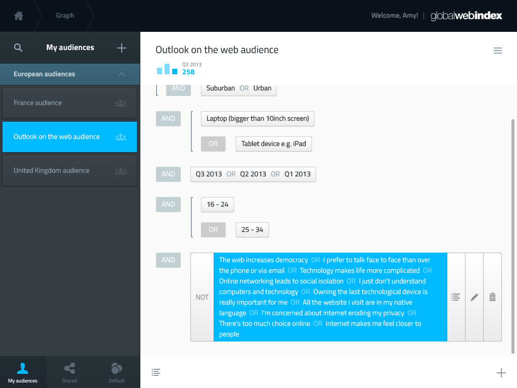
The second half of the tool was supposed to help users define custom audiences, by mixing up variables from an extensive library. Creating the logic to allow the construction of such complex structures, while being easy to use repeatedly, was a UX challenge, and a solution that seemed to work really well was the mental model of a simplified algorithm, taking inspiration from simplified UI that are used to teach coding. It would be articulated around logic operators, ᴀɴᴅ and ᴏʀ.
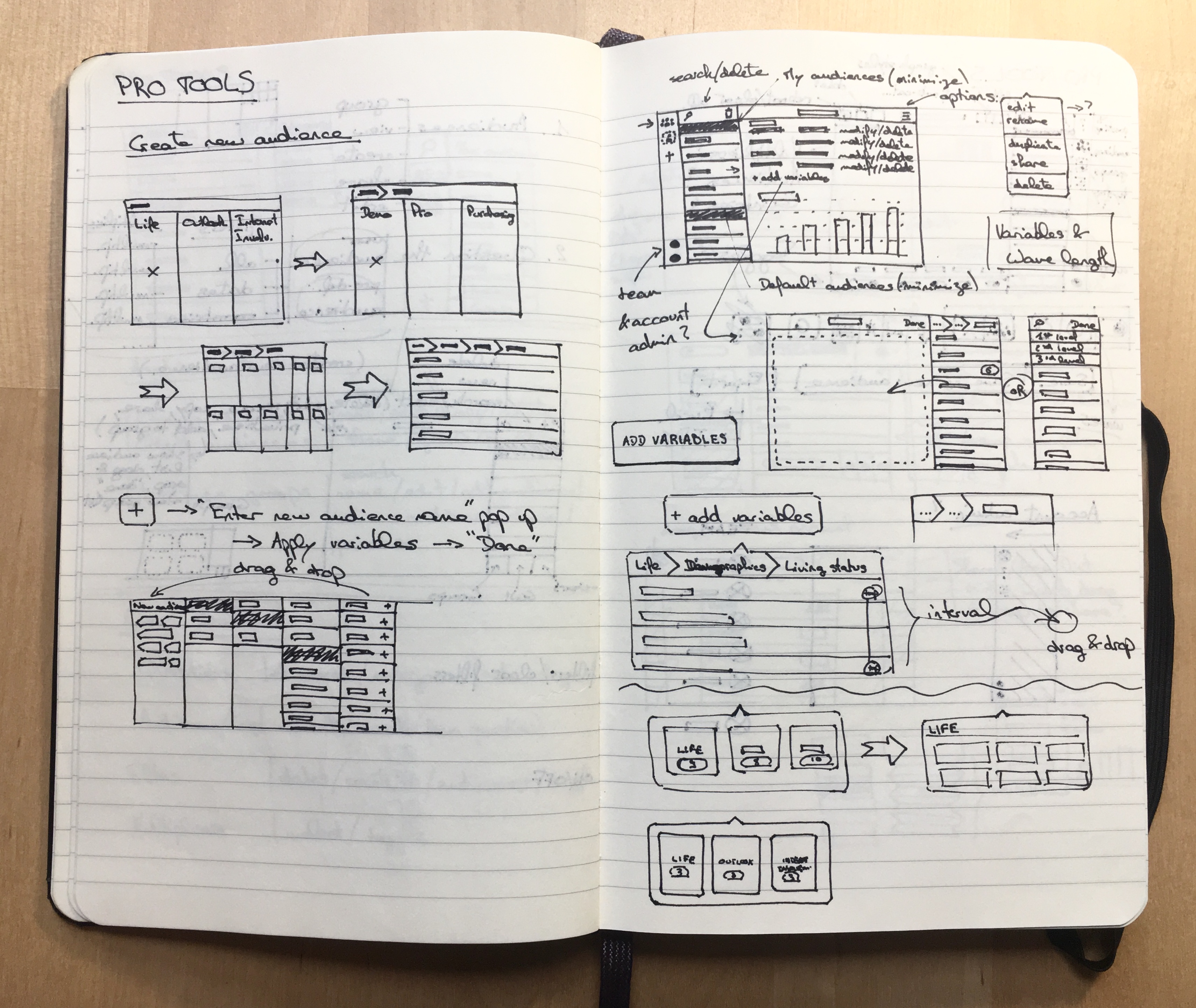
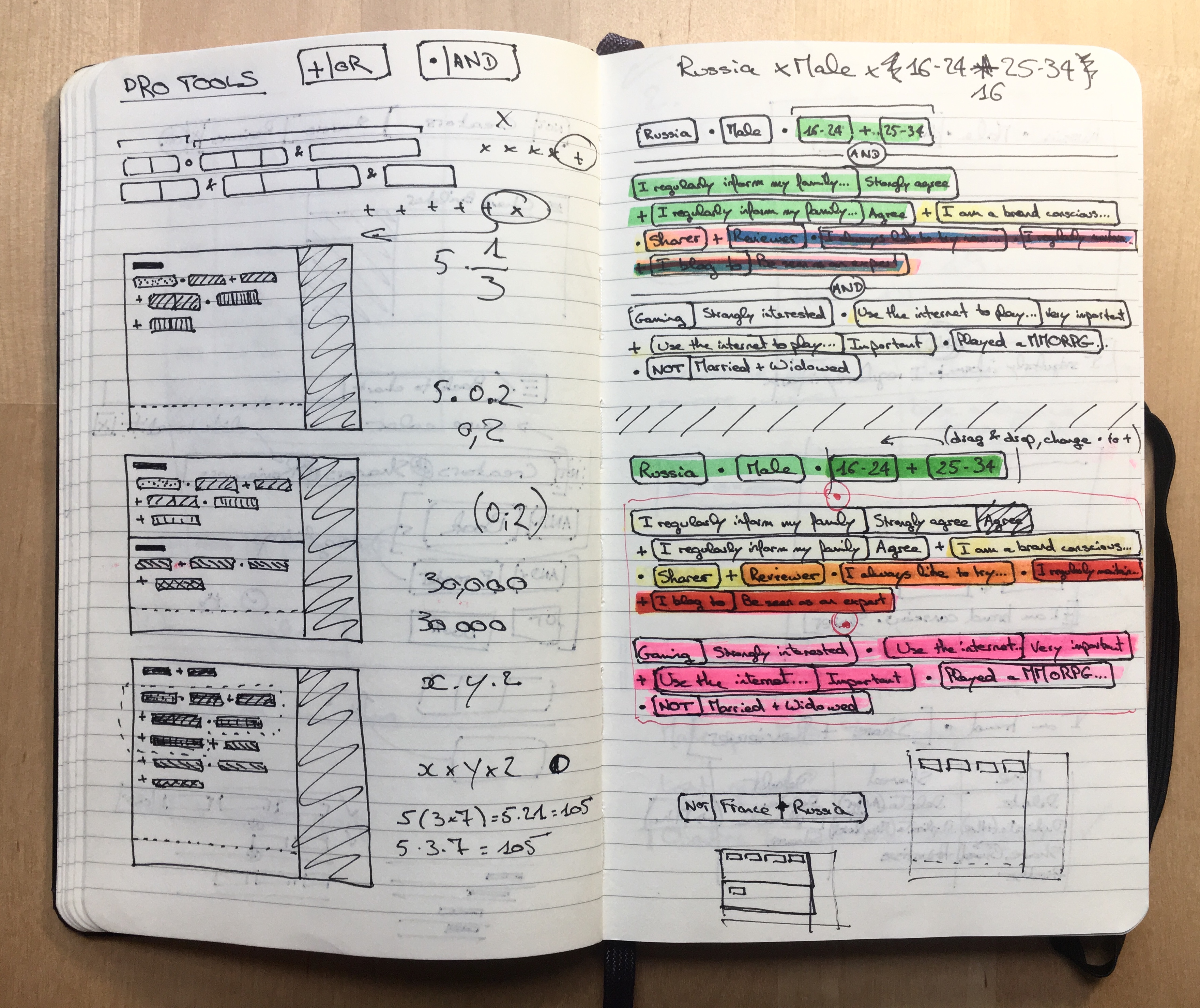
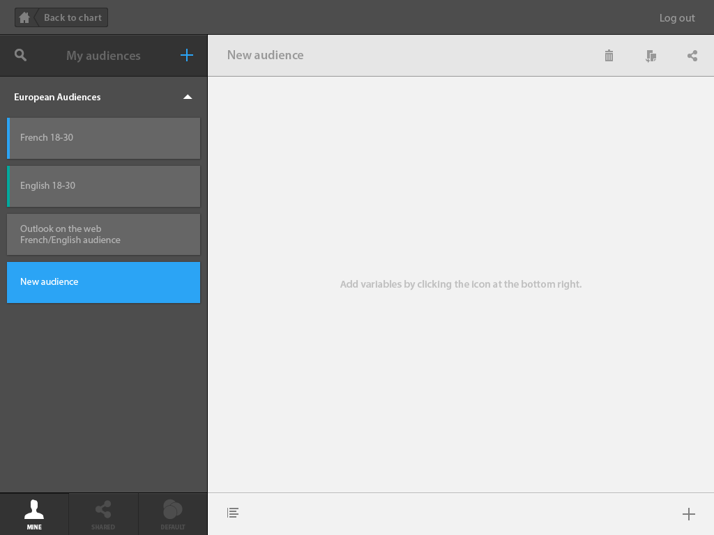
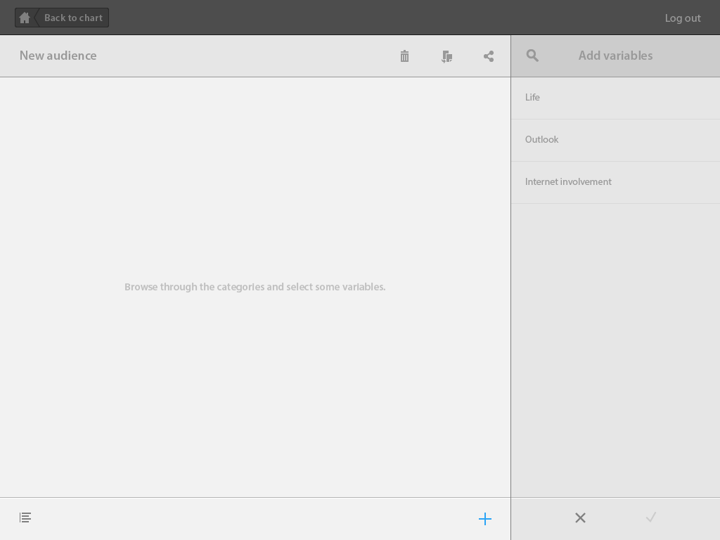
The Audience Builder is revealed when users hit the ‘+’ icon on the top right corner of the right-hand side panel in order to create a new audience, or click on an audience ‘edit’ icon. The whole interface slides across, placing the ’audience’ panel on the left.

VISUAL DESIGN
CONCLUSION
GWI Pro Tools was my first big UX project at Signal Noise. While some choice may seem controversial (the sliding screen…), overall the platform works well, has a strong sense of coherency, and user feedback was overwhelmingly positive.


